Wyvern No 60C/38 Pen & Pencil Set

Wyvern produced 60Cs over a long period and they’re not all the same.  Some are slender pens with not much in the way of trim, others are thicker and more opulent.
IMGP2986
This one’s quite a large, thick pen and the Greek Key band sets it above the run-of-the-mill pens of the time.  The time, I would guess, is about 1948, going by the clip, and I expect that this pen and pencil set in their hard case would have been quite pricey.  60Cs are usually lever fillers but this one’s a button filler.

Strangely, Wyvern’s Leicester Dragon emblem is nowhere to be seen – not on the barrel, the nib, the box or the instructional papers.  Perhaps Wyvern was going for a clean, uncluttered look.  The large nib is warranted and broad.

The pencil is a Wyvern No 37 and its trim echoes that of the pen.  It has lead and works well.
IMGP2982
This is a good set, tastefully presented, and it shows that soon after the war, Wyvern was more than holding its own.  Indeed, judging by the number of post-war Wyverns I see, I think they must have been doing rather well until the ballpoint came along and dealt a killer blow to fountain pen production by this company, like many others.

A Large No-Number Swan

Swan turned out a lot of pens with no number.  I’m not sure why that should be the case.  Maybe they thought it wasn’t especially important, or maybe there was another reason, unfathomable to us now down the long stretch of years.
IMGP2957

IMGP2962
Despite the lack of a model number this pen can be dated to the war years by the centrally-positioned swan in the barrel imprint.  It’s a big beast, 13.8cm capped and of course there’s that trowel-like No 6 nib.  Though there are spots of wear here and there the gold plating is generally good and the pen is free of  cracks, scratches and bite-marks.


IMGP2961

IMGP2976

The gold Swan emblem on the top of the cap is unusually clear and clean.  The barrel imprint could have been done yesterday, so sharp and clear is it.
IMGP2958
It’s big and it’s dignified in its solid black.  The three rings and gold Swan emblem reinforce this suggestion of opulence under reserve.  This is the pen of a man of status (and in those days it invariably was a man) to whom the distance from those under him was important and should be made evident.  It marked him out as a leader in just the same way as did his bespoke tailoring, his Rover,  or even Bentley did.

Of course we believe ourselves to be more democratic these days, but we still enjoy the craftsmanship of a surpassingly well-made pen.

The Conway Stewart 93

IMGP2967

I’ve been trying to get my hands on one of these herringbone Conway Stewarts for years, but I always got outbid.  Until this week, that is.  Not only did I get a herringbone, I got a RED one, and one of the least common models too.

It’s not often I select a pen purely for its looks but I admit that’s what I did this time.  That being the case, there’s not much point in me getting into my usual discussion of the pen’s good and bad points as a writing instrument.  I’ve put a new sac in it; I have no doubt that it writes, probably very well, but when it comes down to it, this is a pen for looking at.  So let’s do that.

IMGP2969

IMGP2972

IMGP2974In conclusion, this was an expensive pen.  If not the most expensive I’ve bought, close to it.  How did it arrive?  In a padded bag with a single turn of re-used bubble-wrap!

Site Glitches and The Swan L230/63

I’ve been having some glitches with the site.  Nothing dramatic and mostly intermittent, I believe, but unless I have examples to hit her over the head with, the developer refuses to believe there’s anything wrong.  I’d be grateful if those of you who have bought from me could give me some indication about how the functions of the site that I don’t see are working.

Does the site send you a notification when you create an account?

When you make a purchase, does the site send you a confirmation?  I don’t mean a confirmatory email from PayPal or a personal one from me.  It should be an automatically generated site email.

If you lose your password, does the button provided actually do anything?
IMGP2945
On to other news: this came this morning.  I haven’t even cleaned it up yet, but it’s too pretty not to write about it immediately.  It once had a number on the base of the barrel but it has worn away.  What would the model number have been?  Well, it’s a Leverless so that’s “L”.

IMGP2949

The nib is a Phillips one (Phillips were official repairers for Swan, and Swan stamped nibs “Phillips” for them, but they’re essentially the same nibs) and it’s a No 2 size, so that’s “2”.  The pen has two barrel bands and a band at the top of the cap, making it “3”.  The cap lip is unsupported, so “0”.  Finally, the colour is russet and jade, which is “63”.  So we have an L230/63.
IMGP2953
Finally, I note that it has a “stacked coins” pattern on all the bands.
IMGP2946
If there’s a more beautiful pen anywhere, I’d love to see it!

Parker Duofold “Big Red”

IMGP2908

You might think from my recent grumbling and growling that I was fed up with pen purchasing but it isn’t so, not really.  I have some exciting things coming my way.  My assistant is helpfully lurking behind the hedge watching for the post lady, which is a little unfortunate, given how intimidating she can be.  Post-people expect to be bitten by dogs, but the cat?  I leave it for them to sort out among themselves.  I have better things to do.
IMGP2934
Like playing with this Big Red.  It’s the first one I’ve been able to get my paws on for years and I am reminded what a mighty beast it is and how glorious the colour.  This one was made in 1926, I believe, going on the fact that the cap band has been set level with the material of the cap, rather than a little raised as previously.  It hasn’t passed these eighty-seven years entirely unscathed.  There’s a very slight colour difference between the cap and the barrel.  Is one a replacement?  Also, the nib is certainly a replacement, though a very interesting one  It’s a great big No 6 size warranted nib, something I haven’t seen before.  There’s very little barrel imprint left.  I can see “Duofold” and that’s about it.
IMGP2939
The pen I’m using every day is an early Slimfold, which is smallish but far from tiny.  Holding them in my hand in the writing position one after the other emphasises the great difference between them.  The Duofold is certainly bigger than the pens I generally use but it isn’t unwieldy or uncomfortable.  I think I could get used to it.  It must have been quite a shock when it was introduced back in 1923, when new pens were rather smaller than they are now.

IMGP2935

Aaaaaargh!


I know I’ve written about this before and I know that, calm as I’m forcing myself to be, I know I’ll be in a bug-eyed, foaming-at-the-mouth raving rant in about 90 seconds from now but I don’t care.  Things need said.
IMGP2917
This arrived this morning and that’s the packaging it arrived in: a reused paper envelope and a wisp of bubble-wrap.  Without wishing to be unpleasant about the seller I think it’s fair to assume from the packaging alone that he hasn’t got the wits of a wool sock.  Then we move on to the pen, part of which is a fine old two-band Waterman 52.  The other bit?  Your guess is as good as mine.  It’s a cap with a crack in it and it doesn’t fit the pen.  Not by a long chalk.  The crack might have happened because of the ridiculously poor packaging though I have to say it looks older.  The inner edges of the crack are fully oxidised and quite dirty.  But let’s give the seller a break here and say that he didn’t knowingly send out a cracked cap.  He sent out a cracked cap because he’s too (a) stupid or (b) cheap to pack a pen properly.  Or it may be that he sent out a cracked cap because he’s too stupid, lazy or blind to check for a crack that you could reverse a tractor-trailer unit into.  But the fact that the cap doesn’t fit onto the pen?  We can’t excuse him that one.  He knew it didn’t fit the pen.  It wouldn’t fit the pen even if he used a hammer.  He knew about that.  And he sold it like that without disclosure.
IMGP2920
So what happens now?  Now, I go through the ebay dispute procedure.  The seller may make an offer of refund right away but if he does he’s an exception.  Most go into full fictional mode, pouring out tales like Charles Dickens on crack, wasting my precious time by forcing me to respond to their drivel.  eBay allows this to go on for a week.  At that point I’ll get my purchase price and initial postage back but then I have to send the pen back by a signed for service at my cost.  At my cost!  That’s £3.70 that I have to fork out because some crook or cretin sent me a broken pen for the reasons discussed above.   It’s got absolutely nothing to do with me, but I have to incur the loss, not the seller.

“Boy,” you’re saying at this point, “She does make a fuss over a paltry £3.70!”  And you would be right, were it not for the fact that I have no less than three of these disputes active at the moment.  How many have I had this year?  I don’t know.  Fifteen?  Twenty?  Somewhere around there and it’s only August.

They may do things differently elsewhere but here in Britain if a seller sends out faulty goods he has to pay to have them returned, which is entirely as it should be.  The fault lies with the seller, not the buyer.  eBay is the only environment here in which this anomaly is allowed to persist.  In fact, eBay themselves seem determined to keep it that way.  It’s iniquitous.

And I didn’t swear.  Not even once.

Onoto Numbers

Not content with creating his immense Mabie Todd list, John Brindle has given me another list, this one the result of his observations of Onotos over a period.  I think it’s fair to say that though mysteries remain, the Mabie Todd numbering system is no longer the impenetrable puzzle it once was.  There are some rare colours and numbers to be matched up.  An explanation is needed for those pens that start with 6.  The combined efforts of a number of individuals over a couple of years  have shown the way the numbers work.  It’s a pair of fairly simple codes, in effect, with the odd anomaly. Once you get a hang of how it works, the mystery blows away like a morning mist.

Studying the Onoto list, no such consistency leaps out at me.  If you can see a coherent whole in this pot-pourri of numbers, you’re a better man than I am, Gunga Din (allowing for the fact that I’m not a man and nor really, for that matter, is the fictional Gunga Din), as Kipling repeatedly said.  The low two-digit models like 14 and 16  could be part of a design run, but then it leaps to 30 and we discover that these  higher numbers were made in Australia, some as late as 1960.  And what about the 4-figure numbers; what do they denote?  The last digit sometimes seems to relate to the number of cap rings; other times it clearly doesn’t.  And, of course, many have no number at all.

It’s perfectly possible that there is no crackable (is that a word?  It is now) code, but just numbers that relate only to entries in a long-ago destroyed book, a bit like Conway Stewart.  Or it may be a bit of both, some code, some merely reference.

Deb, awaiting enlightenment.

Conway Stewart 388 Oblique

IMGP2508

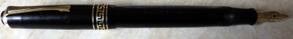
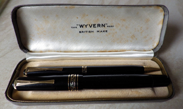
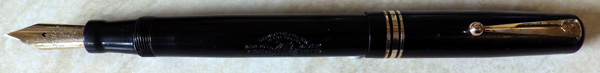
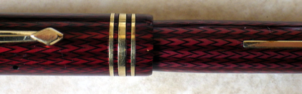
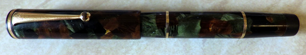
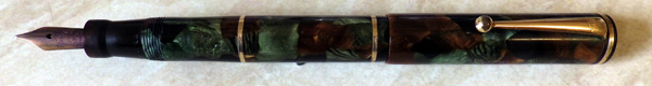
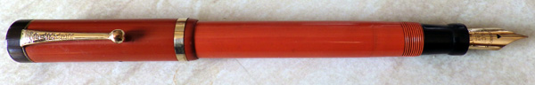
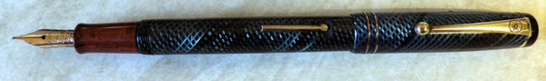
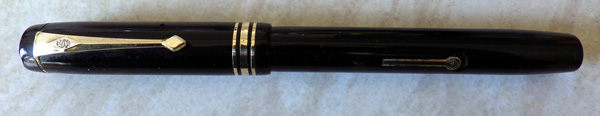
I can’t believe that after all this time I still haven’t written about the Conway Stewart 388, but I just searched the blog and I’ve only mentioned it in the passing where it related to other pens.  Judging by the number of survivals, it must have been one of Conway Stewart’s most popular pens of all time, though its very long period of production, from 1939 to 1955 must help with that.  With its narrow/medium/narrow cap rings and only slightly streamlined shape it looks like a cut-down Conway Stewart 55.   Actually, it’s the other way round.  The 55 is a much later pen inspired by the smaller pen’s popular design.  It worked,  Both pens were big sellers.
IMGP2510
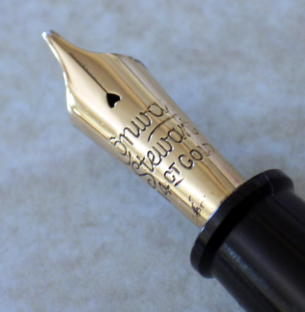
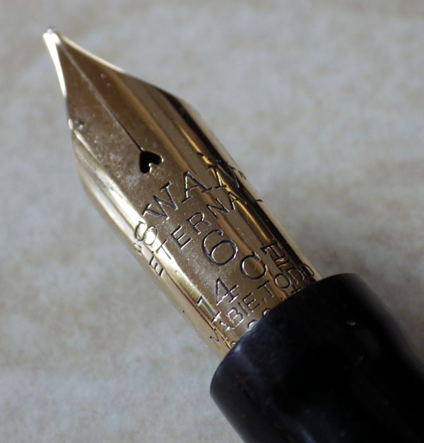
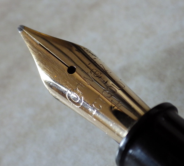
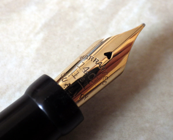
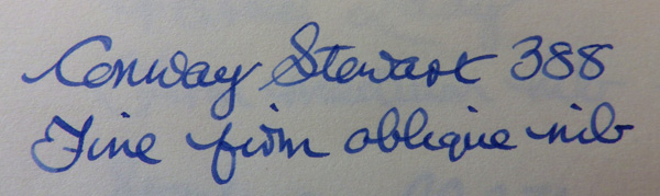
This initially plain looking 388 is, in fact, rather special.  The nib is a firm medium oblique.  Admittedly, such a small nib is unlikely to produce much in the way of dramatic line variation but if you’re one of those people (like me) who hold the pen in a rotated position, this is the pen for you.  It will work with you in producing improved hand-writing.
IMGP2515
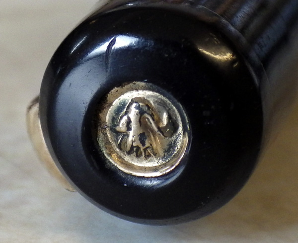
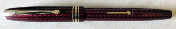
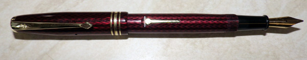
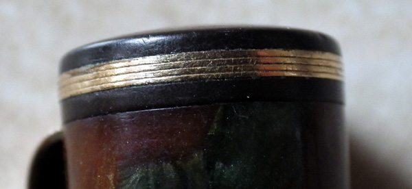
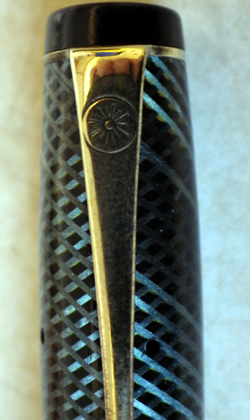
Compared with Swan or De La Rue, Conway Stewart produced few special nibs but when they did produce one they spared no effort.  This high-shouldered nib tapers beautifully to a narrow, slanted stub.  It looks like a piece of jewelry rather than the practical instrument it is.

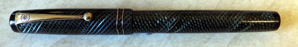
The 388 remained in the catalogues until 1955, long after its quite straight-sided style had been replaced by the post-war fully streamlined Conway Stewarts.  Perhaps in that year its sales finally began to tail away, because it went out of production and was replaced by the 36, which inherited its cap band arrangement and CS 5N nib.  A pleasant enough pen, the 36 somehow lacked the appeal of its predecessor despite the addition of a unique striped pattern, and judging by the number of survivals, it sold a little less well.

Edit: Andy Russell kindly provided an illuminating comment on this post which changes the chronology and hence the interpretation.  It makes such a significant change that rather than leave it as a comment which many might miss, I post it here as an edit.

“Hi Deb, as you know I’m not one to let a misconception about CS history pass unchallenged…..!

This is one of the areas where Jonathan’s history turns out to be wrong. Surprisingly, the 388 wasn’t actually first produced until after the 58! The 58 was first advertised in the trade press in 1949, the 388 was never mentioned at all until early 1952. This would most likely mean it was first produced in late 1951, probably as a replacement for the 55, and as something more akin to the size of the 58 for those who still preferred a more traditional, straight sided pen.

There is certainly no mention of the 388 in pre-war price lists (up to 1940), the closest model then would have been the 380. CS production was limited throughout the war and for a good few years afterwards, and the 388 doesn’t appear on any of the ‘restricted’ price lists up to 1948. The final date of production of 1955 is about right, though – it still appears on the list for December 1954 but not in December 1956. So, rather than being one of the CS models with a long lifetime, it actually had quite a brief existence! I suspect the low price was the main reason for its appeal – at 22/- in 1952 it compared very favourably with the more modern 58 at 31/6 and the 28 at 25/8.

The lineage of the 55 is rather clearer. The original model of this design was the pre-war 35 (itself a cut down version of the massive Duro 26). This was replaced with the 45 during the war years, a very similar model but with a reduced level of trim (single cap band) because of material shortages. After the war, the 45 was in turn replaced with the 55, with the original cap band configuration being reintroduced, though both models appear to have co-existed for a brief time in 1946. The 55 seems to have disappeared from the listings c. 1950, at about the same time as the introduction of the 58 which was obviously intended to be the clear ‘top of the range’ at that time.

Andy”

The De La Rue Pen No 1332

IMGP2496

Remember this little guy:  http://wp.me/p17T6K-yP ?  Well, here’s its close relative.  The last one I had was without identifying numbers; this ones a 1332, which makes it mid to late thirties.
IMGP2500
That’s the same nib as some of the Onotos, so you know it has to write well.  And so it does.  I tried it and it writes beautifully, a semi-flexible medium.  If you were rigidly practical, that’s all you need to know – that the pen writes well.  But of course none of us are entirely practical or we wouldn’t be deep into the world of fountain pens.  So it doesn’t hurt that it’s beautiful, that the blue latticework throws the light back at you with an almost metallic shine, that the mottled hard rubber finds some kind of absolutely right harmony with the latticework and the overall design of the pen is that of an object intended to work, but also to please.
IMGP2499
As pen makers, De La Rue were early in the field and could have chosen any logo that they wanted.  What did they choose?  A sunburst, a very common image.  Many years later this caused confusion because jobbing parts makers turned out levers with sunbursts on, just to convince puzzled pen collectors that all sorts of cheap pens were made by the prestigious De La Rue.
IMGP2498
Anyway, the pen’s the important thing.  Isn’t it a beauty?

The Swan SM2/58

IMGP2490

Here’s yet another of those colourful 1930s Swan Minors. This one’s slightly larger than the last, as it has the No 2 size nib and the whole pen is larger proportionately. The colour code is 58 which doesn’t appear in the FPN list, but I would describe it as green/gold/black. I think it’s quite a rarity – at least I haven’t been aware of it before now.

IMGP2487


As ever with these outstanding pens, it will be sold on the website (though not immediately – I have a little work to do on it). I can’t sell it privately. Previously, with pens of this quality several people have wanted it and I have no fair way of deciding who should get it.
IMGP1557
I showed it to my assistant but she wasn’t very impressed. “Come back,” she said, “When you have a calico one…”