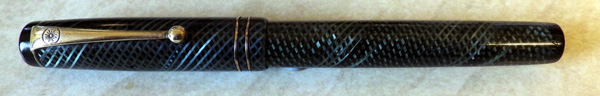
Remember this little guy: http://wp.me/p17T6K-yP ? Well, here’s its close relative. The last one I had was without identifying numbers; this ones a 1332, which makes it mid to late thirties.

That’s the same nib as some of the Onotos, so you know it has to write well. And so it does. I tried it and it writes beautifully, a semi-flexible medium. If you were rigidly practical, that’s all you need to know – that the pen writes well. But of course none of us are entirely practical or we wouldn’t be deep into the world of fountain pens. So it doesn’t hurt that it’s beautiful, that the blue latticework throws the light back at you with an almost metallic shine, that the mottled hard rubber finds some kind of absolutely right harmony with the latticework and the overall design of the pen is that of an object intended to work, but also to please.
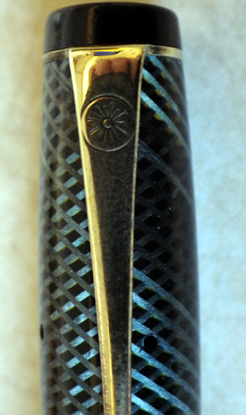
As pen makers, De La Rue were early in the field and could have chosen any logo that they wanted. What did they choose? A sunburst, a very common image. Many years later this caused confusion because jobbing parts makers turned out levers with sunbursts on, just to convince puzzled pen collectors that all sorts of cheap pens were made by the prestigious De La Rue.
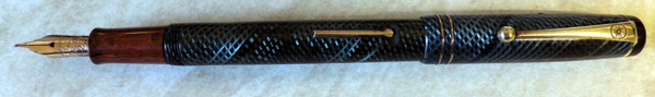
Anyway, the pen’s the important thing. Isn’t it a beauty?

Yes, it certainly is a beauty, about as nice a 1930s pen as I can remember seeing. Decorative without being gaudy.
Have you ever encountered this sunburst imprint on the head of the lever mechanism on a De La Rue pen? I recently bought a red ripple Swan Minor 2 off an online marketplace, but when I received it and was able to give it a closer look, it turned out the barrel is not original (though a very good match to the M2 section and cap), and it has an identical De La Rue sunburst pattern on the head of the lever, which is part of a Waterman’s-style lever box mechanism. There are no imprints on the barrel, so this is all I have to go on. I was hoping you could perhaps shed more light on this mystery barrel, if you’ve seen something similar, or might know which De La Rue pen it might belong to. Unfortunately, I cannot post pics here to help you out. Thanks!
Hello Andy,
I don’t have any of the latest Onoto reference material but the short answer is yes. I have seen that sunburst lever on an Onoto. The box lever is correct, I should think as Onoto certainly made them. If you would like to send me pictures to redripple@btinternet.com I could write something about it and appeal to the knowledge of my readership. I assume that what you have is mottled hard rubber, not red ripple as I am unaware of De La Rue producing that pattern.