A Mystery Parker

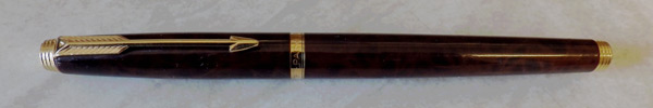
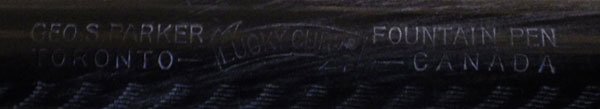
Here’s a mystery pen. I would be grateful for your comments. I’m no expert on the Parker brand but I’m not entirely ignorant of it either. However, this mixture of mercies has me beat. I might mention that it was raised in Fountain Pen Network but they were not helpful, I’m informed. That’s how I remember FPN when I was a member some years ago. Long on opinions, short on facts. To be fair, though, FPN is first class when you need to know what colour of ink to put in your latest Montblanc.


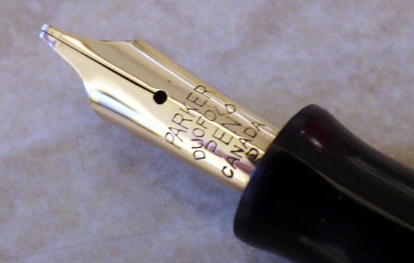
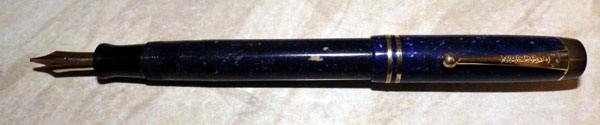
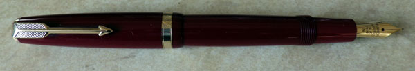
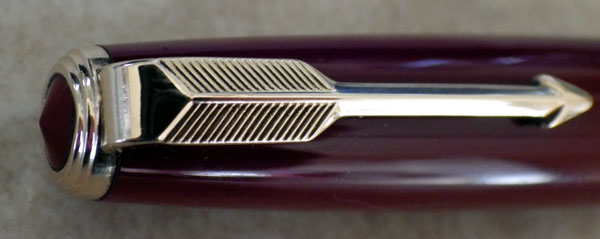
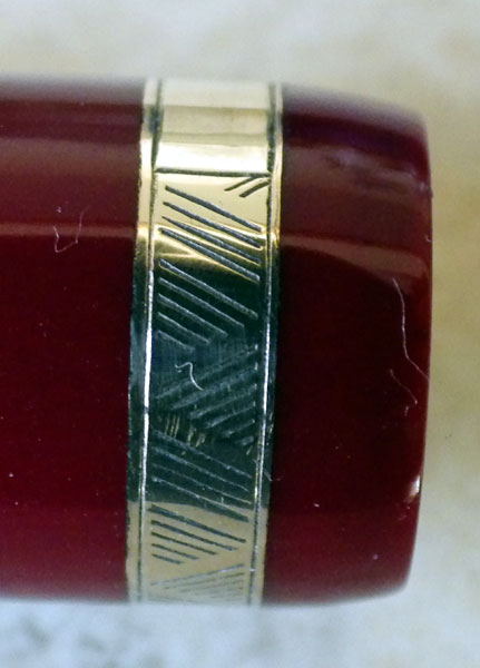
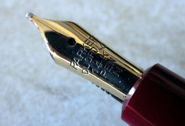
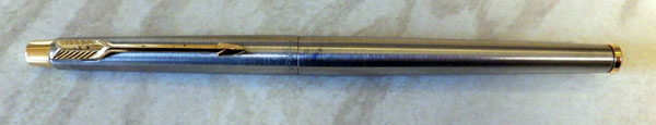
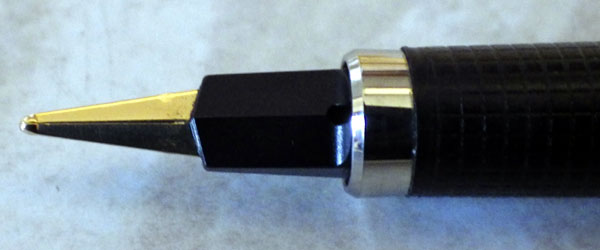
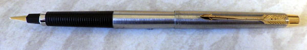
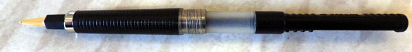
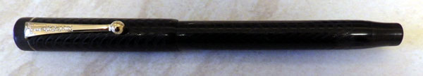
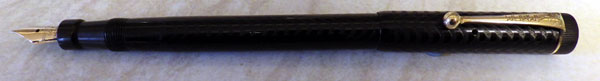
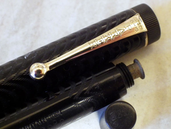
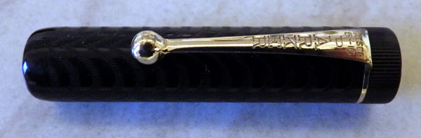
All that aside, here’s the story with the pen. It’s short at 115 mm capped. Parker Duofold is stamped on the barrel, off-centre towards the section. The aforesaid section is translucent. Was there ever a Duofold with a translucent section? It also has a Televisor-style multi-part pressure bar. I confess I cannot remember whether any of the Duofolds ever had that style of bar. The pattern is in the style of the earliest Newhaven Duofolds and Victories. The nib is imprinted, “Parker USA” and does not have the usual indication of 14K gold, though that is undoubtedly what it’s made from. I believe that the nib and feed are replacements.

The pen bears enough of a resemblance to the pens made for Parker by Valentine to be one of that production run and its size might indicate a “Lady” pen. I seem to remember that the USA Streamline Lady Duofolds were around that size. It’s the odd accoutrements that puzzle me. It might be that some part of this arises from replacement parts being fitted but that doesn’t really work as an explanation because the translucent section and compound pressure bar work together. A screw-in section could not be replaced by a friction-fit one without machining. In any case, a friction-fit section would be pushed out by a traditional bar.

What do you think?

Thoughts on English Duofolds

I sold an English Parker Duofold the other day.  What’s so special about that?  Well, the Aerometric and AF Duofolds just don’t sell that well.  It’s a strange thing.  An English Duofold, in terms of quality, is as good a pen as the best of the 50s Swans, and that’s real quality.  They don’t have any special problems.  The sacs in the aerometric ones seem to last forever and the AFs are very straightforward to repair should they need a new sac.  Some say they have a tendency to crack in the cap lip but I have handled lots of them and I can’t see that it’s a common problem.

They are perhaps a little bland to some eyes, but you could say the same thing about many self coloured modern pens which sell well enough.  The nibs are generally inflexible but again, most modern pens are the same.  The AF, in particular, has some nice features like the aluminium pushbutton and the better section.  The plastic that they are made from, which I understand to be a form of Perspex, readily takes a beautiful shine with just a rub of a polishing cloth

When new, these were quite expensive pens, associated mostly with doctors, lawyers and other professionals.  Now they go for buttons.  It’s a strange old pen world.

The Parker 25

Usually I like workhorse pens but the Parker 25 Flighter will have to be the exception that proves the rule golden.

In the 70s Parker thought they had spotted a niche in the market that needed filling: an inexpensive pen that would appeal to the 18 to 30 age group.  They engaged the services of Kenneth Grange, a successful industrial designer, already well known for such things as the Kodak Instamatic camera, Wilkinson Sword razors and the InterCity 125 high-speed train.
IMGP7818
His intention was to create a pen of functional simplicity, inexpensive to produce and well-nigh indestructible.  I think he probably succeeded on all counts but he also managed to make one of the uglier pens there is, especially when capped, showing the barrel that descends rapidly from one diameter to a smaller one.  It can be said that this ensures secure posting of the cap on the barrel, but that problem had been solved rather more elegantly many decades earlier.  Posted, it looks a little better, especially if you don’t look at that stubby piece of metal that passes for an nib.
IMGP7819
On the example I have, and probably on all the rest, the tipping material is almost spherical with the result that the line is exactly the same in all directions and tends towards a soft edge.  In its favour, it can be said that it writes reliably at all times.  After all with as simple a shell for an ink cartridge as this, there’s very little that can go wrong.

Priced low, it sold moderately well until it was discontinued in 1990.  Surprisingly, it has generated some interest among collectors.  The blue and black trim colours are the most common; rarer and more in demand are orange, green and the quite rare white.
IMGP7821
This is one of the few pens I cannot enjoy writing with.  The line is too vague and unvarying.  Grange’s design seems to have removed almost all the attributes that make a pen a pleasure to use and to look at – it has been reduced to a basic writing stick.

Parker 75 Thuya

IMGP7416

I’ve always wanted to get my hands on a Parker 75 but up to now I have never succeeded, mostly because the prices they fetched were a bit too steep for my pocket.  When I saw this beautiful lacquered example I was determined to have it and luckily it sold at not too wild a price.
IMGP7418
It has always seemed to me to be the most beautiful of all the Parkers, whether it was in the cisele pattern or this beautiful Thuya.  This one is French made and is part of the lacquer series which dates the pen to the period from 1981 until it went out of production in 1994.
IMGP7422
The lacquer on this pen gives the impression of great depth and in a sense that’s right because these lacquer finishes were worked up layer upon layer.  The metalwork fits right in with the finish and the gold trim has lasted well as it remains perfect.
IMGP7420
The cap and barrel are made of metal – probably brass – but the pen isn’t really heavy.  The cap slides over the section smoothly and closes the pen with a satisfying click.  It’s completely firm and requires a noticeable effort to remove the cap again.  The pen is a cartridge/converter filler, of course, and it takes several turns to remove the barrel.  This one has a squeeze-type converter fitted and it takes a good fill of ink.  It posts securely and, for me, feels absolutely right in the hand.  The sculpted section indicates where your fingers should go and provides a secure, non-slippery grip.  The very handsome gold nib – in this case a broad one – is as smooth as silk.
IMGP7424
This was an expensive pen when it was new and 75s continue to fetch a high price when they appear.  I would say that unlike many another high-priced pen, this one has always been extremely good value for money.  It’s a pinnacle of pen-making.

Lapis Lazuli Duofold Streamline

Months go by without a lapis lazuli pen, then I get two!  This second one is a real beauty, a streamline Duofold.  Forgive the flash photos; time is pressing today.
IMGP6265
As if the glorious colour is not enough, how about this nib?  You don’t get many oblique stubs in a pound of Duofolds.
IMGP6269
What more needs to be said?  The pen says it all.
IMGP6267
Talking of beautiful colourful things, this pair of goldfinches honoured my bird feeder today.
IMGP6247
And here’s my assistant, busy as always.

IMGP3882

The British Parker Duofold Aerometric

IMGP5424

Throughout the fifties, there can be little doubt that the Duofold Aerometric was the most popular pen in Britain.  Hardly surprising, given its high quality.  The aerometric system made for easy, clean filling and the streamlined shape was not only satisfying in itself; it was influential right up to the present day.

IMGP5440

The beautifully cast arrow clip with its cowling and “jewel” sets off the cap perfectly.

IMGP5441

The chevrons make the cap ring instantly recognisable.

IMGP5436

Duofold nibs are usually inflexible – the time of the flexible nib had finally passed by, even in Britain – but they are reliable and the pen writes every time.  If British Duofolds have a fault, it is that the material they are made from is a little soft and the barrel imprint is often faint or missing.  A perceived fault these days is that they are bland.  Perhaps, and perhaps what is seen by some as blandness is just classic perfection.  Pared down to the essentials, with the only decoration being in the gold-filled trim, the modern eye isn’t always suited to such understatement.

These are great pens.  Everyone should have one.  The Fifties Duofold is the baseline against which you judge everything else.
IMGP5422
This one (in case you hadn’t noticed) is red – the deep red of fresh blood.  For me, this is the best Duofold.

The rest of today, for me, will be pen restoration.  My assistant says she will lend a paw.  Or two.

IMGP5450

Mea Culpa!

I’ve had a couple of people kindly inform me that the last pen I wrote about is not a Parker 180 but a rather later Parker Classic.  This only goes to show that I can get things wrong too!  In fact, I get things wrong quite often, but my trusty readership usually sets me on the correct path, for which I’m duly thankful.

As people search these pages for information on pens they’re interested in, I think the best thing to do is go back and completely edit the article.  Otherwise I’m going to be unintentionally misinforming people.  But I’ll do it tomorrow, because now I’m going to go and put my feet up and watch a movie.

The Parker Classic

IMGP5069

It may be a slight eccentricity, but I like the Parker Classic.  I like all those pens that show an edge of experimentation, especially where nibs and feeds are concerned, and there can be little doubt that the Cl;assic was an experiment – one that succeeded rather well, especially from a marketing point of view.  The rather space-age nib/feed/section unit caught the eye of buyers and the pen was surprisingly popular.  It came in a wide variety of finishes, some quite expensive.  This rather more humble brushed steel Flighter GT was introduced in 1993.
IMGP5075
The nib is almost flat, having only the very slightest curve that you see on normal pens.  Part of Parker’s idea was to make a very robust nib, as writers used to ballpoints were bending fountain pen nibs left, right and centre.  It’s quite effective, I think.  They seem to have survived in quite large numbers, anyway.
IMGP5072
The Classic is the successor to the Parker 180 and there are considerable similarities both in the shape of the nib and in the style of the pen as a whole.
IMGP5074
The Classic Flighter GT went out of production in 1994 and this pen appears to have worn quite well through the intervening years.  The gold plating does have a spot or two of wear but otherwise the pen is in very good condition.  It has the Parker syringe type of converter.  All in all, I like this odd pen with its radical nib.


Black Hard Rubber Parker Lucky Curve

IMGP4750

IMGP4753

This is a pre-Duofold Lucky Curve button-filler.  I can’t identify or date it more precisely because I’m not well up on American and, as in this case, Canadian pens.  Suffice to say that it’s a handsome old pen and this one is in exceptionally good condition, still shiny and black with little wear on the engine-turned pattern and the imprint. Oh, and it has 222 on the end of the barrel but I haven’t a clue what that signifies.
IMGP4761
As with many button fillers someone had taken the old sac out and while they were there, they had taken the time to throw the pressure bar away.  Of course it might have been that the pressure bar was rusted or broken, but it happens so often that I suspect a conspiracy.  There are some bad, nihilistic groups out there you know.  I can just see them now, cackling fiendishly as they throw yet another precious long pressure bar into the waste-paper bin.  As luck would have it I had a long pressure bar in stock and was able to fit it and bring this fine old pen back into working condition.  Foiled, you filthy throwers-away of pressure bars!  You will never win!
IMGP4760
This pen is a Lucky Curve in name only, as like so many of this type, the feed has been cropped, by a former repairer, I assume.  I see the odd complete Lucky Curve, but not many.  However, it doesn’t seem to have affected the pen adversely.  It writes well with just a hint of flex and it sits well in the hand.  It’s a slender pen, but not as slender as some of the earlier eyedroppers.  I could live quite well with this pen.
IMGP4756
If any of you have more information about this fine old Parker, please don’t hesitate to enlighten me.  I confess myself in need of education where pens from the other side of the Atlantic are concerned

Three Green Demis

IMGP3001

There are one or two interesting things about the green Demi.  One is that none of my cameras (and I’ve had a few) could ever capture a green Demi in its true colour which is British Racing Green, near enough.  It always comes out somewhat bluer than that, often almost teal, which is most misleading.

The other great mystery is why a huge majority of a Demis are green.  You see the very occasional black or blue one, hardly ever a red, but the glorious greens are everywhere.  Why’s that then?  Was it a thing in the fifties?  Something everyone knew about, never spoke about and absolutely never wrote down?  Was it something proud mothers instructed their debutante daughters in, very quietly, “Never appear too intelligent, dahling.  Men can’t stand brainy women.  Make sure you always have a spare handkerchief for emergencies.  Oh, and keep a Parker Demi in your purse.  Green, mind.  Never black, red or blue.  They so non-U, dear.”

Or maybe it was a recognition thing.  Bond casually opens his jacket to show the green Demi clipped to his inside pocket (none of that geeky pens-in-the-handkerchief pocket for Bond).  With a scarcely perceptible nod his contact hands over the valise containing the blueprints to the latest Soviet super-reactor.

There’s a lot of green Demis around, anyway.  And I like them.  Very much.