Usually I like workhorse pens but the Parker 25 Flighter will have to be the exception that proves the rule golden.
In the 70s Parker thought they had spotted a niche in the market that needed filling: an inexpensive pen that would appeal to the 18 to 30 age group. They engaged the services of Kenneth Grange, a successful industrial designer, already well known for such things as the Kodak Instamatic camera, Wilkinson Sword razors and the InterCity 125 high-speed train.
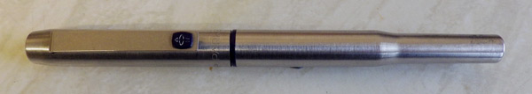
His intention was to create a pen of functional simplicity, inexpensive to produce and well-nigh indestructible. I think he probably succeeded on all counts but he also managed to make one of the uglier pens there is, especially when capped, showing the barrel that descends rapidly from one diameter to a smaller one. It can be said that this ensures secure posting of the cap on the barrel, but that problem had been solved rather more elegantly many decades earlier. Posted, it looks a little better, especially if you don’t look at that stubby piece of metal that passes for an nib.
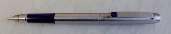
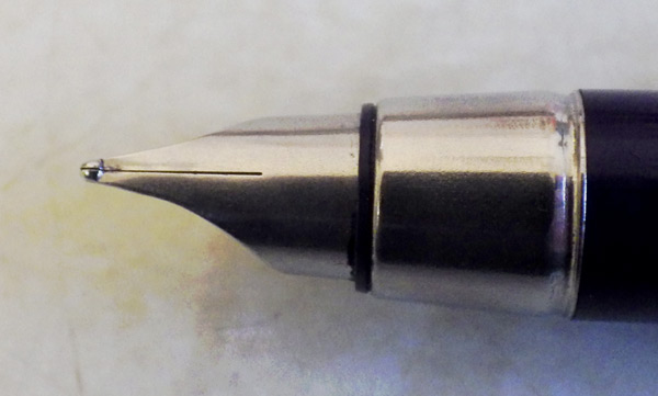
On the example I have, and probably on all the rest, the tipping material is almost spherical with the result that the line is exactly the same in all directions and tends towards a soft edge. In its favour, it can be said that it writes reliably at all times. After all with as simple a shell for an ink cartridge as this, there’s very little that can go wrong.
Priced low, it sold moderately well until it was discontinued in 1990. Surprisingly, it has generated some interest among collectors. The blue and black trim colours are the most common; rarer and more in demand are orange, green and the quite rare white.
This is one of the few pens I cannot enjoy writing with. The line is too vague and unvarying. Grange’s design seems to have removed almost all the attributes that make a pen a pleasure to use and to look at – it has been reduced to a basic writing stick.

An excellent last paragraph, Deb and sums up perfectly, fountain pen mania – at least from the writing point of view, which I suppose should be the priority – but sadly (for me anyway) this is not the case nearly often enough.
However I should say that I was deeply shocked and disappointed when I received the Swan 242/52 and found that I now owned an expensive “writing stick”! Fortunately the nib responded to some expert grinding and now has some character. Perhaps the 25 would benefit from such aggression?
The only thing that would improve the Parker 25 would be a trip to the landfill.
Thank you for sharing…it’s a fascinatingly unappealing pen.
Strangely unappealing indeed! But there are collectors of these pens. I’ve seen them proudly displayed in the pen discussion boards.
Another excellent review. I was fortunate that when I passed my school exams aged 16, my dad bought me a maroon Parker 61 with a gold plated nib. My brother, 7 years younger, received a Parker 25. I think I got the best deal although I wish he still had the 25, I could add it to my collection.
Yes, you dodged a bullet there! The 61 is a fine pen indeed and it’s hard to imagine that these two pens came from the same company.
I had one or two 25s in the early 1980s; these pens were the reason for my low esteem for Parker pens in general. In the last few years, I have bought some nice vintage Parkers, and I have completely reversed my opinion of Parker (except, of course, for the 25).
Yes, the 25 really was the nadir of Parker’s pens. Bringing in an outside designer with no background in fountain pens sometimes works and brings freshness of approach to the design. Other times, it must be said, it’s a disaster, and this is one of those occasions.
I have to say that I rather like the Parker 25, but then it takes all sorts I suppose. It is very much of its age. The one I have doesn’t use cartidges.
Does that mean that it has a converter? I, personally, didn’t care for the Parker 25 but obviously many other people did as it sold in big numbers.
It has a squeezy metal thing each side of a black ink sac. I’m afraid I don’t know the correct term. It might come out as it certainly rotates.
Yes, that sounds like a Parker converter.
Thank you for the information. The pen was found in an old desk along with a Platignum cartridge pen and a handful of cartridges, one of them Platignum and the other two unnamed but all in a Platignum box. Looking at the WH Smith website, the two unknown cartridges look like Parker so presumably I can pull out the ink sac assembly, when empty, and fit a cartridge.
I’m just getting into using a fountain pen again after having my old Conway Stewart 27 repaired, and I have to say using these pens is a joy after years of ballpoints and even roller balls.
You’re welcome. I hope you continue to enjoy your fountain pens.
One of those saw me through my education from age 11 or so onwards. I feel a little nostalgic seeing it, but wouldn’t want to write with one again. Your highly accurate assessment made for an enjoyable read as usual, Deb.
I feel a little guilty for being quite as hard on the Parker 25 as I was. I think I was influenced by the act that there was a while there when Parker turned out a succession of damn bad pens.
Ah well,1970’s design is not to everyone’s taste! I have a lovely metallic red Sparklets soda siphon in full working order with all the bits and cartridges that lives in the cupboard as my wife can’t stand it….
I’ve had a fun hour this afternoon comparing various pens (I even tried a couple of old dip pens) and I have to say the Conway Stewart 27 is the smoothest, the Parker 25 is next followed by modern 0.7mm roller balls. I’ve also enjoyed using the fountain pens for notetaking and meetings this last week. I’m not sure they are suitable for use in the field i.e outdoors, as much as a good modern roller ball.
The paper seems to make a big difference too.
The older fountain pens that feature on this blog really are beautiful and what is interesting is that many of them would have been affordable and used for many years. Now we just have pens that are disposed of and lack much of the beauty.
I found lots of information about Parker 25’s at this website http://www.moreengineering.co.uk/parker-pen/4582690612
That’s an excellent site!
I found this site after discovering my old collection of 25s from my school days. I love the bullet-style design; minimalist and sleek. They’re still in good condition, but I changed the nib. It’s back in use now as my main pen, and its as nice to use now as it was then. (I don’t like thick pens, never have, like writing with a tree trunk although I’m no pen “bien pensant” if you’ll pardon the pun…)
Though it does not appeal to me, I have found that the 25 is well-liked and of course it is thoroughly reliable. I think there must be a happy medium in pen thickness; I am unhappy with most very thin 80s/90s pens because of arthritis but some modern pens are altogether too large and appear ridiculous. A 20s Duofold or Swan SF230 is comfortable for me to write all day.