The Chatelaine

IMGP4310

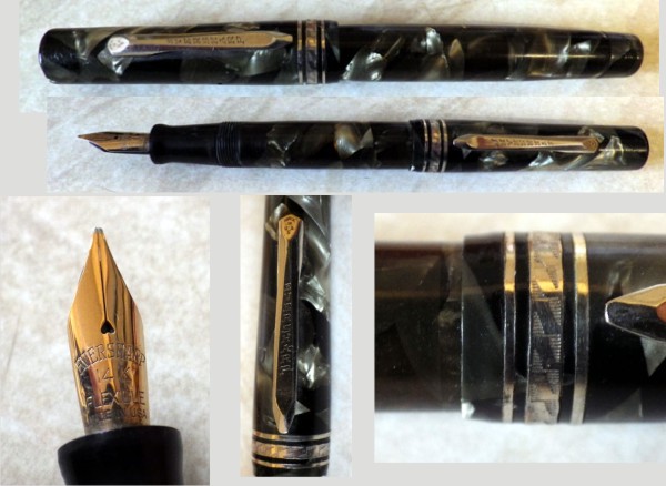
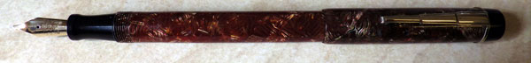
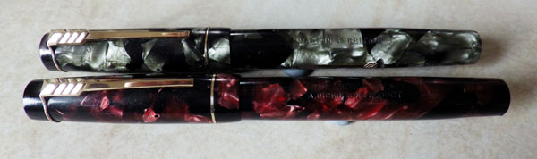
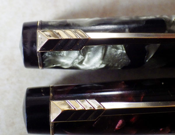
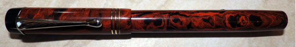
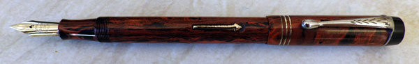
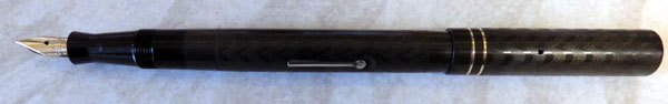
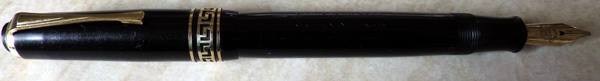
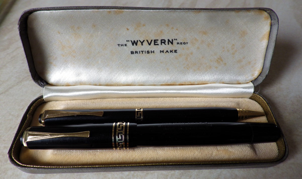
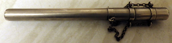
This is a chatelaine.  No, not a chatelaine pen; it’s a receptacle that you put your pen in.  Does that seem a little redundant to you?  It did for me, at first, then I had a bit of a think about it.  The later ringtops, the ones with a screw on cap, they were more or less all right, though I believe it was not entirely unknown for them to unscrew themselves in a treacherous way, allowing the delicate pen to fall to the flagstone floor.  Like cats which always land on their paws, pens dropped on a hard surface mostly manage to twist themselves into the nib-down position.  If they were liable to self-destruction, so much more so must the cone-cap pens of an earlier time have been.  I’d be amazed if any of them lasted the week.  Swan turned out a few with a bayonet-type cap fitting, but they didn’t seem to catch on to any great degree.  All this does make the chatelaine look more practical, if a bit tiring.  Pull the cap off the chatelaine, take the pen out.  Pull the cap off the pen, post it on the back of the pen.  Write note.  Take cap off back of pen, slide it back onto the front.  Put pen in chatelaine.  Put cap back on chatelaine.  Do that a couple of times and I’d be done for the day.  Makes the pencil behind the ear seem more of a practical solution…
IMGP4311
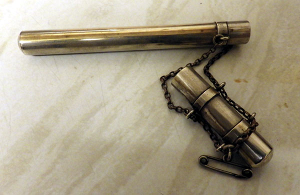
Though it’s made from some base metal it’s quite a stylish and well made thing.  Quite plain, though the equally spaced bands with the attachments for the chain give it dignity.  I confess to being quite taken with it.  If you have to hang something off your clothing for writing purposes, this might as well be it.  It could be quite versatile, too.  You could stir your tea with it or if any person in the company was becoming irritating you could use it poke them in the eye.

I’m sure they had great fun with all their accoutrements back in those Edwardian times.

A Macniven & Cameron Advertising Fob

IMGP3807

This little disc has been in my desk drawer for years.  I’ve always had an interest in all things Macniven & Cameron and I must have snapped it up either from eBay or a junk shop.  It’s a watch fob, I suppose, and it appears to commemorate George IV.  It certainly wasn’t made  during his lifetime, or even as a mark of his passing.  Though the origins of the firm lie sixty years earlier it was not called Macniven & Cameron until 1840, by which time King George had been dead for a decade.

Why would Macniven & Cameron wish to associate themselves with Britain’s most unpopular monarch?  The answer lies in George IV’s visit to Edinburgh in 1822.  Sir Walter Scott managed the occasion and turned it into a pageant of tartan and misty Celticism.  We may regret its effects a little now, but in its day it was welcomed as it made Scotland the fashionable place to visit.  As a result George may have been remembered a touch more fondly in Scotland than he was in the rest of Great Britain.  Scott, of course, is the author of the Waverley Novels after which the famous nib is named.  It’s worth adding that with their headquarters in Edinburgh’s Blair Street Macniven & Cameron overlooked the district of Waverley or were perhaps a part of it.
IMGP3810
On the back there is a list of pens: Waverley, Nile, Pickwick, Owl and Hindoo.  These names relate to dip nibs – then called “pens”- rather than the later fountain pens which reused some of these names.  Waverely we have already discussed, what of the Nile nib?  After the expulsion of the French from Egypt and their replacement by the British at the end of the eighteenth century, all things Egyptian became fashionable for the first half of the nineteenth century.  Doubtless this nib was first manufactured during that period and the name was chosen as a favourable association in the public’s mind.  It may also suggest that the nib was suitable for use by the colonial civil service in Egypt.

Pickwick takes us back to literary allusions; this time to the Dickens novel which was published in 1836.  The Owl has a couple of possibilities.  The owl is seen as wise because of its association with Athena, goddess of wisdom*.  Perhaps one would write wisely with an Owl nib.  On the other hand, it may be another literary association, this time with Lear’s The Owl and The Pussycat of 1871, though that seems a little late.

“Hindoo” is, of course, an archaic spelling of Hindu which may even be regarded a derogatory nowadays but was probably without such a value in the nineteenth century when this nib was made.  It’s probably nothing more or less than an attempt to break into the immense Indian Civil Service market.  It was doubtless successful.

Does any of that help us to date the object?  Not really.  There’s too much ambiguity.  If the Owl nib related to Lear’s poem the fob could not have been made before 1871 but the Athena explanation gives no guide.  I suspect that it may be quite late, but still within the period when sales of dip nibs formed the majority of the company’s balance sheet.  How about the centenary of George IV’s ascension to the throne, which would been 1920?  Your guess is as good as mine.

*My husband kept a pet owl when he was a boy.  He assures me that an owl is dumber than a log.

Another Candy Striped Kingswood

IMGP3640

I’ve written about these hatched?  candy striped? Kingswoods before but they’re charming pens and always worth another look.  For anyone who has seen Valentines of the same period there can be no doubt who made the Kingswoods.  Strangely, though, while the Valentines tend to delaminate or crack if you give them a harsh look, the Kingswoods seem more robust.  Or at least that’s my experience.
IMGP3645
This one began life the colour of its cap and a decomposing sac changed the barrel.  However, as faded pens go, this one is quite beautiful.  When you think of the muddy colour that faded jade is reduced to, this doesn’t seem too bad at all.

Eversharp Kingswoods are long overdue a re-evaluation.  They’re sturdy pens, often colourful, with great nibs.  The company’s British presence is obviously overshadowed by its American parent but Eversharp and Eversharp Kingswood pens were produced here for forty years and form a part of British fountain pen history.

The Dickinson Croxley

IMGP3407

As you will see from my earlier speculations in this blog, it took a long while before I was able to get an overall picture of the Dickinson’s Croxley range of pens.  Indeed, it was only when Stephen Hull’s The English Fountain Pen Industry 1875 – 1975 came out that the mystery was fully solved.  In a way, this substituted one mystery for another.  Why, one must ask, did Dickinson discontinue production of the Croxley after such a short time when the level of sales must have been gratifyingly high.  Considering that the company was in business for only a couple of years, the number of Croxleys around is phenomenal.
IMGP3408
The earliest Croxley I have seen was a very plain pen with a smooth ball-ended clip and an unexceptional lever.  The next model is the one we’re all familiar with, with its angular stylised arrow-shaped clip and lever.  This model remained in production until the end of the company though the pen was constantly modified.  You’ll notice that the grey Croxley has a much shallower clip screw than the red one, which I believe to be earlier.  The length of these clip screws which also form the inner cap varies considerably too.  A streamlined pen and one with a silver cap were introduced in 1948.

Considering the huge number of Croxleys that had been sold, it is difficult to understand the decision to cease production but it was brought to an end in mid-1949.  It has been suggested that Dickinson chose to kill the Croxley off because it had a dated filling system and no replacement system was available.  The “dated” filling system doesn’t seem to have affected sales in the previous two years.  In any case, does any system that successfully fills a pen with ink ever become dated, except, perhaps, in the eyes of the advertising man who wants to sell you his latest gimcrack novelty?

A Twenties Wyvern No 60N

Wyvern, despite the great many pens they made in a variety of models, is poorly represented in the literature and on line.  Yes, Lambrou provides a potted history and Hull covers it in much more detail, but where does one go to find illustrations of the many different models?
IMGP3389
This, for future reference, is a Wyvern 60N.  It closely resembles some other models of that mid-twenties period.  I’ve seen an unnamed button filler in this rich mottled hard rubber, differing in the filling system and the addition of medium bands at the top and lip of the cap.  Another has an inserted clip and no black clip screw.
IMGP3391
The red and black hard rubber is exceptionally richly coloured and shows no sign of fading in its 90 or so years.  The pen is quite big.  At 13.7cm it’s slightly bigger than the Waterman 52.  The warranted nib is large too, around a No 4 size.  I don’t know what the “N” designation means.  It occurs to me that I don’t know what the more common “C” stands for either.  These No 60 pens first appeared in 1921 and continued to be issued with changes, some minor, others major, for the life of the company.

IMGP3395The toothed feed is typical of its time and does an admirable job of getting ink to the nib.
IMGP3390
Though it fits perfectly and was once gold-plated to match the lever and cap rings, I’ve never seen this clip on any other Wyvern and I suspect that it may be a replacement.  In terms of quality, I think it has to be said that this is a better pen than any of the post-war ones I’ve handled.

The Starling Pen

Don Powell, who lives w-a-a-a-a-y over yonder in Oregon told me about this interesting pen that he had.  I say “had” because he has very kindly given it to me.  ‘Twas a very pleasant surprise when it arrived in the post yesterday.
IMGP3387
It’s the English-made black chased hard rubber Starling pen.  The first thing I noticed about it was that the proportions – barrel length to cap – look a little unusual.  Second thing was how beautifully flush with the cap those slender cap rings are.  It looks very neat.  The third thing was the very sculpted section.  It’s clearly not one of those made-by-the-thousands cheap pens that mostly appear as advertising for non-fountain pen companies.  No, this is a very well made pen.  I can find nothing about it online or in any of my reference books.  My guess – and I emphasise that it is only a guess – is that the Starling was made by one of the many small companies that didn’t make it, not even to the extent of having their name noted somewhere.
IMGP3382
Without going into too much detail, it has been suggested Elsewhere that this pen was part of the Mabie Todd range.  It was assigned to that maker, it seems, purely because Starling is a bird name.  So, for that matter are Eagle and Pelikan but those pens were not made by Mabie Todd any more than this one was.  Mabie Todd’s name is imprinted on all of the pens that form part of their range.  Those pens that they did make in Britain, the Swans, Blackbirds and Jackdaws have an unmistakable resemblance to each other.  The Starling bears no resemblance to those pens and, in fact, doesn’t look much like any other English pen of the period that I can think of.
IMGP3381
It might have been called “The Starling” in emulation of Mabie Todd’s naming policy, in an attempt to cash in on that manufacturer’s popularity, though the fact that no effort was made to make the Starling look like one of those pens argues against this theory.  Equally likely is that this is another example of the association of pens with birds, which comes naturally after hundreds of years of writing with bird feathers.  Not starling ones, so far as I am aware, but the association is strong and was picked up by many manufacturers both in words and symbols.  The flight feathers of the arrow clips of Stephens, Croxley and Parker come to mind.

So this very attractive Starling (it writes well too) remains a mystery.  Unless, of course, you’re going to come along and tell me you have another and you know all about its manufacture!

The Pepys Pen

IMGP3372

This fine old fellow arrived today.  As you might see (excuse hasty photos) it’s the Pepys Pen.  Clearly, this was a pen that belonged to none other than the great diarist Samuel Pepys, and it is remarked upon in an entry for 15 March 1662:

15th. With Sir G. Carteret and both the Sir Williams at Whitehall to wait on the Duke in his chamber, which we did about getting money for the Navy and other things. So back again to the office all the morning. Thence to the Exchange to hire a ship for the Maderas, but could get none. Then home to dinner, and Sir G. Carteret and I all the afternoon by ourselves upon business in the office till late at night. So to write letters and home to bed. My work made more pleasant and speedy by my new pen which has a reservoir of ink within, and needs not a dip in three pages.
IMGP3374
No, no!  I jest.  That would be too great an anachronism to run, I’m afraid.  Rather, someone chose the name “Pepys” because the great man was known for writing.  It’s a tidy pen in nice, bright mottled hard rubber.  I can find no reference to it but there’s something familiar about it.  The lever with a recessed end and the nib that says no more than 14ct are both familiar from somewhere else.  It will come to me in time.

The New Bond Easiflow

The New Bond Easiflow doesn’t have a following among collectors.  Mostly this is because it was sold by F. W. Woolworth and Co and is taken to be cheap and shoddy.  So far as the earlier ones, those made by Langs are concerned, it’s quite untrue.  Cheap, in the sense of being aimed at a sector of the market that didn’t have much to spend, they certainly were, but they were well-made gold nib pens.
IMGP3005
This later version might fit the description better, though “cheap and cheerful” would be even more accurate.  The pen is a standard lever filler.  The silver and black plastic is rather appealing.  The nib is of the plated folded-tip type.  It writes surprisingly well.  The plating on the trim is holding up, except on the lever which is nearly back to the base metal.  I expect that the manufacturer applied no more than a colour wash.  All the plating will go with use in a quite short period.   The three-coloured box is attractive, with a stylised drawing of a pen writing the word “Easiflow”.
IMGP3003
When Langs closed their doors for good, Woolworth would have had to go looking for another pen manufacturer to turn out their New Bonds for them.  Purely because I’ve seen them use this plastic for some of their own pens, I think Mentmore/Platignum got the job.IMGP3014

I think the day will come for pens like this, and it may not be very far away.  The prices for the “good” pens have gone through the roof in recent times, with the result that there is more interest in the lower orders of gold-nibbed pens like Nova, Unique and Kingswood.  How long before the previously-ignored school pens like the Osmiroid, the Platignum and the New Bond become rehabilitated in the eyes of collectors?
IMGP3006
For most school children, pens like these were their first, and for some years their only experience of writing with a fountain pen.  Some, of course, were unlucky enough to get the very worst of the Platignums, Queensways and Universals and may have been put off permanently, accepting the ubiquitous ballpoint with glad cries of joy.  Others, my husband among them, wrote with pens like this, liked them and moved on to better things as soon as the budget allowed.

On a different note, has anyone any clue as to who made the nineteen-teens/twenties BCHR lever fill pen called “The Starling”.  And no, it wasn’t a sub-brand of Mabie Todd.

Wyvern No 60C/38 Pen & Pencil Set

Wyvern produced 60Cs over a long period and they’re not all the same.  Some are slender pens with not much in the way of trim, others are thicker and more opulent.
IMGP2986
This one’s quite a large, thick pen and the Greek Key band sets it above the run-of-the-mill pens of the time.  The time, I would guess, is about 1948, going by the clip, and I expect that this pen and pencil set in their hard case would have been quite pricey.  60Cs are usually lever fillers but this one’s a button filler.

Strangely, Wyvern’s Leicester Dragon emblem is nowhere to be seen – not on the barrel, the nib, the box or the instructional papers.  Perhaps Wyvern was going for a clean, uncluttered look.  The large nib is warranted and broad.

The pencil is a Wyvern No 37 and its trim echoes that of the pen.  It has lead and works well.
IMGP2982
This is a good set, tastefully presented, and it shows that soon after the war, Wyvern was more than holding its own.  Indeed, judging by the number of post-war Wyverns I see, I think they must have been doing rather well until the ballpoint came along and dealt a killer blow to fountain pen production by this company, like many others.