Months will go by when I don’t see a Wyvern, then I get two on the same day, beauties both of them.
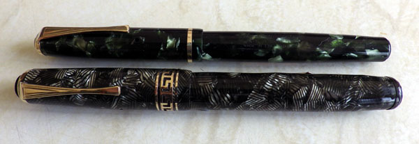
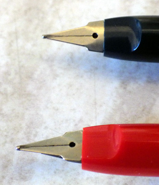
The No 60C is a bit of a puzzle. It appears with different levels of trim and, indeed, as a completely different pen from this one, more slender and cheaper-looking. This version, with its Greek Key cap ring and cowled clip is doubtless quite high in the range and probably post-war.
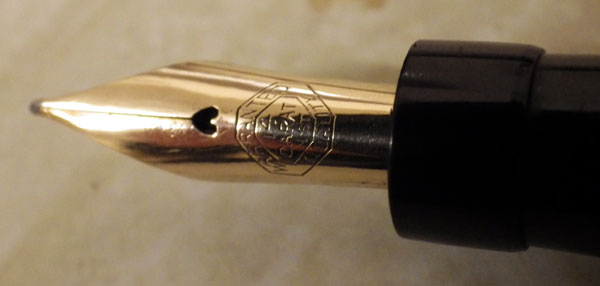
The 404 is definitely post-war. The best dates I can find for it are 1948 to 1956, when pen sales came to an end. The hooded nib hints at the Parker 51, though in fact it’s a perfectly traditional nib, not a tubular type as was featured in the Parker. Indeed, though it looks a little more modern than the No 60C it’s made in exactly the same way. There’s no collector in hiding beneath the hood, just an everyday feed.
What makes this 404 especially interesting is the broad nib. You don’t get many of them!
Less Common Pens
Omas Limited Edition Phoenix Plated Fountain Pen With Diamonds
Have you seen this $48,000 Omas pen? It’s reduced from $60,000 so I suppose that makes it a bargain.
$48,000! Google tells me that’s £28,742.50. That’s a lot of money when you can buy a perfectly good Pilot V-Pen for £7.76. I could buy a really snazzy car for that or, more to the point, a whole stable of hot motorbikes. Or even enough used pens to fill my workshop to the roof. I’d have them but I couldn’t work on them because I couldn’t get in.
Beauty is in the eye of the beholder, they say, but for me that’s one very ugly pen. It’s bulbous, the colours are garish and the clip looks like the handle of a teapot. In the sales-speak blurb they say “The highly original clip is inspired by movement and harmony.” Yeah? Well so’s my dog’s hind leg, the one he lifts at every lamp-post.
There are some comments on the page that are highly amusing.
Is this kind of thing good for our hobby or does it expose it to ridicule? What do you think?
The FPR Triveni Acrylic
The only Indian pens I’ve had have been two Walitys, a medium-sized piston-filler (good) and a large eyedropper filler (dreadful), so I thought I might try something else from there as the pens are so inexpensive. After looking through the plethora of pens available I settled on Fountain Pen Revolution and and chose their Triveni Acrylic. According to the blurb: “The Triveni Sangam is a confluence of 3 rivers in India. The handmade Triveni accepts 3 fill methods (converter, eyedropper, cartridge).” That makes sense. The pen cost me the princely sum of $45 (around £28 – £29). It arrived this morning. First impressions: it’s very long at 14.7cm. The red and black acrylic is translucent and very beautiful. The black tassie and blind cap set it off very well. (These serve no purpose other than the aesthetic) The fine nib is a nail. The pen takes two and a half turns to close, which feels like a lot. The chrome-plated metalwork is good.
The syringe-type converter takes up a mere two-thirds of the barrel length, so the excessive length seems to be catering to modern tastes rather than serving a practical purpose. The pen would be much better if it was 2cm shorter. Thankfully Indian manufacturers seem to work honestly with their materials, unlike the Chinese who often bury lumps of brass pipe in their pens. This pen, then, is the combination of the acrylic and a little thin metal, so it’s very light indeed, perhaps even at the lower end of acceptably light even for me, and that’s saying something. The section is black plastic at the top. That’s where I’d grip it and it feels comfortable. Further down it’s metal. Aesthetically, that seems like a mistake and I’ve known metal sections to corrode severely when in contact with ink. The nib seems well enough made but it is noticeably scratchy. I think that’s a function of the shape of the tip which is quite angular. A spell on the micro-mesh may well cure that. However, as I said above, the nib is an absolute nail. I’m inclined to feel that with a nib like that, this is the pen for the person who wants no more from a fountain pen than he gets from a ballpoint.
Another thing about this part of the pen: though this is a normal-sized nib, similar to a Swan No 2 in size, the excessive length of the barrel makes it appear very small and out of proportion with the rest of the pen. If the pen is to be so very large, a bigger nib would look better. The feed appears to work well but I haven’t used the pen enough to be sure.
I’ve been critical of those things about the pen that I don’t like, but overall this is a well-made pen. All the parts fit together perfectly with a much finer tolerance than I’ve seen on much more expensive pens. For instance, if the Sheaffer Intrigue of less than fond memory had fitted together as well as this pen, it wouldn’t have turned out nearly the bow-wow that it, sadly, is. With some nib work it will probably be more pleasant to write with and I believe that FPR supply a flexible nib, which might be the way to go. I can’t see this pen becoming one of my users, but I bet there are plenty of modern pen buyers out there who would find it impressive for the small amount of money it costs. Finally, almost anything could be forgiven because of that delightful acrylic. It looks good in blue or orange as well.
Handwriting
Since my far-off college days I’ve been a keyboard kid, both for work and for leisure, though when I write I do it with a fountain pen. Given that most things I write go into a word processor or a spreadsheet, is handwriting still necessary for me? The answer is emphatically “yes”. I’ve never been able to make use of those computer note-taking programs or screen sticky-notes. They just seem like a lot of work for something I can do in a more straightforward way – pick up a pen and take a note! There’s always an A4 tablet – ruled or plain, whatever’s cheapest – by my keyboard, and a page may last a day. I can’t work, indeed I can’t think without taking notes.
Then there’s lists – “to do” lists, lists of pens to be uploaded, lists of pens I’m watching in eBay today; they’re all done with pen on paper. I know that clever people have created software programs to handle your “to do” lists but they’re wasted on me. Then there’s correspondence: all correspondence with pen people is done with a fountain pen. It would be a bit weird not to. One thing I seem to have less call for these days is invitations and place settings, which gave me a chance to play with my flexy pens. It’s about time someone was getting married!
A few years ago I spent some time educating a teenager in the use of his computer. He was a very smart kid and didn’t require all that much of my time, but one thing I noticed: he had a pad at the side of his keyboard and took notes as he went along. Admittedly, he was using a ballpoint and his writing was like a drunken hen staggering in the snow, but he was handwriting. Perhaps all these scare stories we hear about school children being unable to write are not entirely true, or not true everywhere. I suspect that handwriting will survive.
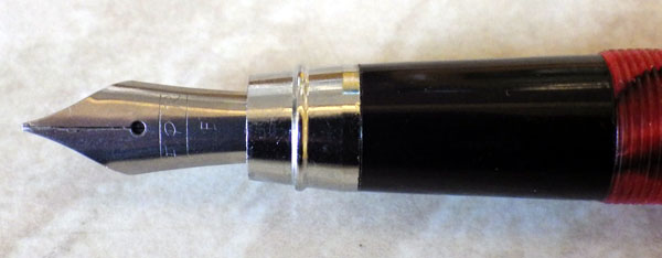
A Copper And Brown Marbled Kingswood
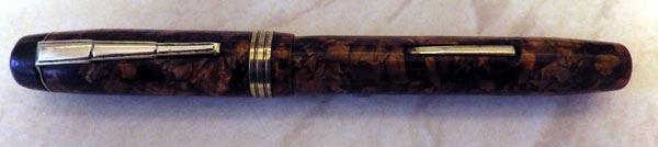
At 12cms capped, this is a shorter than average Kingswood.
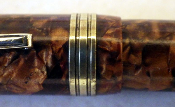
It’s also unusual in that it has a single broad cap ring giving the appearance of a narrow/medium/narrow set of rings, something I have occasionally seen elsewhere but not, to my recollection, on a Kingswood. Posted, it’s a respectable 15cms so it isn’t so short as to be uncomfortable in the hand. The plating has just about gone from the trim, but that’s usual with these pens. The rich copper and brown marbled celluloid more than makes up for it.
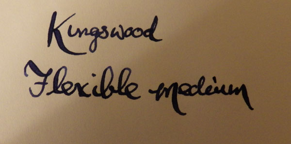
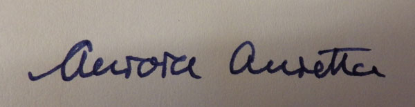
This pen doesn’t have the usual Eversharp nib but a warranted 14ct nib which may or may not be a replacement. In any case, it’s a superb nib as the writing sample above shows.
My guess would be that this pen is a product of the Langs factory. It’s a lovely pen, in appearance as in the pleasure of writing with it.
Aurora Auretta
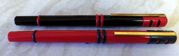
I only bought these because they are stylish in a sixties sort of way, and so that I could say I own a couple of Auroras. Accepted, they’re not quite the the three thousand-odd quid creations of today, but all the same…
These are inexpensive cartridge pens aimed at the school market. There have been many Aurettas over the years, all rather different from each other. I’m not sure when the version I have was made – it looks like sixties styling but I’ve seen it dated to the eighties. Either way, it makes a memorable pen. The attachment of the clip to the cap reminds one of the accommodation clips of the early twentieth century.
 The nib is quit unlike any other, though it has the nearly flat profile of the Parker 180 or Classic. The colours are bright and strongly contrasting. Adults who manufacture things often assume that bright, contrasting colours will attract young people, but I’m by no means sure that that is true. It’s more than a little condescending. We know that babies appreciate bright colours but by time that they’re in high school they might well want to put that behind them and go for something more subtle. But who am I to criticise corporate designers? Actually, I like the colour schemes very much, but then I’m just a little kid at heart.
They’re eye-catching, comfortable to write with, cheap and that strange nib writes well. I approve!
Today’s Uploads And More On The Parsons Italix
I’ll be uploading about 20 pens to the sales website today, many boxed Conway Stewarts among them and quite a few flexible nibs too! Keep an eye on the site as they’ll be popping up within the hour.
I had an email from Peter Ford of the mrpen website. I had said that I believed the Parson Italix pens to be Chinese. He informed me that they are, in fact, made in a workshop in Crewe. I’ll add that as an edit to the original blog post. It’s one of those occasions when I’m delighted to be proved wrong – it’s a very good thing that we’re making these excellent pens in this country and it makes me appreciate my pen even more.
I’ve been using it quite a lot – that’s how good it is – and I’ve revised my earlier opinion. It is too heavy for long periods of writing in the posted position. Without the cap it’s fine, but I could feel the strain building up in my thumb and wrist from the leverage of the heavy cap. I always write with my pens posted but this will have to be the exception. It feels a little funny but I’m sure I’ll get used to it.
OK Foreign Pens
I suppose that many of you will have come across pens with “foreign” on the lever and “OK” on the steel nib. They are often very attractive pens, like this one, but all that I’ve had were impossible to repair.
Generally the section is stuck into the barrel with some mighty adhesive which could be useful in salvaging sunk oil-tankers. It could withstand a straight lift of several thousand tons without giving an inch. As I proved to myself recently, heat will eventually defeat it but it’s a long and tedious job. I was utterly determined to get this one apart just to see what was in there, and because it’s a pretty pen in good condition. Someone might have enjoyed it.
However, as you can see, there’s a plastic inner sleeve through which the inner end of the lever passes and there seems to be no way of disengaging it. Checkmate, foreign pen. I suppose I could go the delicate, technical route and hack the plastic sheath to bits with tin-snips, but who has the time? I haven’t quite conceded defeat yet. I’ll put it on the shelf and have a think about it. Probably for years.
I finally got the bits and pieces together for the “ephemera” section and I photographed them all last night. I’ll edit the photos, write descriptions and I should be uploading them very soon, provided I don’t get interrupted too often.
I always thought of ephemera as things of short duration – newspaper advertisements, perhaps or posters. That kind of thing. Now the term seems to have been expended to include anything related to the collected object – in this case fountain pens – regardless of their solidity and durability. Some of the things I’ll be including as “ephemera” will still be around when the last celluloid pen has disintegrated into a dusty pile of chemicals. But who am I to argue with linguistic change? It’s not so long ago that it was a heinous crime to start a sentence with but, but now it’s OK. In fact, reading the pen boards, most posts seems to start with “well”, as in “Well, I finally bought the Montegrappa…” Well, that’s OK too.
That’s enough demented rambling for today. To work!
Ingersoll Continued
Please see the very informative update to the Ingersoll post.
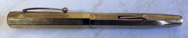
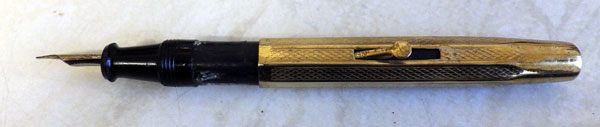
Ingersoll No 30S
I wrote about English-made Ingersoll pens once before, back here: http://wp.me/p17T6K-3T. That post gives some of the background to these mysterious pens.

This pen appears to have been made later, perhaps the nineteen-fifties, or maybe it’s just the superb condition that makes it appear later than it is. It has the curious mid-cap fitting for the clip, but that gives no clue as it appears from time to time from the nineteen-twenties on. The chunky section with a decided step harks back to that earlier model.
The rather splendid warranted nib is unusual. I read somewhere (can’t remember where) that some later Ingersolls were made by Wyvern. Wyvern had their own nib-making capability and may have made such a nib.

In any case, it’s an attractive and very unusual pen.
Edit: With thanks to Simon (Waudok)

This picture shows why I think Ingersoll’s were made by Wyvern. The 3 on the left are Ingersolls, the other 5 are all Wyverns. I have quite a few of this model Wyvern in these 5 colours but with different cap band configurations, and also shorter pens. I also have this model as a Kenbar (store pen for Barkers of Kensington), The City Pen from Spooners of Plymouth and some other advertising pens such as Earle’s Cement. I think I also saw one called a Regent pen on the Melbourne Pens site a few years ago.
The model names change over the years, I think the earliest is the Wyvern No 60, Clutch Selfil-Safety, Pat151753, WP Co, London (e.g. the Orange one); the Jade one is a Wyvern No 7N; and the Lapis one is a Wyvern Perfect Pen, No 81. There is also a shorter No 5, and shorter pens with an S instead of the N suffix.
The patent was applied for in 1919 (http://worldwide.espacenet.com/publicationDetails/biblio?DB=EPODOC&II=17&ND=3&adjacent=true&locale=en_EP&FT=D&date=19201007&CC=GB&NR=151753A&KC=A) and judging from the shape, I would have thought this pen dates to late 20s or 30s.
By the way, the section of your other Ingersoll looks like a Wyvern section to me as well.
Happy new year
Simon
