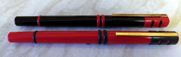
I only bought these because they are stylish in a sixties sort of way, and so that I could say I own a couple of Auroras. Accepted, they’re not quite the the three thousand-odd quid creations of today, but all the same…
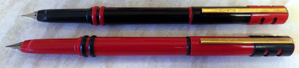
These are inexpensive cartridge pens aimed at the school market. There have been many Aurettas over the years, all rather different from each other. I’m not sure when the version I have was made – it looks like sixties styling but I’ve seen it dated to the eighties. Either way, it makes a memorable pen. The attachment of the clip to the cap reminds one of the accommodation clips of the early twentieth century.
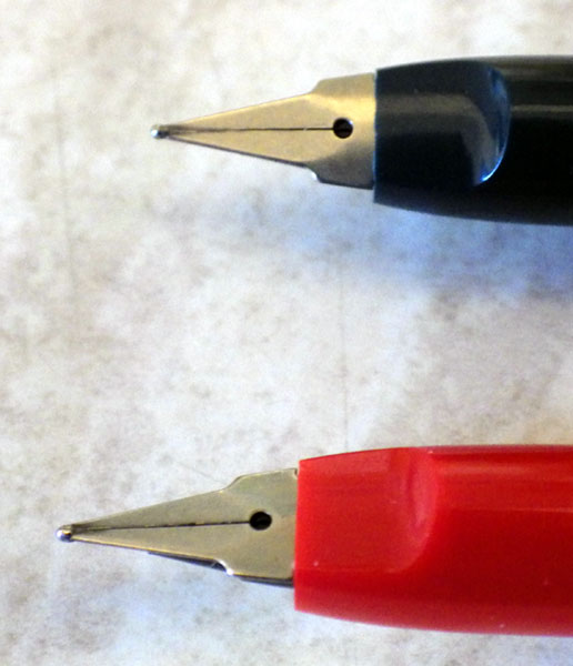 The nib is quit unlike any other, though it has the nearly flat profile of the Parker 180 or Classic. The colours are bright and strongly contrasting. Adults who manufacture things often assume that bright, contrasting colours will attract young people, but I’m by no means sure that that is true. It’s more than a little condescending. We know that babies appreciate bright colours but by time that they’re in high school they might well want to put that behind them and go for something more subtle. But who am I to criticise corporate designers? Actually, I like the colour schemes very much, but then I’m just a little kid at heart.
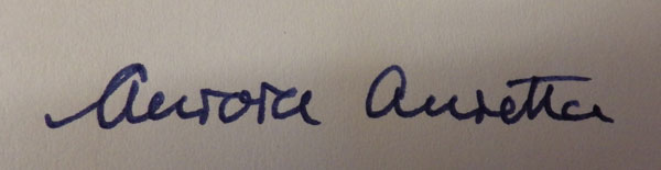
They’re eye-catching, comfortable to write with, cheap and that strange nib writes well. I approve!
