Conway Stewart Dinkie 570 Lumina Green


(Excuse the quality of these photos.  I’m not happy with this camera.  They say it’s a poor workman that blames his tools but I think I bought the wrong tool.  It has a lens with all the chromatic qualities of a milk bottle bottom.  And no, I won’t tell you publicly what it it is, because it was made by a huge manufacturer who might sue me to bankruptcy.)

IMG_0359

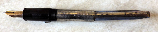
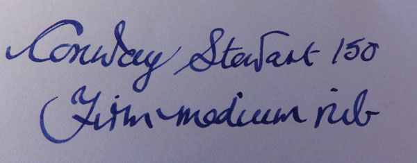
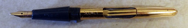
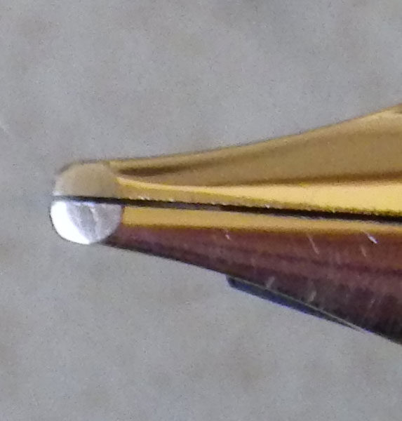
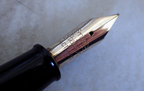
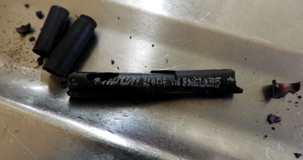
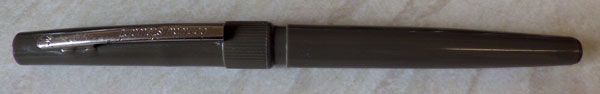
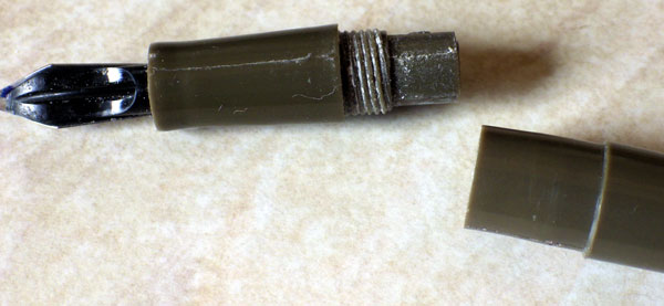
This is a customer’s pen.  It had a slight leak which, as it turned out, was down to someone having fitted a Parker Pliglass sac which didn’t adhere too well to the section.

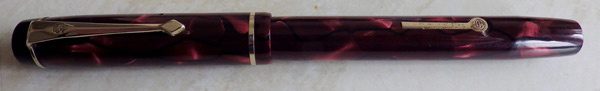
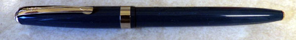
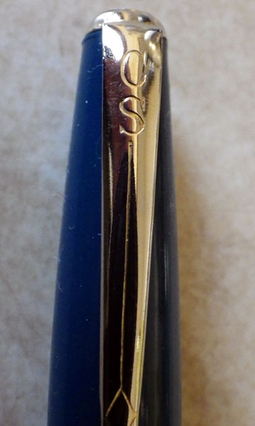
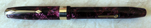
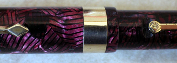
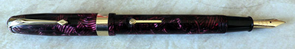
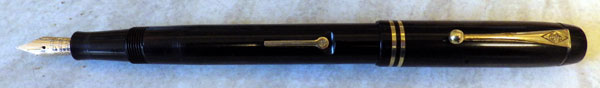
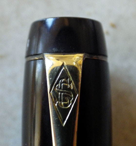
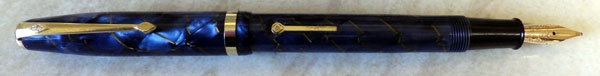
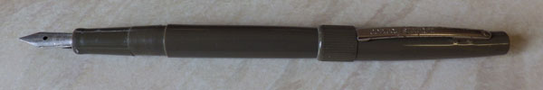
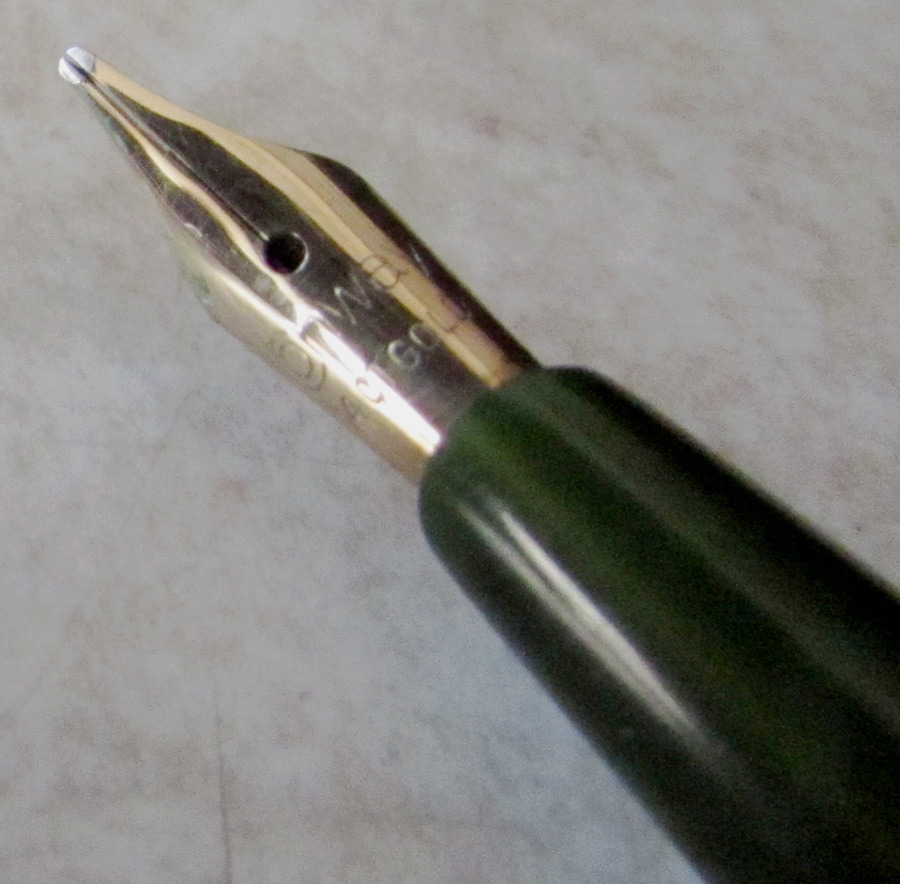
I’m not all that familiar with Dinkies and this little fellow puzzled me for a bit.  At first glance I took it to be a 570, then I doubted that because it is a Pressac filler.  It took a bit of digging around before I found out that there were Pressac 570s, so that’s what it is.
IMG_0365
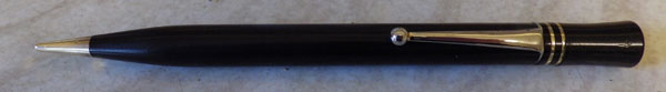
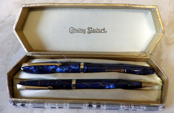
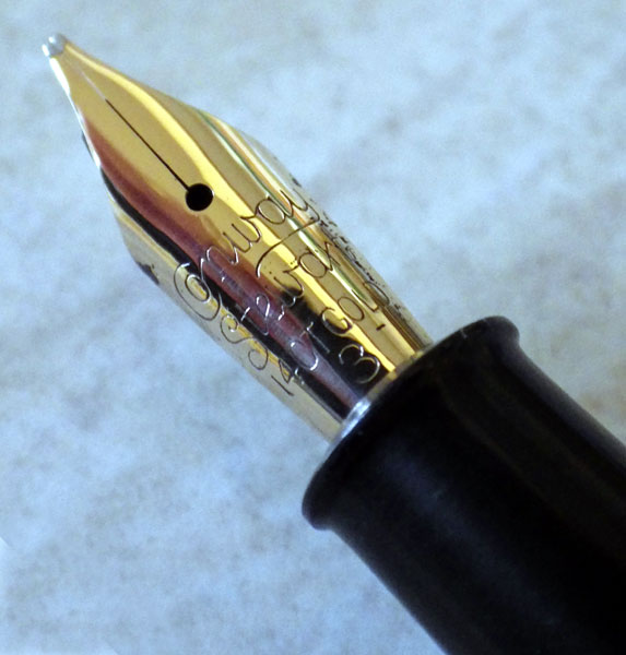
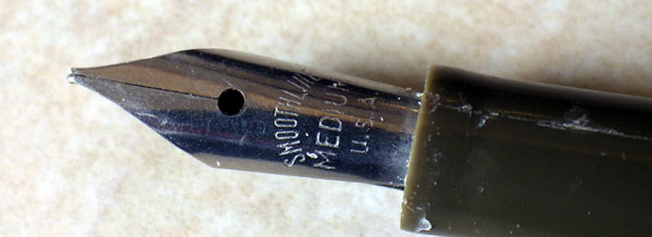
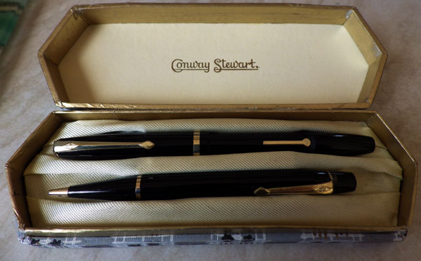
It’s a stunning little pen in the Lumina green.  Dinkies usually came in sets with a pencil and were extremely popular gifts.  I sometimes wonder, particularly with regard to the post-war Dinkies, whether they were more popular with the giver rather than the recipient.  I say that because so many of them come on the market in an unused state.  Perhaps they were felt to be too pretty to use and remained in their box.  Another thing that I’ve heard said is that they are too small to use, and to be honest, I sort of subscribed to that view myself.  However, write-testing this little fellow, I found it to be quite comfortable.  Perhaps I might write for a slightly longer time with a bigger pen, but it was certainly no worse to write with than the slender First World War Swans or Onotos.  I have moderately small hands which probably makes it a better fit, and it may be that those with larger hands can convince themselves that it’s impossible to write with anything other than a big pen, roughly around the size of a policeman’s baton.  Having seen joiners with hands like shovels writing perfectly comfortably with a half-inch stub of pencil, I’m inclined to regard that as another of those affectations that plague the fountain pen world.
IMG_0366
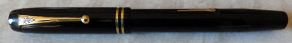
Dinkies are the collector’s pen par excellence.  There have been so many models made over the years, in so many colours and patterns, that a comprehensive collection must be very big indeed.  Though the Dinkies are the most famous, several other firms made small pens, including even American manufacturers like Wahl Eversharp.

Like everything else, the prices of Dinkies are rising, though many of the post-war sets still sell for prices that seem a real bargain.

A Conway Stewart 759 Set in Plum With Black Lines

IMGP7825

The 759 is a wartime pen.  It’s a step down in price from the ever-popular 286.  They are the same length but it might be that the 759 is a little narrower – believe it or not, for once I don’t have a 286 to hand to make the comparison.  I think the 286 nib is bigger and the cap has a less pointed top to the clip screw.  Also, whereas the later 286s had a diamond shield on the lever, the 759 has a round one.  The major difference between the two pens, however, is that whereas the 286 is a celluloid pen, the 759 is made from casein, which is shown in the glowing colours with a depth to them, like looking into a placid stream.

IMGP7826 IMGP7829

In this set the 759 is paired with the “Nippy” pencil, which is correct.  They make a handsome pair in their “plum with black lines” livery with gold plated trim.  The box is a little discoloured and shows signs of age but the pink leaf pattern can be clearly seen.
IMGP7830
As the years go by it becomes ever more difficult to find Conway Stewart boxed sets in really good condition.  This one is very good indeed, and I think I struck it lucky!

The Conway Stewart 150

IMGP5961

Like the 68 I wrote about yesterday, this 150 is a late, downmarket pen. A year or two ago these later Conway Stewarts would hardly sell at any price but I see that’s no longer the case. There are two reasons for buying these pens, (a) to complete your collection of Conway Stewarts or (b) to fix it up to write with. After all, they have good gold nibs and the filling system is usually easily repaired. Conway Stewart insisted on calling it a Pressac filler but really it doesn’t merit another name. It’s just a squeeze filler. The sac housing is just thin sheet steel with a chrome layer and it’s particularly prone to rusting. That’s OK. It’s inside the pen when in use. You don’t have to look at it. Even if it had rusted through I suspect that cobbling a replacement together wouldn’t be too taxing on the ingenuity.

IMGP5975

This pen is more traditional than the 68. It retains the usual Conway Stewart streamlined shape and the cap is screw-on rather than the clutch type. I popped a new sac in and it writes like a dream, quite stubbish like the 68.

IMGP5965

It’s a shabby pen, though. The clip once had a gold wash but of course that didn’t last long. A little reminder of it can still be seen in the impressed letters. The cap is scratched where the clip rotated against it. The plastic seems especially soft and has a waxy feel to it, like an Osmiroid 65. The cap ring has not only lost its gold wash; the layer beneath is eroding away also.

IMGP5973

Internally it’s even worse. The Pressac housing has rusted extensively. I got most of the rust off and gave it a brisk polish but it hasn’t really improved it. It works, though, which is about as much as you can ask of a pen of this age and quality. Or lack thereof. All that said, I find myself liking the pen. It’s a good and comfortable writer and it fits the hand well. It could easily be my next everyday writer – in fact I’m sure it will be. To be frank, it’s no worse than many popular low-cost pens and indeed it’s better by virtue of the gold nib.

IMGP5964

In the interests of accuracy it’s worth saying that this is the later version. The earlier ones, while no higher in quality, looked a lot better because they had something approaching the appearance of the traditional Conway Stewart clip, whereas this one has a cheap-looking steel pressing.

A Conway Stewart 68

This Conway Stewart 68 differs from any of the previous ones I’ve had in one respect: it writes! The others never could be induced to write, no matter what I did. The 68 is the definition of flow problems.

IMGP5950

This one is in remarkably good condition. The gold wash still adheres to the clip and the squeeze filler inside also has pretended gold on it. I’ve never seen that before. This pen just needed a new sac (easy to install on these squeeze-fillers) and a gentle polish and it was good as new.

IMGP5956

That, of course, might not have been all that good. The late lamented Jonathan Donahaye said of the 68, “This is another copy-cat pen trying to emulate the Parker streamlined designs. In the rise and fall of Conway Stewarts, this definitely belongs to the fall.” That’s true. Though the overall impression of the pen is good, the devil is in the detail, to coin a cliché. The clip looks cheap and tinny. The squeeze-filler unit is a flimsy thing and it’s no wonder that these are often beyond recovery now. They’re very prone to rusting and as the metal is so thin it doesn’t take much to penetrate it.

IMGP5957

As against that, though, the design is visually harmonious. The placement of the clip, cap band, clutch ring and nib looks balanced and just right. The little jewels at the end of the barrel and the top of the cap set it off very well. Yes, there’s a homage to Parker in the streamlined shape and the way the tiny traditional nib and the section that looks like a hood try to be an echo of the Parker 51, though with little success. Nonetheless, I like this pen. Though elements of its style were borrowed from elsewhere, that’s not such an egregious fault. The history of fountain pens is one of stealing the best ideas of competitors.

IMGP5953

One thing I especially like about this 68 is the nib which has a rather strange-looking grind. It imparts a stubbish effect to the writing. Whatever else Conway Stewart was doing in this period, and most of it was bad, they got this right. The nib tip is a work of art.

IMGP5958

Conway Stewart 27 Plum Hatched

IMGP5733

Given my choice among the more opulent streamlined post-war Conway Stewarts, I would choose the 27 every time.  It’s very similar to the No 60.  It’s a little slimmer and it has a CS 5 nib rather than the Duro.  Not everyone prefers the Duro.  For me it’s a stiff and unresponsive nib whereas the CS 5, though not usually flexible, has a bit of spring in it that makes it much better to write with.
IMGP5735
It’s true that the Conway Stewart No 58 doesn’t always come with a Duro nib.  The CS 58 is the alternative, but it is often as nail-like as the Duro.  In addition, I prefer the single wide band of the Conway Stewart 27 to the narrow/medium/narrow bands of the No 58.  Together with lever and the clip, the broad band seems to establish a pleasing harmony, to my eye, at least.
IMGP5736
There are some splendid patterns in the Conway Stewart 27 range.  Like everyone else, I’m always on the look-out for the cracked ice, the herringbone colours and the tiger’s eye but I’ll happily settle for the more common but very lovely plum hatched.

IMGP5734

Conway Stewart 496 Set

IMGP5134 IMGP5135

The 496 is not often seen and that’s a pity because it’s a beautiful pen.  The patterned ones are exceptionally lovely in their schist-like colours but even the black pen is inordinately handsome and stands out from other Conway Stewarts of the time, which is around 1930 – 1935.  The taper at the top of the cap sets it off as something unusual and refined.  It’s not the only Conway Stewart with that elegant profile – I had a piston filler that looked the same some time ago.  The number for that one has slipped from my colander memory, I’m afraid.  You see a similar tapered top in some Onotos and De La Rue pens.  It takes as little as changing the taper on the cap top to take a pen from pleasant to exquisite.

IMGP5141
IMGP5144

The pencil is a handsome Duro Point which has no number.  I can’t tell if these make a true set as they came in a box which is not original and Donahaye’s list shows no paired pencil for the 496.  However, with their matching twin rings they look as though they should be together.
swansac
On an entirely different subject, I see crusty old ossified Conway Stewart sacs all the time.  I showed some a few posts back, in fact.  Mabie Todd ones are rather less common but I found one this week and here it is.  Sorry that the closed end had crumbled  but enough remains to make it recognisable, I think.

Which Conway Stewart?

Thank you for the suggestions.  Keep ’em coming!

One question that perplexes me that would likely be within your realm of expertise regards the pens by Conway Stewart. I wonder just what is the REAL difference between the various models? I understand that like car manufacturers, the pen company is pressure-bound to come up with ever newer “improved” models in order to maintain their competitive position within the industry. But what REALLY is the difference between a #27 and a #28? Is it just a slight variation of length of the barrel or the cap? Is there a double cap band instead of a triple band? Is the lever a bit lower or higher on the barrel? For me, these are not really differences. There ought to be something more SIGNIFICANT to qualify as a GENUINE difference between the various models. But is this really the case. I am not restricting my question to just the models 27 and 28, of course. I am referring to all the various models over the years in this one company. I would grant that going from hard rubber to celluloid to casein represent significant changes in the pens – or going from lever filler to button filler to piston filler or clip to ring-top but is there anything else ? The same question would apply to the other companies as well…
Stuart (scratching my head across the pond)

This is a matter of perception, really.  If you compare one pen of the same period with another, the differences do appear contrived and trivial, but the short answer to your question is that the difference between the No 27 and the No 28 is the price point that they are produced to meet.  We may think of Conway Stewart’s product as being this pen or that; they would have seen the entire range as their product.  It was their aim to provide pens that would suit the taste and pocket of everyone and they chose to do that (as did many other manufacturers) by producing pens of different size and trim with a range of nibs.  Within the grasp of the financially hard-pressed parent buying for a school pupil were the No15s and 16s, small with no cap band and a small nib, whereas at the other end of the income scale were the more opulent Nos 27, 58, 60, and 100 with much more gold trim, larger size and big Duro or No 5 nibs.  Between these extremes are a host of pens separated from each other only by a few shillings, if that.  However much you could afford to spend, there was a pen of the size, colour and trim that you wanted.

I have used post-war pens to explain this point, but exactly the same pattern emerges in the study of nineteen-thirties Conway Stewarts.  The company made a price differentiation on the basis of appearance and size, not how they wrote.  They were not alone in that, of course.  Most producers did pretty much the same.  Though Conway Stewart, like other British pen companies, didn’t make innovation a selling point they did innovate from time to time.  Though they produced excellent piston fillers and stud fillers in the pre-war period and the Speedy Phil after the war, it was always the traditional lever filler that made up the vast bulk of their output.  You can only differentiate one lever filler from another so far.  That lies with the customer rather than the manufacturer, to a great degree.  The British pen-buying public distrusted innovation for its own sake, and preferred to stick with the tried-and-trusted lever filler or button filler.  Neither Conway Stewart’s Speedy Phil nor, in an earlier period, Swan’s Visofil sold in anything like the numbers that had been anticipated.  Hence the policy of creating what was essentially one pen and dressing it up in slightly different clothing to suit different requirements.

Immensely successful though they were, Conway Stewart didn’t capture all the economic groups that they aimed at.  At the very top, whether of the professions, the forces or industry, Swans and Onotos were chosen rather than Conway Stewart 60s and 100s, hence the comparative scarcity of these more opulent models.

Today, collectors and users alike can be grateful for the number of different models Conway Stewart produced.  There’s still something for everyone and we all have our favourites, despite the fact that they’re all pretty much the same pen.

Conway Stewart 85L Blue With Gold Veins

IMGP5107

I wrote about the 85L before, back here: http://wp.me/p17T6K-cI, where I suggest that the 85L is a successor more to the 84 than the 85.  Be that as it may, the 85L is a pen that stands out among the other models of its time (late fifties early sixties).  It a little longer and slightly more slender than the other Conway Stewart pens of  the period and it comes in some outstanding colour patterns like this bright blue with gold veins.  Judging by the numbers that turn up nowadays it was a very popular pen back in the day and it remains so with buyers today.
IMGP5105
I’ve been going after boxed pens and pen and pencil sets whenever I can.  The prices can be a little steep but they’re worth it, especially when they and their box are in such good condition,  It’s almost like getting a nineteen-fifties pen new.  In comparison with real new pens of similar quality, they’re very cheap, in fact.
IMGP5110
And, of course, they write better…

A No Number Late Conway Stewart Cartridge Filler

I was almost convinced that I have written about this hideous pen before, but I have assiduously searched the blog and there’s nothing there so here goes:
IMGP3798
The pen closely resembles the Flowline nylon-tipped pen which was introduced in 1972, and doubtless this one is of the same date.  Essentially, the pen expands with slightly curved lines from both ends until they meet in the complexity of the lower cap and the barrel.  Very seventies, one might say, afflicted with the same style that was applied to everything from cars to transistor radios.  Still, it’s functional, isn’t it?  Well, no.  The raised, ridged area at the bottom of the cap looks as if it would be useful in unscrewing the cap – except that the cap doesn’t unscrew but is friction fit.  Unscrewing merely removes the barrel and leaves the nib/section unit inside the cap.
IMGP3800
Goodness knows what compelled the “designers” to use that military drab colour.  Full-on khaki would be attractive by comparison.  At a stretch it could be described as olive green by the kind-hearted but at least the ugliness of the colour is consistent with the rest of the pen.  The cap pulls off to expose an imported steel Smoothline nib, about which one might say that it’s no worse than many other cheap after-market nibs.

IMGP3802

A lot of plastic flashing is also revealed on the section.  Unscrewing the barrel shows that it is a cartridge filler.  Like most other pen manufacturers of the time, Conway Stewart intended to cash in on the sale of over-priced ink in dedicated cartridges, so nothing else fits this pen so far as I’m aware.  Conway Stewart cartridges of the right date do turn up in eBay sometimes, a little evaporated but useable.  That’s always assuming I’d want to write with this pen, or be seen with it.  Stop it – I’ll split my sides!
IMGP3803
So that’s it, except I failed to mention the rust – yes, rust, not wear or tarnish – on the clip.  This, really, is where the company that once was Conway Stewart touched bottom.  No matter how hard you might try, you can’t really make a worse pen than this, qualitatively, aesthetically or practically.    If  you would like this pen to complete your collection, or maybe just to stamp on it, send me the postage and it’s yours.  If, against all good advice you decide to keep and use it, don’t wear it in an external pocket where it can be seen, or men may spit at you in the street and women will slap your face for inflicting such ghastliness upon them without provocation..

Conway Stewart No 12 Set And Musings On Other Matters

I had a productive morning fixing pens.  I covered most British manufacturers and most filling systems.  Keeps me interested.  There were several Swans and it occurred to me that there was a period after the war when Swans became irritatingly over-engineered.  There’s the brass barrel threads, which admittedly look nice, but can be hard on cap threads.  This is one of the not infrequent occasions where plastic is better than metal.  Then there’s the lever-fillers with screw-in sections.  What’s that about?  What does a screw-in section add to a lever filler?  A friction-fit section is equally secure and makes re-saccing much easier.  Many of these pens come my way with a sac twisted up inside them like a piece of string that the kittens have been at.  Where a press-in section would take an 18 sac, you have to drop to a 16 and keep it quite short to ensure that it doesn’t snag on anything.  So what, long-dead Swan engineers, were you thinking of?  EMWTK!
IMGP3708

IMGP3713
I don’t often get Conway Stewart sets.  They tend to be priced a bit beyond my restricted budget, but I managed to snag this nice black CS12/Nippy No 3 set the other day.  The box is nice and fresh too.  The pencil, strangely, shows wear to the gold plating whereas the pen doesn’t.  It’s usually the other way round.  I’m very pleased with it, though.  It ,looks great for a set that was made at least fifty years ago.  I love the pattern on the box.  Conway Stewart knew how to present a pen and pencil set back then.
IMGP3704
As I was so busy I asked my assistant for assistance.  She replied that she couldn’t do much with the tools with no thumbs and re-saccing’s not the job for her either, not with those long, sharp, latex-puncturing claws.  “You’ve got my moral support, though, boss,“ she said, “but keep the noise down ’cause it’s nap time, m’kay?”