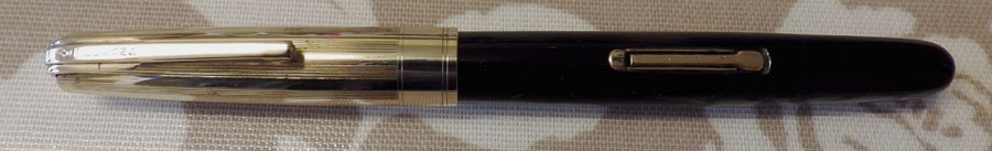
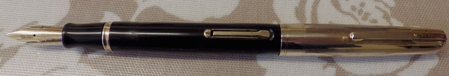
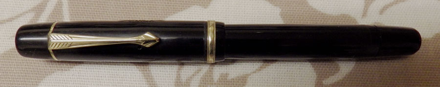
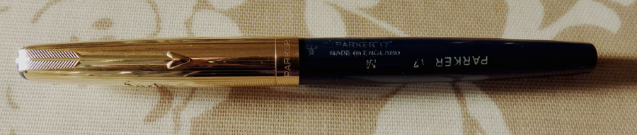
When the Parker 17 first appeared in 1962 it had an exposed nib. Shortly thereafter it was redesigned to have a hooded nib in the style of the Parker 51. There were various levels of trim from the standard up to this deluxe. It is evident that they sold very well as there are many around but, strangely enough, they don’t seem to sell very well nowadays. I see them go through eBay and though they sell they often don’t make much money. That’s a mystery to me as they are attractive pens and all those I have handled were great writers.

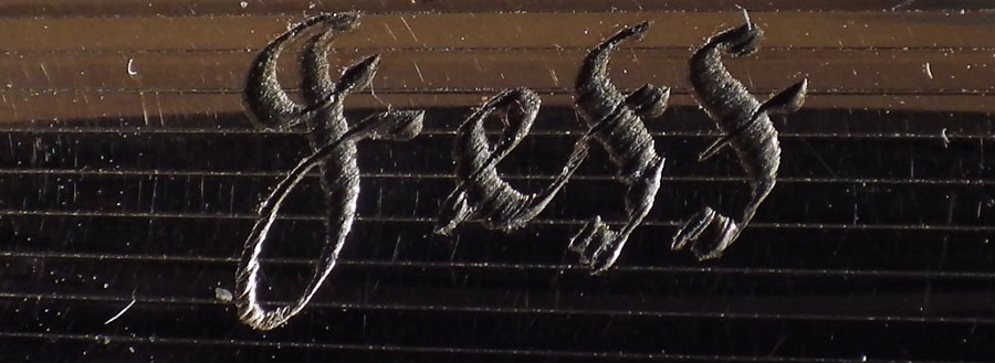
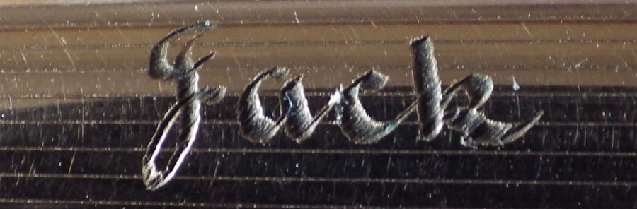
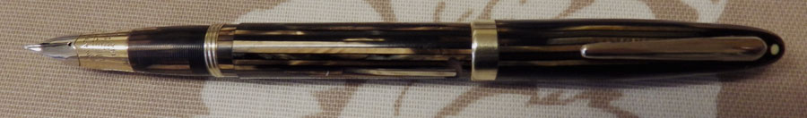
This particular example is a bit of an oddity. It has three names engraved around the cap: Allan, Jeff and Jack. There is also the engraved date 3.12.65. The pen has clearly not been used much as the factory chalk marks are still on the barrel. How do we explain this? Did Allan, Jeff and Jack present this pen to someone? Or did someone present this pen to Allan, Jack and Jeff? Did Allan use it on Monday and Tuesday while Jack had it Wednesday and Thursday and Jeff wrote with it Friday and Saturday and no one had it on Sunday? Are you convinced? No. Nor am I.

The lady I bought the pen from said that she had been told it was a demonstrator pen. Clearly, it isn’t in the normal sense, but perhaps it was intended to show the quality of engraving that could be produced.

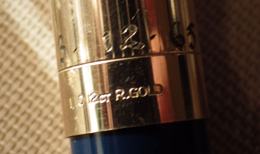
One thing that puzzles me is the date. The Parker 17 Deluxe is said to be a late introduction in the production run. 1963 seems to me rather early. It may be, of course, that it is simply an example date and not the date the engraving was done.
Waterman Emblem
In the nineteen twenties and thirties Waterman was a market leader with their wonderful ripple hard rubber pens and beautifully patterned celluloid pens. By the forties the company’s tide had begun to ebb and their pens were less attractive with unexciting design and poor gold plating. Their top of the range pens were still good, though. First was the Hundred Year Pen, followed by the Emblem.


This is a pen of an entirely different order from the 512s and the 513s of the same period. Most obviously, the gold plating is much thicker and despite this pen bearing the marks of having been much used there is no brassing. It’s heavier, too, probably partly from the greater amount of gold but also because the Lucite barrel is thick. At 13.7 cm, with a considerable girth, it’s a large pen for the time. When the clutch cap is removed the large Emblem nib is exposed. Though I believe some Emblem nibs are firm, this one is decidedly flexible. It’s a great pen by any standards.

The Emblem is not a common pen in the UK though I believe it sold better in the USA. Its successor, the Medalist, didn’t seem to catch on here at all. The result is that this is almost a forgotten pen here. They don’t run to the prices that they do in the USA, which gives the British collector the chance to obtain a very prestigious pen at a comparatively low cost.
Pen Reviews
There is an interesting debate going on in Fountain Pen Geeks about the comparative value of written and videoed reviews. Speaking for myself, I avoid videoed reviews because I tend to lose the will to live about halfway through. The very worst ones, I believe, are those where a big ego has a part to play (no names, no pack drill). These usually run to quarter of an hour or more. That’s madness – if you can’t describe a pen and its pros and cons in under five minutes there’s something sadly wrong! Others, perhaps, aren’t quite so bad but they often tend to ramble. It’s as if the discipline that one would apply to a written review disappears when the camera is switched on.
There are exceptions, of course. SBRE Brown, for instance, has a pattern to his videoed reviews and appears to marshal his thoughts well in advance. So it can be done – though it rarely is. That’s not to say that all written reviews are good. Some of them are rambling nonsense as well but the ratio of signal-to-noise is rather better.
What do you think?
Sheaffer Triumph Lifetime Statesman
You may remember that a few weeks ago I wrote about a Sheaffer Triumph Sovereign that I really liked but was unsuitable for me as I prefer a fine and it was a medium. A very kind and generous correspondent made me a present of a very similar Sheaffer with a fine nib.

This, I believe, is a Sheaffer Triumph Lifetime Statesman. If you know better, please inform me. I’m no expert on Sheaffers and there are very many of them. Anyway, this one dates to about 1945, I understand, and it was made in Canada.

It’s very like the other one, being brown/gold striated with a Lifetime Triumph conical nib. What a splendid concept the Triumph nib is! Several other manufacturers have come up with conical nibs but none of them are a patch on the original.

This pen is a superb writer and it will always be on my desk. It’s one pen that won’t appear on the sales site. Ever.
A Curiosity!
At first glance it’s a Swan SF1 in unusually good condition. Picking it up, it seems a little too heavy – and that’s because it’s solid, machined to the appearance of an SF1 only externally.

This would have been a salesman’s example or, more likely, part of a shop display. I suppose it saved the labour of making an actual pen and, of course, the cost of the nib. It’s just a pity that the actual pens turn up in such good condition so very, very seldom!


These things appear from time to time but they’re by no means common. Most, I suppose, were thrown away long ago when the model ceased to be current.
Mentmore
Usually the company made a clear distinction between Mentmores and Platignums but this pen is the exception. Everything about it, the pattern and the feel of the material, the glittery chrome-plated trim and the tiny nib all say Platignum, but it’s a Mentmore. It has neither model name nor number.

It’s a button filler, 13 cm long. The nib is warranted and so may not be original though I suspect that it is because it fits so well. The nib has considerable flex.

This pattern and style among Platignums dates to the late thirties and doubtless it’s the same when it has a “Mentmore” stamp on the barrel. The material of barrel and cap is quite thick, making for a very robust pen.
Union No 68
The good news is that my assistant seems to be responding well to her insulin injections and change of diet. Here she is after being introduced to a catnip-laced toy. She’s saying, “Man, that’s good weed!” Anyway, to business:


I’m aware of three brands of fountain pen called “Union”. There is a British one made by Langs, an American pen that is a sub-brand of Morrisons and a Dutch company that made pens after World War II. This, I believe, is the latter, purely on the grounds that it is very European in appearance and I’m not aware of any American or British companies that used this “fixed converter” type of filler.

It appears to have been made out of a fairly soft kind of plastic because both barrel and cap have shallow scuffs and scratches. The viewing window is discoloured, probably from the use of red ink. All of this is redeemed by the nib which is quite splendid – a fine with a little line variation.

These pens are not very common – in Britain at least – but they would hardly qualify as rare. Much of their interest arises from the fact that they were one of the few pens that were made entirely in Holland rather than from imported parts. Just one of the many well-made European pens that are well worthy of note.
Pilot Custom Heritage 91
There was much talk in the boards some time back about this Pilot Custom Heritage 91 and I ordered one some weeks ago. I think I paid around £50 for it but I believe you can get it cheaper in eBay these days. Mine came direct from Japan, boxed in the usual way for pens nowadays and with one cartridge and no converter which I thought was a tad stingy of them. That’s really the only criticism of this pen that I will have. I’m really pleased with it. I hear tell that it’s not on sale in the USA – I don’t know why.

At 13.7 cm it’s a medium sized pen by today’s standards. Cap and barrel are made of black resin (what we used to call plastic in days gone by) which makes for quite a light pen at 17 g. The trim is nice, shiny rhodium. When you unscrew the cap, there is the nice, shiny rhodium plated nib. Why take a gold nib and plate it with something that looks quite like stainless steel? That doesn’t apply to this pen alone, of course. It’s the fashion of the day. The clip is quite Pelikan-like.

Some reviewers have referred to this pen as semiflexible. It isn’t. It’s just a soft nib. With pressure one can wring some line variation out of it but I just enjoy the springiness which makes writing comfortable. I have seen the number five nib described as “small” but that’s just in comparison with today’s huge, spade-like nibs. It’s about the size of a Swan number three. It writes beautifully; adequately wet, no skipping or scratching, just some slight but positive feedback.

The pen is aesthetically understated and it’s hard to wax lyrical about such a subdued pen, yet it’s probably the best modern pen that I’ve tried. In fact, its only possible equal is the Capless by the same company. I’ll be keeping this one.
Conway Stewart 570
This is the Conway Stewart 570, a late version of the ever-popular Dinkie. It measures 11.4 cm capped. It hasn’t quite the quality of earlier Dinkies and, indeed, the barrel bears the legend “holder foreign”. I have a vague memory that these pens were made, for the most part, in Germany. The Conway Stewart nib was added and the pen assembled in Britain.

These pens are popularly called “Lumina” because of their luminescent colour and they are very beautiful. The clip is in a most un-Conway Stewart-like arrow form. The section is short and hints at a modern semi-hooded nib, though it doesn’t go quite that far. The nib is small, with quite a lot of tipping material. This example is in excellent condition and may never have been used.

The pen is contained in a very shabby box and on the underside is written “Vanessa Hodge”. I found plenty of Vanessa Hodges in a Google search, including a biodynamic craniosacral therapist, an investment consultant and a soccer player among many others but they all appear too young to have been the owner of a pen made between 1964 and 1972.

I think that if the 570s had been plain self-coloured like many of the other pens Conway Stewart made at that time they would attract very little interest now but the splendid luminescent colouring, which you see on some Continental pens, is their saving and they are quite popular today.
Smartie
Sad news today. My assistant is not well and is at the vet’s having tests done but it seems likely that the problem is diabetes. Thankfully, much can be done these days but her life will never be the same.
We’ve spent the day researching. One thing that stands out a mile is that there has been a huge increase in cat diabetes in line with the huge increase in the popularity of dry foods. It seems that most of these foods contain a lot of plant material, particularly cereals. Considering that cats are exclusively carnivorous that would seem to be the reason for the diabetes. I checked the packaging of the Science Plan that Smartie lives on and there it is: rice, maize and vegetable oil. No percentage is mentioned but doubtless it’s in large quantity to fill the bag cheaply.
It’s the old story. The providers of these cat foods have loyalty only to their shareholders, not to the cats. I feel a thunderous anger rising. Someone may have their gizzard forcibly removed before I’m done.
This is the second cat of mine that has developed diabetes. When it happened to the first one, injections of insulin were not given for small animals; the only treatment was a dietary one and my poor Lily would not touch the food provided. The outcome, as you may imagine, was a tragic one. She too, was fed Science Plan. It didn’t occur to me then to associate the food with the illness.
I would say if you are feeding dry food to your cat, stop it NOW! Find a food that is composed entirely of meat, or is at least low carbohydrate, high-protein.


