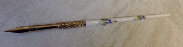
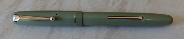
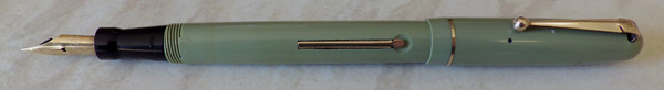
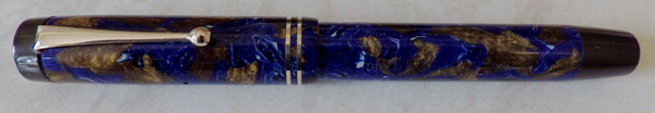
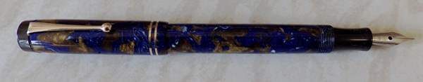
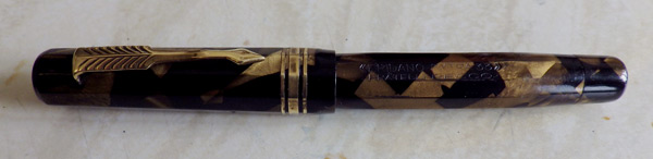
When this pen was offered in eBay a few weeks ago it caught my eye. I knew nothing about it but decided I must have it. Its colours, quite unlike anything else around, appealed to me as did its 10-sided shape. As it turned out, there was little interest in it and I got it easily.

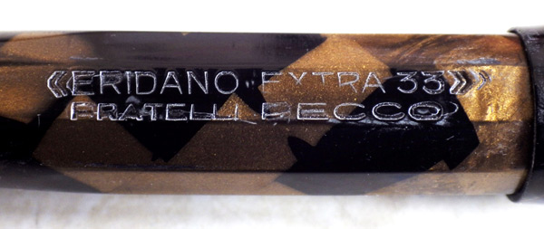
The pen was made by the Pecco Brothers in Turin, who began pen-making in 1917. They used the names Eridano, Eridania and the slightly better known brand-name Stilus. Eridano, for what it’s worth, is the ancient Greek name for the River Po which flows through Turin.

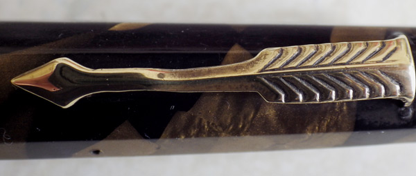
One might be forgiven for thinking that the Pecco Brothers had a good look at the Wahl-Eversharp Doric before they sat down to design the Eridano Extra 33. It’s ten-sided rather than 12-sided but at first glance it’s very Doric-like. The arrow-shaped clip has come to grief at some point. I straightened it a bit and may do some more but it doesn’t detract too much from the beauty of the pen in my opinion.

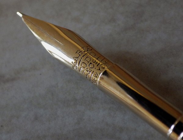
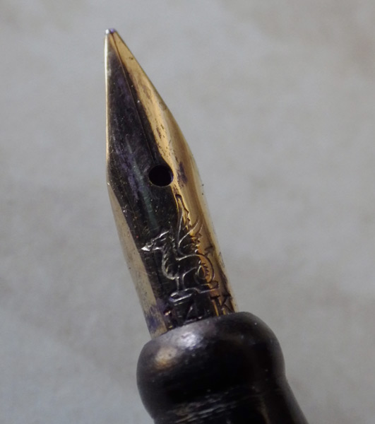
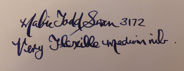
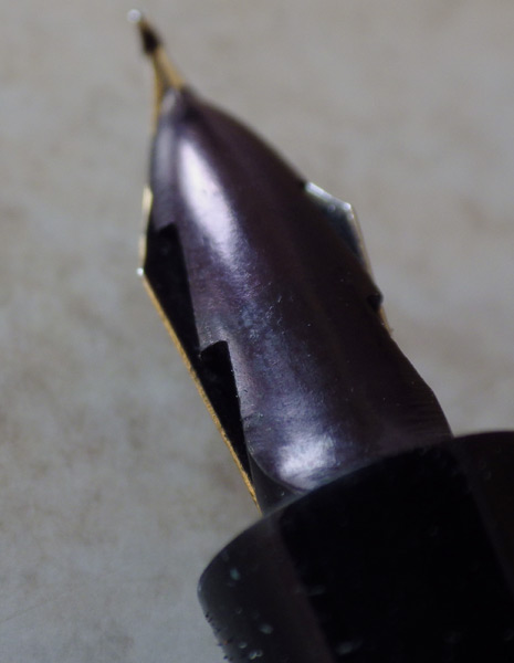
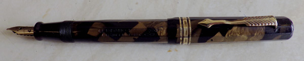
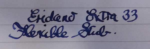
The nib it came with was beyond repair. I had a hunt through my warranted nibs but nothing there fit. However there was a rather splendid Swan No 1 flex stub that slotted right in and could have been made for the Eridano.

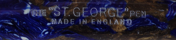
It’s a superb pen, though it suffers from being one of those brands whose name is not well or widely known. I think I might hang on to it. It’s time I had a new daily writer.
Month: May 2014
Tax and The Bullfinch
High Quality Dip Pens
This is an unusual entry for me. Dip pens are certainly not core to what I do, but Mabie Todd is. Looking at these two treasures I suspect that dip pens may feature here a little more often. I spotted this glorious dip pen when it first appeared on eBay. It had a bid or two and I think it was around £6.00 at that time. I knew that it would go higher – very, very much higher, but I hoped that it would not go beyond what I could afford, and as luck would have it I managed to obtain it within the budget I had set myself.
Mabie Todd as you may well know is one of the oldest pen companies. It was formed as Mabie Todd & Co. some time in the 1840s and kept that name until 1873 when it became Mabie Todd & Bard. It reverted to Mabie Todd in 1907. As this nib is marked Mabie Todd, it could have originated in either of those periods but common sense suggests it is much more likely to be the latter. The increasing popularity of fountain pens did not mean an immediate end to the production of dip pens which indeed continues to this day. These very high quality dip pens were probably only made until around 1920, so give or take, this pen’s around 100 years old and is in splendid condition. The large No. 3 nib is very flexible indeed. Sorry there’s no writing sample – I’m just no good with dip pens.
The handle may be ivory but I think it’s more likely to be celluloid, and it is hand-painted with a very fetching floral design. It’s a wonderful survival and while these high-quality fountain pens are not rare as a class, individual designs are often represented by only a few surviving examples.

It was, I believe, good value for money, but the seller (acetateblue in ebay – I recommend him highly!) kindly included another high-quality dip pen as a gift. This one is a Grieshaber of probably around the same date. Again, the nib is very flexible. It’s a little smaller, probably around the No. 2 size. The handle is mother-of-pearl and again the condition is very good. Grieshaber is not well known here but it was an old established nib and pen company dating back to 1884. They produced some outstanding high-quality dip pens and later went on to produce good quality fountain pens though they were generally conservative in style.

I confess that I don’t know a great deal about dip pens and dip pen holders. I keep an eye on the market and have a general awareness of what’s available and how the prices run, but there’s a whole world of knowledge on this subject that I have yet to acquire.
A Waterman Ideal 513 Set
Here’s a very handsome Waterman 513 set. It’s in a striated version of the Tiger’s Eye colours, an exceptionally beautiful combination of honey and brown. The 513 is a standard-sized pen, 13cm capped. It’s paired with an equally attractive and (to me) unusual pencil. It’s part of Waterman’s less expensive range – you’ll not that it doesn’t have a lever box.

There’s quite a bit of confusion over these pens with the Art Deco stepped clip. They end up being called Stalwarts, 513s or W3s. They’re made to slightly different specs in the USA, Canada and Britain. To be absolutely precise this particular Canadian pen is just a Waterman Ideal with no number or name assigned to it, but as it meets the specification of a 513 we might get away with calling it that. The 513 is the 1948 version with two cap rings and a 2A or W-2A nib. Nibs give rise to alot of confusion and this pen isn’t an exception in that. It has an Ideal No 2 nib which is certainly a replacement. It’s actually an older nib, commonly found in the Waterman 52. I’ve also seen 513s bearing W3 nibs and that’s wrong too. The W3 nib is fitted to the W3 pen, a much later though not dissimilar pen turned out in 1955, so that nib’s a replacement too. Why so many replacements? I don’t know. The 2A nib has always seemed a perfectly good nib to me, as robust as any other Waterman nib, and coming in the full range of nib types from flex to nail, with the occasional stub or oblique.

If all that hasn’t made your head spin you now have the story on these post-war Watermans. The 512 is a slightly cheaper version with a single cap ring. The 515 is a bigger beast with an impressive, often flexible nib. The W2, 3 and 5 are later pens. Some people try to find an equivalence between these pens and the Stalwart. If it doesn’t say Stalwart on it, it isn’t a Stalwart. Simple as that. I don’t know why people want to insist that these are Stalwarts – perhaps they prefer names to numbers. There is enough similarity to allow for confusion but it’s important not to run them all together.

Anyway, I’ve had this pen and pencil set for quite a while and I’ve written with the pen quite a bit. The nib isn’t flexible but it’s smooth, making it a nice pen to write with. The pen and pencil came in the leather case and I assume it’s original. It’s the right age.
Wyvern 303
As is usually the case with Wyverns, there isn’t much information available for the 303. It was introduced in 1948 along with several other hooded or semi-hooded new models. In truth, the 303 can’t really be regarded as even semi-hooded. It’s a perfectly traditional button-filler. It just doesn’t look it. The very small nib is fully visible. Small though it is, there’s still room for the little Wyvern image. The extremely long cap band (if you can even call it that) has no equal anywhere, though perhaps the Waterman Taperite Citation comes close.

It is sometimes said that the fountain pen failed in Britain because manufacturers were not innovative enough in the post-war period. I think this pen and several other Wyverns and Mentmores gives this opinion the lie. These pens were very different from what had gone before. In any case, British buyers did not demand innovation in the way that the American buying public did. Besides, the American fountain pen industry suffered almost as much as the British, in the face of the irresistible success of the ballpen.

The 303 is a pleasant pen to use. The little nib isn’t flexible but it’s a smooth fine to medium. Grab one if you get the chance but beware – this is one of those Wyverns that have a left-hand thread at the section. There’s a nice example on a Buy It Now here. I expect to be selling this one in due course and I’ll try to undercut that one. By more than a hundred quid.
Mabie Todd Swan 3172
The Swan 3172 isn’t very common. Maybe there wasn’t much demand for pastel green in the first place, and I know that it had a short production run, being withdrawn along with the grey self-coloured pens. This was because they were subject to discoloration, though I suspect that applied to the grey ones more than the pastel green. This one shows no signs of discoloration.

Each to their own, of course, but I really like the pastel green. There was also a pastel blue which was offered briefly after the grey was withdrawn. They make a change from the blacks and the reds, blues, greens and browns so dark that they would be mistaken for black in anything but the strongest light.

Phillips of Oxford have fitted one of their own nibs to this pen, doubtless as a replacement for a damaged original. Phillips nibs are usually nails but this one isn’t. The term “superflex” would not be misplaced in describing this nib. It’s by far the most flexible nib I’ve seen in a post-war Swan. It’s a glorious thing and I haven’t done justice to it with my scrawl. Forgive, I’m just not in a writing frame of mind today.
The St. George Button-Filler
Here’s another mystery pen. All suggestions and comments welcome.
It’s a well-travelled pen. Though it was made in England, I discovered it on one of my periodic trawls of eBay Australia. I bought it and here it is back in Britain.

The “St. George” name doesn’t give much away. Patriotic, perhaps in the adoption of the name of the English patron saint. It doesn’t help me in determining where it was made or by whom. When, I think, would be the early thirties. This is a consciously Duofold-like button-filler and as it’s a little tapered, it is doubtless based on the Duofold Streamline. It goes so far in its emulation of the Duofold as to have a copy of the spearhead feed. It’s not a Lucky Curve, though. That’s where they drew the line.

The patterned celluloid is the same as one of the patterns used by Waterman for their Patrician. Waterman called this pattern “Turquoise” and it’s dark blue with large areas of golden brown and little splashes of white. It’s an outstandingly beautiful pattern but I’ve always wondered about the name they gave it. Turquoise is an opaque, blue/green mineral with brown inclusions. The main blue/green colour is about as far away from this dark blue as it could be, and it is this pale blue/green colour that people mean when they say turquoise. If you don’t believe me, put the word into the search engine of your choice, then select “images”. Your screen will be awash with pale blue/green pictures and there won’t be anything that looks like this pen or the Waterman Patrician. Strange!

This pen now has a W.R. Bruton Bros plated steel nib. Bruton Bros made dip pen nibs and folded-tip nibs for fountain pens like this one. I’ve heard it said that they made low-cost fountain pens but I’ve never seen one. Did Bruton Bros make this pen? It seems highly unlikely though it can’t be totally discounted when there is no other evidence. I would say that this is anything but a low-cost pen, though, and the plated nib looks quite out of place. I think I will have to find a suitable 14ct nib for it.
Upload
Another upload today at the sales site. Some rarities, some flexies, and many good restored pens.
IMAK Arthritis Gloves
It’s a little frustrating when your main interest is fountain pens and you’re finding it painful to write. This has happened to me gradually over the years and recently it has become rather less gradual.
CCBarton recommended hot wax for pain relief and that works well. Someone else recommended IMAK arthritis gloves. I tried a pair and they’re really good. They gently compress your hands and somehow that reduces the pain and allows you to work. I use them for writing, typing and pen fixing. For other sufferers out there, they’re well worth a try.

My hands in these gloves reminded me of something, though. For a while I couldn’t think what it was, then it came to me. I’m Fagin! Ron Moody as Fagin in Oliver!
In this life, one thing counts
In the bank, large amounts
I’m afraid these don’t grow on trees,
You’ve got to pick-a-pocket or two
You’ve got to pick-a-pocket or two, boys,
You’ve got to pick-a-pocket or two.
But that’s OK. I don’t mind being Fagin if it’s a bit less painful.


