Here’s another mystery pen. All suggestions and comments welcome.
It’s a well-travelled pen. Though it was made in England, I discovered it on one of my periodic trawls of eBay Australia. I bought it and here it is back in Britain.
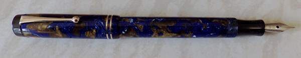
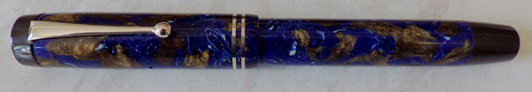
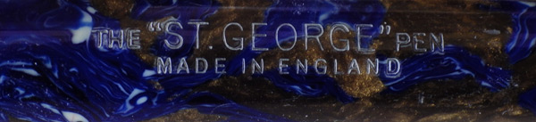
The “St. George” name doesn’t give much away. Patriotic, perhaps in the adoption of the name of the English patron saint. It doesn’t help me in determining where it was made or by whom. When, I think, would be the early thirties. This is a consciously Duofold-like button-filler and as it’s a little tapered, it is doubtless based on the Duofold Streamline. It goes so far in its emulation of the Duofold as to have a copy of the spearhead feed. It’s not a Lucky Curve, though. That’s where they drew the line.
The patterned celluloid is the same as one of the patterns used by Waterman for their Patrician. Waterman called this pattern “Turquoise” and it’s dark blue with large areas of golden brown and little splashes of white. It’s an outstandingly beautiful pattern but I’ve always wondered about the name they gave it. Turquoise is an opaque, blue/green mineral with brown inclusions. The main blue/green colour is about as far away from this dark blue as it could be, and it is this pale blue/green colour that people mean when they say turquoise. If you don’t believe me, put the word into the search engine of your choice, then select “images”. Your screen will be awash with pale blue/green pictures and there won’t be anything that looks like this pen or the Waterman Patrician. Strange!

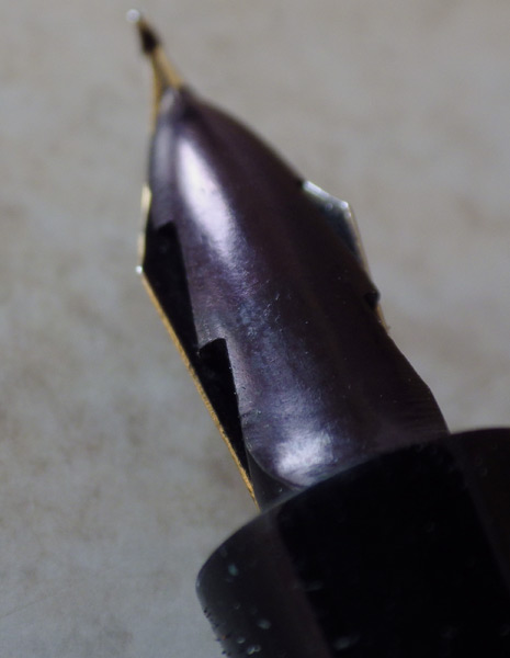
This pen now has a W.R. Bruton Bros plated steel nib. Bruton Bros made dip pen nibs and folded-tip nibs for fountain pens like this one. I’ve heard it said that they made low-cost fountain pens but I’ve never seen one. Did Bruton Bros make this pen? It seems highly unlikely though it can’t be totally discounted when there is no other evidence. I would say that this is anything but a low-cost pen, though, and the plated nib looks quite out of place. I think I will have to find a suitable 14ct nib for it.

It looks like another Platignum pen to me Deborah that had a replacement nib and Parker Christmas tree feed fitted.
That blue and gold pattern is quite common, and sometimes the top and blind cap were in the same material too.
Regards, Peter
I know the pattern that you mean, Peter. In fact there may be examples of it in this blog. I’ve certainly had some of those pens. This isn’t that pattern, however. There are things that a photograph doesn’t convey well. This pen feels quite different. The cap rings remain beautifully tight and undisturbed in a quite un-Platignum-like way. The button isn’t the usual Mentmore type. I don’t say it couldn’t have come from the Mentmore stable but given the quality of the pen it doesn’t seem likely.
I do not think there is any direct connection but Richard Binder mentions another pen company of similar name, St. George Fountain Pen Company in New York, which ceased to exist in the 1920s (http://www.richardspens.com/?page=ref/glossary/S.htm, http://www.kamakurapen.com/Manhattan/ManhattanList.html)
Yes, I came across that one while I was trying to place this pen. However, I’m pretty sure that it’s a Mentmore product, as Peter suggests.