You may remember that a few weeks ago I got hold of a BB2/46 pen minus the cap. I was glad to get it even in that state because of the beauty of the bright blue material. I don’t know why these pens are such rarities. Perhaps they did not suit the taste of those times or maybe Mabie Todd only got a limited supply of the material.
Anyway Professor Paul Gollan was kind enough to share photos of his fountain pen and pencil set. Isn’t it a stunner!
If you look on my sales site you’ll find a black Swan marked 3162. The /62 code usually refers to the Wine and Silver pattern. Though I haven’t seen it Stephen Hull records that it is sometimes erroneously used for the Almond Green pattern. I always refer to Stephen Hull’s number/pattern chart but I know that there is at least one other list out there: one prepared by members of FPN several years ago.
I searched online and it appears there are or have been other post-war black Swans bearing the number 3162. That means it isn’t just a one-off error as I first thought. It’s hard to imagine why it was thought necessary to apply another number to the simple black pen but it seems that’s what happened.
Might it be that as those mixed colour patterns were no longer produced by 1949 when the pen was made, Mabie Todd decided that the earlier code could be re-used? Even if that is so we still don’t know why it was done.
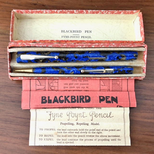
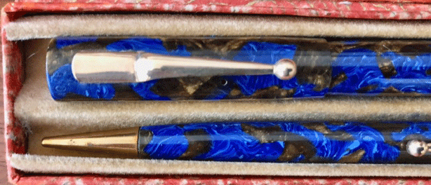
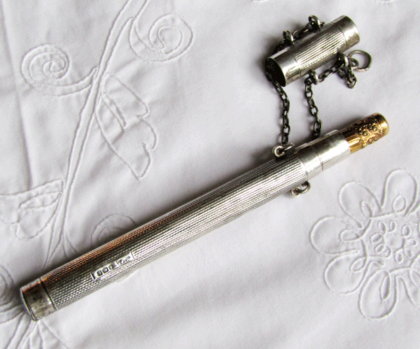
Here’s one I haven’t seen before outside of Stephen Hull’s book. The L275/60 went into production around 1934. It’s wonderful to see the full set, complete with original box and papers. Such a beautiful set.
Hello! It’s me again! You may remember that when I first came to visit, Deb christened me McTavish. Since then she has discovered my real name, Tuppence. It’s appropriate because I’m small for a grown-up cat and it also hints at how astonishingly cute I am.
I’m lucky to have this job of Part-Time Assistant Fountain Pen Restorer. Actually I’m pretty well full-time as I arrive at 8am and remain until 8pm when I have to go home.
The reason I am so glad to work with Deb is because the lady who owns me (or thinks she does) adopted another cat, a horrid black and white monster who is a BRUTE and a BULLY. He has a tendency toward violence and steals my food. His table manners are atrocious, he has bad breath and he smells. I choose not to associate with him.
It’s much more pleasant to come here and fix pens with Deb. I don’t know how she would manage without me. I do have a little nap now and again, lasting about ten hours out of the twelve and of course I need lots of stroking and worship in recognition of my extreme cuteness.
This 1927 advert for “The Mottled Swan” shows an enviable pen, probably the SF230/61, so I’m drafting this with my SF230. Unfortunately it isn’t mottled; it’s black hard rubber (somewhat faded) with GP barrel and cap bands. A beautiful mottled Swan for 15/-. That’s 75p! Oh for a time machine! Those pens are very expensive today, even unrestored. They are much sought after – and rightly so!
This is one of the more direct Swan adverts except for the logo at the top, combining a stub nib and two swans within a rather abstract surround. It also lists all the Mabie Todd addresses of that time.
There are a number of other adverts on this page from Punch: there’s Spinet Large Oval Cigarettes, “Soothing as an Old Time Melody” and Orient Line Cruises by the 20,000 ton SS Oronsay and Otranto, to the Mediterranean. There’s also the “Hardy” Angler’s Guide and Catalogue and consultations with Dr Brighton, suggesting that a holiday there is a cure for all ills.
Going back to the pens, the late twenties and early thirties seem to have been the very best of Swan pens though the company produced excellent pens before and after. The SF range and their immediate successors combine a particular elegance with comfort and practicality.
It is no secret that I adore vintage fountain pens, especially vintage Parkers. My Parker Duofold with a stub nib is one of my favourites because it gives such a deliciously smooth writing experience, which also goes for my Parker 51 and Parker 61, as well as a very pretty marbled Parkette in my collection. But I also own some pens manufactured by their arch-rivals, Sheaffer.
There’s something about the sleek design of two of my Sheaffer Lifetimes that attract me, because I like green and gold. I suffer from an incurable case of ‘Oooh! Shiny!’
When I received the pens, they were in need of a good clean, inside and out. The clips were grubby, there was dried ink on the nibs, and a chemical smell surrounding them both that could only mean ancient ink inside, or else a somewhat unpleasantly pungent modern one. I started work on the small Sheaffer first (commonly called a Tucky or Tuckaway).
It is part of a pen and pencil set, but since I don’t own any pencil leads at the moment, I focused on the pen. I was, in fact, forced to focus on it very hard indeed, as the Filling Mechanism Was Hidden. I stared at it, firmly and at great length, until I figured out that there was a blind cap on the end of the pen, which unscrews anti-clockwise. You then have to pull it, like a plunger. Then you dip the nib in some ink, push the plunger back down and screw the blind cap back on. Count to ten slowly, and the pen fills with ink, as it is drawn in on the down stroke.
It took me a long time to flush out all the old ink with water, but I did it and removed the unpleasant chemical smell in the process. The nib was still dirty, so I used a microfibre cloth and cotton buds to return it to a clean and shiny state that only 14k gold can achieve. I admit that there is still a thin line of ink around the bottom of the nib that refuses to be removed by anything.
It haunts me.
The grip section is black, so you can’t actually see the ink without looking closely, for which I’m thankful. The only thing left to do now was to polish the barrel and cap. Again, prolonged application of a microfibre cloth and elbow grease was all that was needed, and the stripy green of the barrel shone like new.
I inked the pen and started writing. Wow – the nib felt like butter over the pages! It lays down a medium-thick, firm line. I use it posted because the barrel is so short, and it fits comfortably in my hand. Now I turned my attention to its longer sibling. I won’t go through the whole process again, as it was exactly the same as for the Tucky, except this one has a gold clip and band which needed extra attention. After I had returned it to its former glory, I inked it. I held it up to the light, as you can see through the barrel to gauge the ink level, and I saw that it was nice and full.
Then I wrote.
I have to say, I prefer the medium nib of the Tucky, as opposed to the fine nib of the larger Sheaffer. This isn’t the fault of the pen, as it writes smoothly and is a perfect example of a fine nib. I just prefer medium nibs in general. I do like to draw with my fountain pens, so I will probably be using it for this purpose, because it is a gorgeous pen and I feel happy when I use it. Or maybe I’ll write with it until I get used to using smaller nib sizes!
These vintage Sheaffers are both a great blend of beauty and functionality. The stripy green design is fun whilst still retaining a suitable level of formality, and the smaller pen would fit perfectly into the pocket of a polo shirt. A two-coloured nib is a pretty feature that I appreciate, and both caps are crowned with the white dot characteristic of a Sheaffer Lifetime pen. Even though these pens were manufactured in the 1930s, they are still almost as good as new.
If you see any old Sheaffer pens in an online or in-person auction, you should definitely consider adding one to your collection. They are quality pens!
BIO:
Chloé Stott is a blogger, freelance writer and reviewer with a fountain pen obsession. She is the founder of KraftyCats, where she blogs about pen restorations, guitars, cats and coffee, and publishes reviews for companies all over the world.
There has been some discussion recently in Fountain Pen Geeks about vintage inks of which I have several. I use most of them. One or two have been a sad failure through settling out and though I’ve tried mixing them and even boiling it has been impossible to return them to their original strength. Luckily all the others are as good as they were when new.
This Swan Blue/Black ink bottle was full when I bought it some years ago. It has been my go-to ink ever since. I decant it into my normal-sized elephant bottle.
Some feared that old inks would have mould and maybe some do but not any of mine. If the cap is secure the inks should be free of mould. I think that mould is more of a problem in modern inks.
Anyway I take a special delight in filling my Swans with the ink that was intended for them.
(I managed to include our Peugeot 3008 in the background. Aren’t modern cars boring? Reliable and durable but boring.)
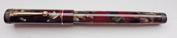
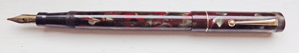
I’ve written about the Leverless L205/62 before and the search box at the top right will find those entries.
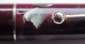
There are several truly outstanding Swan patterns and this is one of them. Some of those patterns score by their subtlety but this isn’t one of those. This is a bold and eye-catching pattern. So much so that I can’t have this pen as I would never get any work done with it as I would be constantly distracted by its glowing colours.
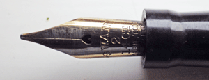
The nib is one of those that has a dip just before the tipping material. This has the same effect as Sheaffer’s tip-tilted nibs or the Waverley dip nib. It makes for a very pleasant writer.