The Sac Debate

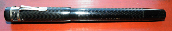
The discussion about sacs, silicone and otherwise, rumbles on. One unfortunate consequence is that some people are making a blanket condemnation of latex sacs. This is premature, at best. Those sacs that were sold as silicone previously, but are in reality a mixture of silicone and PVC, we are told, are much less flexible than latex sacs. Are the new, truly silicone versions stiff like them or fully flexible like latex? That’s not clear yet, or at least it isn’t clear to me.

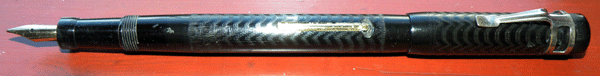
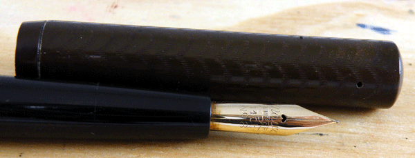
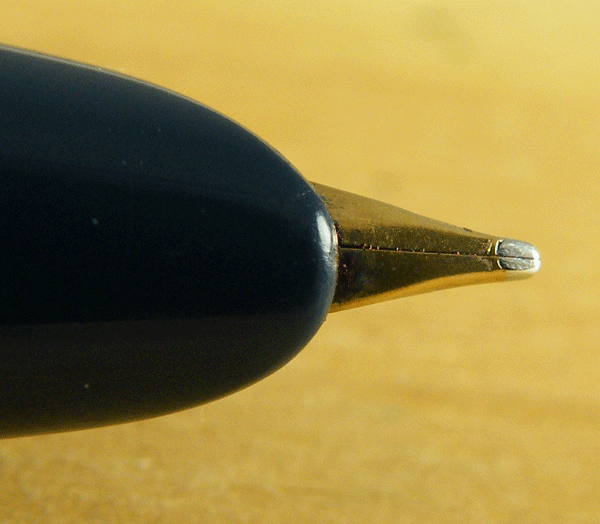
Old pens were designed to be used with latex sacs. Some – Conway Stewarts and Watermans come to mind – do not well withstand the added stress of a stiff sac on aging levers and lever boxes. If we are left without a sac as flexible as latex as a consequence of this debate, I forecast great demand for Conway Stewart levers and Waterman lever boxes.

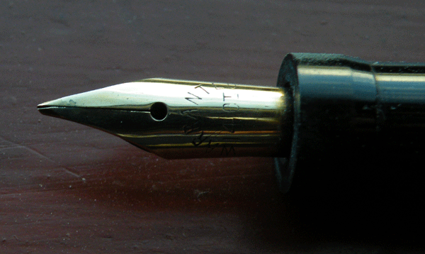
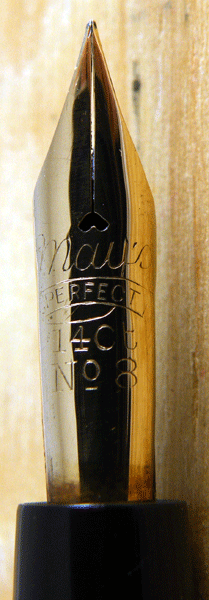
I think it needs to be said, too, that latex sacs are harmless and useful in all but a few pens. Some light-coloured pens like jade, lapis lazuli and some of the Waterman 1930s patterns like onyx do discolour badly due to the decay of latex sacs. However, if you have a celluloid or casein pen of almost any other pattern, it will be entirely unaffected.

Silicone sacs are not a universal panacea. The pattern of discolouring in many pens suggests that there is more than the sac at work. Other rubber components like inner caps and sections appear to add to the problem. It may be, of course, that after 60, 70, 80 years the material in these components has finished outgassing and they’re no longer harmful. But do we know that?

Finally, let’s not rush to too favourable a judgment on the new silicone sacs either. Surely we have learned now that in the pen world, it often takes years or decades before problems become evident. We are assured – and I have no reason to doubt it – that silicone is inert and therefore harmless. But is it adequately durable? Time will tell.

I caution against speedy decisions which we may repent at leisure, particularly with regard to the idea that we should dispense with latex sacs.

The Forward 45 Lever Filler

DSCF9468

Spicer Bros. Ltd. of London was a pen manufacturer which existed from 1917 to 1926*. They made stylos, the Tudor pen, the Kingscote pen and this one, the Forward Pen. Made from black chased hard rubber, the Forward 45 is a large pen at 13.8cm capped. It reminds me of the the Mabie Todd Blackbird BB2/60 in its size, shape and long filler lever.

DSCF9473

The warranted nib is about the size of a Swan No 1 but it’s dwarfed by the pen. A clipless pen, it has been fitted with a rather unusual accommodation clip. It’s a decent pen, and it would be interesting to see the other pens this company made, especially the Kingscote which carried a 6 months supply of ink tablets in the cap*. All are unfortunately rare now.

DSCF9470

Excuse the quality of the pictures which were taken quickly with flash rather than with a full light-box setup.

With the exception of a very few, all the pictures in this blog were taken with my trusty old Fujifilm S8100fd. It took thousands of fountain pen pictures for the blog, eBay, my sales site and the pen discussion boards, as well as the use it got on our travels. It was the perfect camera for close work and it never gave me a single problem until yesterday. After taking these Forward photos it failed in a very final way. I’m sorry to lose it but it certainly didn’t owe me anything!

Fujis have, over the years, served me better than Canons or Nikons and I plan to stick with them. After looking into the best macro cameras around at the moment, I settled on a Fujifilm X 10 and that should arrive in a day or two.

*Stephen Hull, The English Fountain Pen Industry 1875 – 1975.

The Pento “Truda”

DSCF9439

This one is quite a rarity – a Pento “Truda” eyedropper, made by W.J. May & Co Ltd of May pen Works, East Twickenham, London. The company had a short life, from 1923 to 1928 when it failed. It’s probably most famous for the Pento Capless but it made more conventional eyedroppers and lever fillers as well.

DSCF9440

This example, probably one of their earliest pens, is a straightforward eyedropper filler in black chased hard rubber with a slip cap. Perhaps its most eye-catching feature is the splendid May’sPerfect No 8 nib. If quality were all that it takes for a company to survive, Pento would be with us yet, because this is a very well-made pen. A combination of low investment and development costs of a new and complex pen seem to have been the cause of the company’s demise. DSCF9443

The “Truda” (I wonder what that meant, if anything) is a memento of a briefly-lived early pen company, but it is more than that. It’s an excellent pen that suggests what we may have lost in future models through the company’s untimely end.

DSCF9436

Problem With Silicone Sacs

For years now we’ve been in the habit of putting silicone sacs in our most delicately coloured pens. Now, it turns out, they were not silicone at all, but PVC, which, through time, will release a plasticizer that will attack any other plastic it is in contact with.

This comes from David Nishimura (Vintagepens) and he has uploaded a video to YouTube which explains how to test sacs to determine whether they are silicone or PVC. Mark Hoover and David Nishimaura will be producing injection moulded silicone sacs, so there will be an assured supply in the future.

I’ve no doubt there will be more to be said on this subject. I think the hobby is entitled to feel a justified sense of grievance against those who fraudulently sold us PVC sacs under the pretence that they were silicone. Many valuable pens have been put at risk.

David Nishimura never fails to impress. Among all the many luminaries of the fountain pen world, he’s the one person I think of as a true, all-round expert.

Parker “17” Super Duofold

DSCF9391

Looking around the web, it seems that the Parker 17 appeared in many guises during its ten years of production.

This is a Parker “17” Super Duofold, to be precise, and it’s quite well appointed with its broad gold plated cap band and double jewels. This one was bought by – or for – its first owner on 12th September 1970, so it’s quite a late model. I’ve never had one of these before, though I’ve seen plenty around – they appear to have sold very well – and I’ve enjoyed giving it a test run.

DSCF9398

Visually, it’s not quite my style of pen, with its hooded (though otherwise normal) nib. I find with these pens that I have to look closely to see if I’m holding it properly because the hood and nib arrangement is so indeterminate. You always know where you are with an open-nibbed pen. Otherwise, I approve of it. It writes well and it’s light and well-balanced when posted. Using it, I was constantly reminded of the Parker 45.

DSCF9397

This example has been well looked after, or perhaps little used. It looks good with the contrast between the gold plating and the very dark blue plastic.

I’m not sure what was the top of the Parker range during this period but despite the use of the Duofold name, I’m fairly sure that it wasn’t this pen. It’s a more than adequate pen, and it’s certainly a better pen than much of what Parker has produced since, but it lacks the feel of quality that, for instance, the Aerometric Duofolds or the Duofold AFs had.

The Conway Stewart 15

DSCF9410

The No 15, along with the short-lived No 16, appear to have been the economy lines in the range of pens that Conway Stewart issued in the early nineteen-fifties. The patterned ones were made from casein, and beautiful though they are, they are less interesting to me than the single-colour pens, which Jonathan Donahaye believed are made of celluloid acetate. I’m not sure how he came to that conclusion. Perhaps he had a better sense of smell than me, or maybe he accidentally set one on fire. Casein doesn’t burn well but a celluloid pen in flames is memorable.

I had a No 15 in the colour that Jonathan described as “deep brown” arrive the other day. As luck would have it, among my stock was a No 475 which he had described as “uniform chocolate brown”. Comparing the two, they seemed identical to me. I should have photographed the two together, but the 475 found a buyer and is at present winging its way to him, courtesy of Royal Mail. So it goes.

In any case, I would swear that colours, and hence in all probability the materials, were the same. The 15 and 475 also share “uniform forest green”. Is this enough to say that there is a relationship between these pre- and post-war pens? Both are at the economy end, neither have cap rings and both come in innovative colours and patterns that don’t occur elsewhere in the production of their respective periods. Is the CS 15 in some sense the successor to the CS 475?

DSCF9406

The brown almost comes across as black in photos, so here it is with a black Swan.

The Conway Stewart 15 comes in two sizes, the larger at 12.9 cm being the same size as the commoner CS 75, and the smaller one half a centimeter less. The uniform coloured ones especially are an exercise in minimalism, being about as plain as a pen gets. The nib is smaller than that of the CS 75 and it has a different profile, being more wraparound in the style of the CS388 nib. Minimalist or not, it’s a handsome little pen, except for the clunky plastic stud that retains the clip. That does detract from the pen’s appearance, and it suggests that the pen was made to fit a price.

I like the CS 15s, though, and I’m glad to have finally found a deep brown one. I need a forest green and a deep blue to make the set. To be exact, there’s also a grey, but like all nineteen-fifties greys, whether by Conway Stewart, Parker, Swan or Wyvern, they tend to take on a yellow discoloration and are hence less attractive, so I might forget about that one.

A Swan Surprise!

I wasn’t expecting any pens in the post today. I had bought some over the weekend but it was too soon for them to arrive, but the post-lady had left a decidedly pen-like package on the doormat. A cursory glance showed that it wasn’t UK, but from the USA. The mystery deepens…

DSCF9211

It turned out to be a gift from a customer who has become a friend, and a wonderful gift it is too!

DSCF9215

Pens of this type, some with a fixed clip, others, like this one, without, were produced by Mabie Todd USA for what seems to have been quite a short period in the early nineteen twenties.

DSCF9218

These gold-filled pens were made in a variety of eye-catching machine-chased patterns. So far as I can discover, no-one has taken the trouble to list all the patterns and link them with their original names, as David Nishimura has done for the gold-filled Wahl pens. This is a lined pattern with a twist every few millimeters. At a distance of a few inches, these appear star-like and twinkle in the light. It makes for a stunning pen that changes as you move it in the light, and defies the camera to catch all its beautiful effects.

I will always treasure this pen.

Business Almost As Usual

My first pen acquisition of 2013 arrived this morning, a nice black Canadian Duofold from the 1940s. That’s all I’ve bought this year so far because the prices have been nuts since Christmas. Pens that I would normally buy in at £30 have been going for £10 – £15 more. It must be everyone spending their Christmas present money. Next wee things will return to normal, I expect. Luckily I had quite a backlog of stock awaiting restoration. I had promised myself a month off but after about three days of bad television and overeating I was glad to get back to the workbench.

I’m working through about a dozen restored pens today in preparation for uploading to the website. I’ve write-tested them. Next is photography, followed by photo-editing and writing descriptions. With any luck I’ll get them uploaded on Monday, but I’ll announce it here in any case.