A Copper And Brown Marbled Kingswood

IMGP3640

At 12cms capped, this is a shorter than average Kingswood.

IMGP5091

It’s also unusual in that it has a single broad cap ring giving the appearance of a narrow/medium/narrow set of rings, something I have occasionally seen elsewhere but not, to my recollection, on a Kingswood.  Posted, it’s a respectable 15cms so it isn’t so short as to be uncomfortable in the hand.  The plating has just about gone from the trim, but that’s usual with these pens.  The rich copper and brown marbled celluloid more than makes up for it.
IMGP5094
This pen doesn’t have the usual Eversharp nib but a warranted 14ct nib which may or may not be a replacement.  In any case, it’s a superb nib as the writing sample above shows.
IMGP5090
My guess would be that this pen is a product of the Langs factory.  It’s a lovely pen, in appearance as in the pleasure of writing with it.

Aurora Auretta

IMGP5082

I only bought these because they are stylish in a sixties sort of way, and so that I could say I own a couple of Auroras.  Accepted, they’re not quite the the three thousand-odd quid creations of today, but all the same…
IMGP5083
These are inexpensive cartridge pens aimed at the school market.  There have been many Aurettas over the years, all rather different from each other.  I’m not sure when the version I have was made – it looks like sixties styling but I’ve seen it dated to the eighties.  Either way, it makes a memorable pen.  The attachment of the clip to the cap reminds one of the accommodation clips of the early twentieth century.

IMGP5085The nib is quit unlike any other, though it has the nearly flat profile of the Parker 180 or Classic.  The colours are bright and strongly contrasting.  Adults who manufacture things often assume that bright, contrasting colours will attract young people, but I’m by no means sure that that is true.  It’s more than a little condescending.  We know that babies appreciate bright colours but by time that they’re in high school they might well want to put that behind them and go for something more subtle.  But who am I to criticise corporate designers?  Actually, I like the colour schemes very much, but then I’m just a little kid at heart.
IMGP5087
They’re eye-catching, comfortable to write with, cheap and that strange nib writes well.  I approve!

Mea Culpa!

I’ve had a couple of people kindly inform me that the last pen I wrote about is not a Parker 180 but a rather later Parker Classic.  This only goes to show that I can get things wrong too!  In fact, I get things wrong quite often, but my trusty readership usually sets me on the correct path, for which I’m duly thankful.

As people search these pages for information on pens they’re interested in, I think the best thing to do is go back and completely edit the article.  Otherwise I’m going to be unintentionally misinforming people.  But I’ll do it tomorrow, because now I’m going to go and put my feet up and watch a movie.

The Parker Classic

IMGP5069

It may be a slight eccentricity, but I like the Parker Classic.  I like all those pens that show an edge of experimentation, especially where nibs and feeds are concerned, and there can be little doubt that the Cl;assic was an experiment – one that succeeded rather well, especially from a marketing point of view.  The rather space-age nib/feed/section unit caught the eye of buyers and the pen was surprisingly popular.  It came in a wide variety of finishes, some quite expensive.  This rather more humble brushed steel Flighter GT was introduced in 1993.
IMGP5075
The nib is almost flat, having only the very slightest curve that you see on normal pens.  Part of Parker’s idea was to make a very robust nib, as writers used to ballpoints were bending fountain pen nibs left, right and centre.  It’s quite effective, I think.  They seem to have survived in quite large numbers, anyway.
IMGP5072
The Classic is the successor to the Parker 180 and there are considerable similarities both in the shape of the nib and in the style of the pen as a whole.
IMGP5074
The Classic Flighter GT went out of production in 1994 and this pen appears to have worn quite well through the intervening years.  The gold plating does have a spot or two of wear but otherwise the pen is in very good condition.  It has the Parker syringe type of converter.  All in all, I like this odd pen with its radical nib.


Thank You!

Many thanks to those of you who answered my question yesterday.  I’m pleased to say that the responses were much along the lines I imagined they would be, and that writing samples are actually useful.  It would be well worth while going to Fountain Pen Board to see what Christoph does for a writing sample!

Writing Samples

Someone in FPB raised the subject of writing samples.  Not many sellers do them, it seems.  There could be a couple of reasons for that: if your writing is a chicken-scratch you might be reluctant to expose it, though I would have thought a cross-hatch illustration of line width might still help.  Also, if your customer base is collectors rather than writers it might be a bit pointless.

Admittedly we all write differently and this can affect how the pen performs.  Different inks and papers can make a big difference.  My own view is that with all its shortcomings, a writing sample still gives an idea of the line a nib would produce under normal writing circumstances.  I think it’s better to provide a writing sample and from the feedback I get from my customers, many find it helpful.

What do you think?

Decline And Fall?

There’s a widely-held view of cultural history that sees development as being early, worthy beginnings leading to a great flowering, followed inexorably by a descent into works that are technically and morally inferior.  Applied to Italian painting it gives us the worthy early beginnings of, say, Cimabue and Giotto who rose above their contemporaries and tried to make an art more representational of the world they saw around them.  Then there’s the great florescence of the High Renaissance, when the practical difficulties of representing space and the human figure were behind the great masters, the Piero della Francescas, the Botticellis and the Leonardos who turned out a masterpiece a week, it seems, and whose paintings still make us gasp in astonishment today.  Then the decline creeps in with Mannerism where artists like Parmigianino, Pontormo and Bronzino are seen as not only representationally less accurate, distorting forms to serve an emotional purpose, but also morally a little suspect, with a whiff of perversity in the air.  Then painting sinks into the Baroque, over-worked, over-theatrical and overbearing.  Art has lost its high moral purpose and become spectacle.

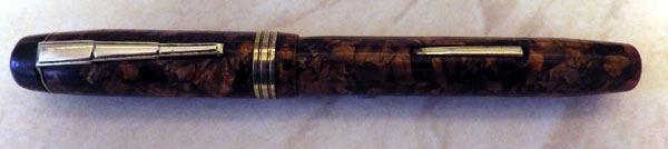
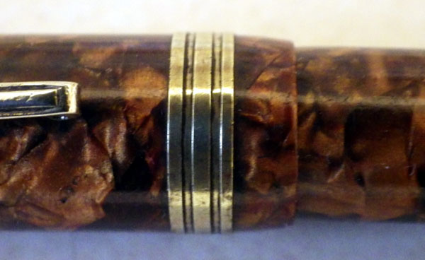
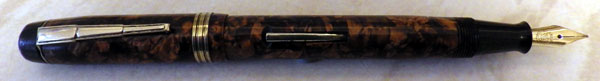
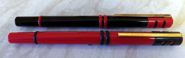
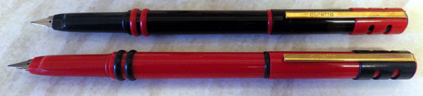
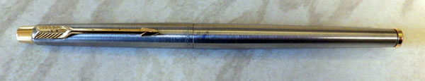
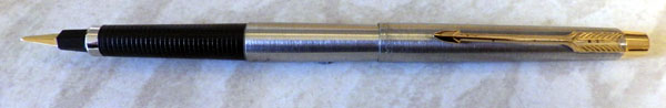
I don’t want to get into whether this is an accurate description of the progress of an artistic movement.  As paradigms go it’s adequate and it’s a view of Western Art that prevailed some years ago and probably still does, to a great extent.  But (and you’ve waited long enough if you’ve got this far) does it apply to pens?  Could be said that the early, hard rubber eyedropper-fillers were the Giottos of pen history, striving towards a perfection that remained out of their reach?  That would make the pens of the Golden Age, when the technical difficulties had been overcome – the colourful Conway Stewarts, the Dorics and Patricians – the High Renaissance.  Baroque, of course, would be today’s pens, when purpose so often gives way to form, when limited editions are produced that will never leave their boxes.

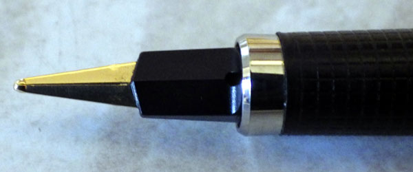
Is that right, or might it be done another way?  Might it be that the over-engineered pens of the thirties to the fifties, the Vacumatics, the Touchdowns and the Snorkels are the Baroque, and today’s pen industry is something else?  Maybe.  Maybe today’s industry is the Jack Vettriano of the pen world, cynically turning out expensive and tasteless anachronisms for an undiscerning public.

I don’t know, but I do like the idea of a High Renaissance of pens, pens so good that they still make us gasp in wonderment today.

Today’s Uploads And More On The Parsons Italix

I’ll be uploading about 20 pens to the sales website today, many boxed Conway Stewarts among them and quite a few flexible nibs too!  Keep an eye on the site as they’ll be popping up within the hour.

I had an email from Peter Ford of the mrpen website.  I had said that I believed the Parson Italix pens to be Chinese.  He informed me that they are, in fact, made in a workshop in Crewe.  I’ll add that as an edit to the original blog post.  It’s one of those occasions when I’m delighted to be proved wrong – it’s a very good thing that we’re making these excellent pens in this country and it makes me appreciate my pen even more.

I’ve been using it quite a lot – that’s how good it is – and I’ve revised my earlier opinion.  It is too heavy for long periods of writing in the posted position.  Without the cap it’s fine, but I could feel the strain building up in my thumb and wrist from the leverage of the heavy cap.  I always write with my pens posted but this will have to be the exception.  It feels a little funny but I’m sure I’ll get used to it.

A Gold Plated Swan Safety Screw Cap

IMGP4772

In the early days of Mabie Todd production in Britain, gold nibs and overlay pens whether plated or solid gold were still made in America.  British and American models were the same at that period, and this pen appears to have been overlaid on a Safety Screw Cap base.  They’re not particularly common in overlay form.
IMGP4776
Though it fits and writes well, the No 3 New York nib looks disproportionately big and I suspect this is really a No 2 or even a No 1.  Posted, it makes a very long, slender and elegant pen, its lines unbroken by either lever or clip.  All that interrupts the pattern is a discreet empty cartouche.  This is the last of the Swan eyedroppers; such clean lines will never be possible again, either with lever fillers or leverless pens.
IMGP4774
Despite being metal-covered, the pen is very light.  It’s a pleasure to write with.  By this time Swan had adopted the ladder feed, so ink flow is well controlled.  The plating is worn at each end and there are a couple of tiny dings on the end of the barrel that must be tooth-marks, so it wasn’t always treated with the respect it deserved.  The Safety Screw Cap range was in production from around 1911 to at least 1925.  Its continuing popularity ensured that it overlapped with first of the lever fillers.   This pen might be a hundred years old but is probably a few years less.

Parsons Italix Originalis

IMGP4762

It’s a rare occasion that I buy a modern pen, but I had heard such good things about the Parsons Italix in recent months that I wanted to try it for myself.  Though you can buy the Italix pens at Amazon, their home appears to be the MrPen website.  I had a poke around the site and settled on the Originalis model, with which you get two additional nibs at no extra charge.  I opted for a broad oblique italic, a medium oblique italic and a medium italic.  By time I paid tax and shipping, the total came to £67.81.
IMGP4765
The pen comes in a plain black box in a white cardboard sleeve.  Not at all fancy, which is good as I prefer that my money goes toward the pen rather than the packaging.  The pen, I would say, is undoubtedly Chinese with the lacquered brass body and gold-alike trim.  You may find that the colour of the pen you receive differs from the image on the website.  My “red velvet” isn’t as bright as the photo on the site.  Good thing too.

The build quality of the pen is good, at the higher end of Chinese-made pens.  It all goes together perfectly and I can find no fault with it.  It is quite heavy, though.  At 32 grams it’s several times the weight of my usual pens, but I must say that it doesn’t feel that heavy in the hand.  It’s really quite comfortable to use, even posted.  The gripping area, which is part of the nib rather than of the pen, is equally comfortable.  The nibs (which are what this pen is about) are marked “Manuscript” together with the nib size.  They’re untipped plated steel and boy are they smooth!  Like any italic, you have to address the nib to the paper at the correct angle and having done so writing becomes an absolute delight.  I am most impressed.
IMGP4767
I’m also impressed by the choice on offer.  It was only the other day that I was complaining about the poor choice offered by many of today’s manufacturers of high-priced pens.  This quite low-priced pen shames them all and ensures that you will get the nib that suits your hand, rather than the compromise that you have to make with the stingy offerings of some others.  That makes for value for money!
IMGP4768
For calligraphy fun or everyday use, I can heartily recommend this modern pen – something I didn’t really expect to be saying!

Edit to add:  I received an email from Peter Ford:

Loved your blog, and appreciate your constructive comments. Only one thing,
the pens are not made in China, they are made in a workshop in Crewe,
England. Thanks again.

Peter

Peter Ford
at P. J. Ford & Associates Ltd
This is one occasion when I’m delighted to be proved wrong.  It’s great that we’re making these excellent pens in this country, and I value my pen even more as a result of this information.