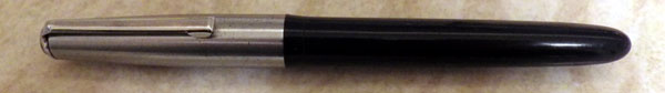
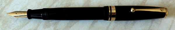
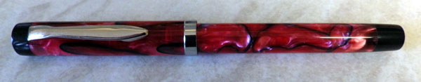
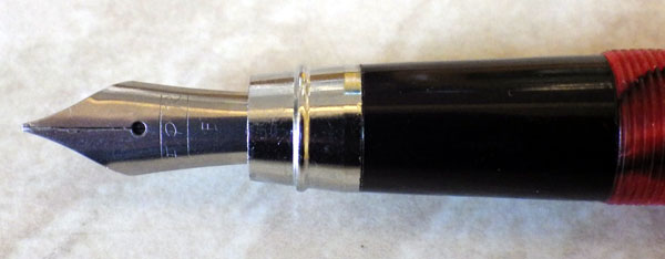
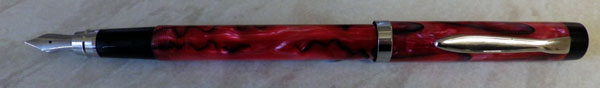
The only Indian pens I’ve had have been two Walitys, a medium-sized piston-filler (good) and a large eyedropper filler (dreadful), so I thought I might try something else from there as the pens are so inexpensive. After looking through the plethora of pens available I settled on Fountain Pen Revolution and and chose their Triveni Acrylic. According to the blurb: “The Triveni Sangam is a confluence of 3 rivers in India. The handmade Triveni accepts 3 fill methods (converter, eyedropper, cartridge).” That makes sense. The pen cost me the princely sum of $45 (around £28 – £29). It arrived this morning. First impressions: it’s very long at 14.7cm. The red and black acrylic is translucent and very beautiful. The black tassie and blind cap set it off very well. (These serve no purpose other than the aesthetic) The fine nib is a nail. The pen takes two and a half turns to close, which feels like a lot. The chrome-plated metalwork is good.

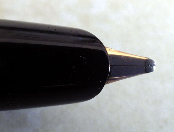
The syringe-type converter takes up a mere two-thirds of the barrel length, so the excessive length seems to be catering to modern tastes rather than serving a practical purpose. The pen would be much better if it was 2cm shorter. Thankfully Indian manufacturers seem to work honestly with their materials, unlike the Chinese who often bury lumps of brass pipe in their pens. This pen, then, is the combination of the acrylic and a little thin metal, so it’s very light indeed, perhaps even at the lower end of acceptably light even for me, and that’s saying something. The section is black plastic at the top. That’s where I’d grip it and it feels comfortable. Further down it’s metal. Aesthetically, that seems like a mistake and I’ve known metal sections to corrode severely when in contact with ink. The nib seems well enough made but it is noticeably scratchy. I think that’s a function of the shape of the tip which is quite angular. A spell on the micro-mesh may well cure that. However, as I said above, the nib is an absolute nail. I’m inclined to feel that with a nib like that, this is the pen for the person who wants no more from a fountain pen than he gets from a ballpoint.
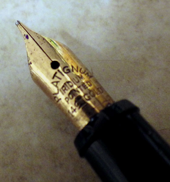
Another thing about this part of the pen: though this is a normal-sized nib, similar to a Swan No 2 in size, the excessive length of the barrel makes it appear very small and out of proportion with the rest of the pen. If the pen is to be so very large, a bigger nib would look better. The feed appears to work well but I haven’t used the pen enough to be sure.
I’ve been critical of those things about the pen that I don’t like, but overall this is a well-made pen. All the parts fit together perfectly with a much finer tolerance than I’ve seen on much more expensive pens. For instance, if the Sheaffer Intrigue of less than fond memory had fitted together as well as this pen, it wouldn’t have turned out nearly the bow-wow that it, sadly, is. With some nib work it will probably be more pleasant to write with and I believe that FPR supply a flexible nib, which might be the way to go. I can’t see this pen becoming one of my users, but I bet there are plenty of modern pen buyers out there who would find it impressive for the small amount of money it costs. Finally, almost anything could be forgiven because of that delightful acrylic. It looks good in blue or orange as well.