A 1915 Swan Advertisement

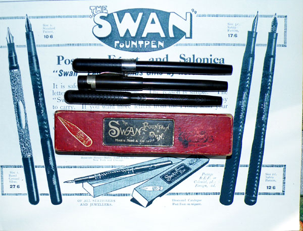
When we think of World War I, we tend to envisage the vast killing fields of France and Belgium where a generation was thrown away in futility, but there were other theatres of war. I stupidly covered up the advertisement’s headline, but it is, “Post to Egypt and Salonica “Swan” pens as Christmas gifts by November 27”. Though the ad is not dated, both the Egyptian campaign, to protect the Suez Canal from the Turks and the expedition to Salonica (now Thessalonika) to help the Serbs against the Bulgarians began in 1915. In 1915, then, you could buy a Swan 1500 for ten shillings and sixpence. Nowadays, good examples can change hands for in excess of £150.

I’m unfamiliar with the pen illustrated on the far left but it appears to be a shorter version of the 1500 with a sterling silver overlay. The two pens depicted on the right are Swan Safety Screw Caps, one with a No2 nib, the other with a No 3.

I’ve included a contemporary box, two versions of the Swan Safety Screw Cap No2 and a 1500.

A Touch Of Luxury, Edwardian Style.

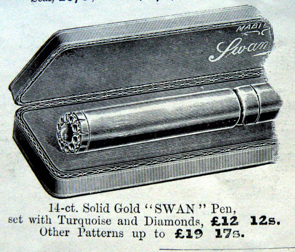
The year is 1911. The British Empire is at its peak. The country is enjoying the rising tide of Edwardian prosperity. God’s in his heaven and all’s well with the world. So what do you give the man who has everything? One of these new-fangled motorcars, perhaps – maybe a Daimler-Benz or a De Dion Bouton? No. You give him one of these.


Judging by the shape it’s a safety pen and it’s made by Mabie Todd & Bard for the princely sum of twelve guineas, or more if you want to go for an even higher specification. I think if ’twere me, I’d settle for this one. Solid gold, turquoise and diamonds is enough. More would be vulgar.

It’s pretty well impossible to calculate how much that would be in today’s serially devalued pounds and pennies, but it can be put in perspective by noting that the company’s cheapest writing instrument, the Cygnet No 2 Stylo, cost five shillings. For the price of one solid gold Swan with its turquoise and diamonds, you could buy fifty-seven stylos and still have change left over.

I have to concede, then, that ridiculously opulent pens were targeted at people of scant wisdom and poor taste even before the age of Krone and the Limited Editions. Still, at least it doesn’t have Swarovski Crystals or a fragment of the DNA of some luminary or other. For all I know, you may even have been able to write with it. I can’t say with any certainty, as this pen has not yet crossed my humble workbench.

Mabie Todd Swan Calligraph 3170

I wrote about Calligraphs back here http://wp.me/p17T6K-bM. As I said back then, Calligraph can be a bit of a misnomer because so many of them are perfectly ordinary non-calligraphy pens. However, sometimes you come across one that lives up to the name and once in a while you come across a sort of strange Wondernib that does everything. How does Oblique Italic Flexible sound?

It’s a true italic, sharp-edged enough to dig into the paper. It is tipped, unlike some other italic nibs. It’s oblique and, quite unexpectedly, it has oodles of flexibility! I managed a cursive writing sample with it but it wasn’t a comfortable thing to do. It wanted to dig into the paper on the upstrokes, as any good italic should do. Flexibility in this configuration of nib feels really odd. I can’t imagine what writing style they had in mind for this nib but any calligrapher with a creative and innovative spirit would have the time of his life with it!

The pen model number is 3170, that is, lever filler with a No1 nib, colour code 70, which is one of those that I haven’t seen defined anywhere. I’ll say teal, for the moment, though I’m not entirely pleased with it. Cobalt comes to mind, but there’s a hint of green here that cobalt doesn’t have.  This is the first – lever-filler – type of Calligraph, by far the best version

A 1913 Swan Advertisement

Mabie Todd, it must be said, always produced stylish adverts. This is true, in fact of most early fountain pen promotional imagery; the commercial artist is often undervalued but he or she is a true artist. The area of work within which he practices is irrelevant except to those who imagine that the value of art is expressed in those grotesque sums of money thrown around at Sothebys or Christies as the obscenely wealthy vie at the pig trough of self-aggrandisement.
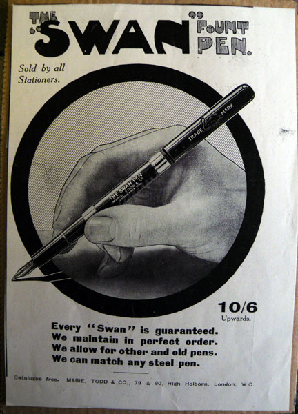
 

The heading is in that strangely arresting, bulging text that Swan used for a few years. It’s followed by a little message in italic: Sold by all Stationers. That doesn’t need to stand out. This is 1913 and Swan is king! You would know where to get one. Then there’s the price – 10/6 – in very bold text with underneath, not so noticeable: Upwards. I think the message is to concentrate on the 10/6 and ignore the fact that the model illustrated, with its two barrel bands, will likely cost a lot more.

Then, in a bold sans serif font, is the company’s main message, reassuring and accommodating. The language is a little obscure to us now. You’ll be pleased to know it’s guaranteed and can be kept in good order. Like Waterman, Swan will fit any nib you want, including your own. To order, prospective purchasers sent a steel nib that replicated the gold nib that they wanted – fine, medium, broad, stub, oblique – whatever the customer desired, Swan could produce. And finally, in small print at the bottom, the address to write to for a free catalogue. Would that I could get that catalogue now!

The ring around the hand concentrates the eye wonderfully. The hand is behind the ring, the pen before it. Though impossible and a little Escher-like, this makes the pen the centre of your attention, and it is drawn in much greater detail than the sketchily-drawn hand. The pen breaks the “frame” of the circle in two places, and its shadow does so in a third. This play with the concept of space harks back to the Post-Impressionists’ borrowings from Japanese prints a generation earlier.

I’m sure some among you can put me right if I’m wrong, but I believe the term “fountpen” was only used by Mabie Todd, though on both sides of the Atlantic. I don’t think it means anything in the sense of specifying a particular sort of pen; it’s just a catchy term that stuck around for a while then faded away.
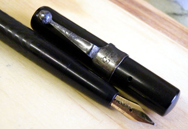
 

I’ve yet to own a Swan Fountpen, but I have had a Blackbird one. The Blackbird Fountpen eyedropper filler appeared in 1921 and had no more than a superficial resemblance to its older Swan sibling. Gone is the over-and under feed, replaced by the spoon feed that Mabie Todd experimented with for a while before settling for their ladder feed. The high dome of the Swan has become a very shallow one, almost a flat-top.


Very slender, the pen is long at 17cm posted, but so light that it balances well in the hand. These pens are not especially common. Perhaps they were a carefully inexpensive pen, keeping the cost down by sticking with the now outmoded eyedropper, when self-fillers were the coming thing. I imagine they were overtaken in sales terms quite quickly and were quietly removed from the market.
The Swan SF2 Revisited

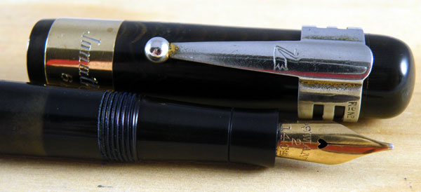
The Swan SF2 is a big pen by any standards. It’s 14.3cm capped and a magnificent 17.7cm posted! Being black hard rubber it isn’t heavy, but the addition of a very broad 18ct cap band and an accommodation clip overbalance this old fellow slightly.

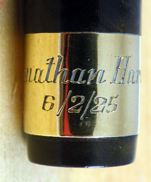
As you can see, there’s no difficulty about dating this one. That’s only one of the reasons why I enjoy personalisations, especially when they’re as well engraved as this one. Sad to say I don’t know who Jonathan Hardy was. There’s the New Zealander actor, but I don’t think he’s old enough.

As you can also see, this one’s Mabie Todd through and through, with the patented Swan Clip attached. You might notice that once upon a time the clip was gold plated but there’s very little left. I think we can forgive them that, as the one bit of plating on the pen, the lever, is in good order.

Still a great writer.

I must remember not to wear a red shirt when photographing shiny pens…

A 1937 Swan Advertisement

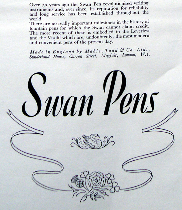
As I’ve said before, the pen is the primary source of the history of our hobby. It’s a great source – solid, three-dimensional and capable of being dismantled but it isn’t voluble. What you see is truly what you get and once you’ve examined it there is no more. Barring someone dropping all of Mabie Todd’s accounts, technical drawings and spec. sheets on my bench (and if one of you has them, c’moooooon!) adverts are the next best source. Even in a simple advertisement like this 1937 coronation example, there’s lots of information.

I’ve broken the advert up into three parts because it’s so long.


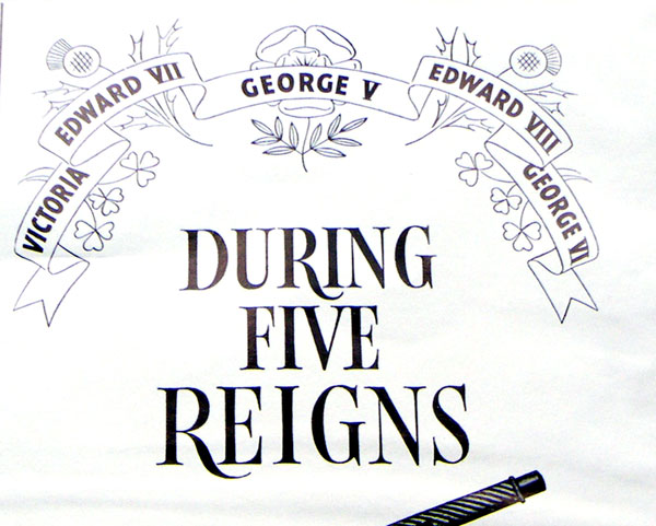
As well as Swan’s ever-present good design, there’s no false modesty here! This is a company at the top of its game. Associating oneself with royalty is rarely a bad move (in Britain, anyway!*) and linking their history to five reigns emphasises the length of time the company had been around. It makes their existence a historical era, rather than a simple span of years.


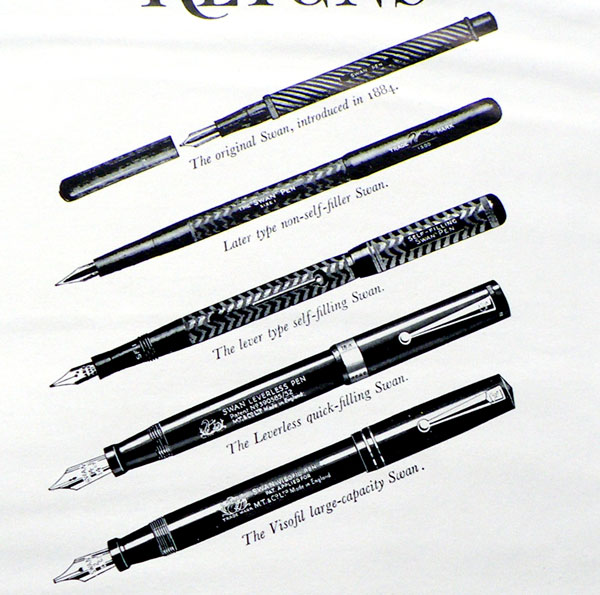
The selection of pens is interesting. The first one chooses itself, pretty much, because it is the first one. The second is the glorious 1500. The third isn’t readily identifiable; it’s one of the lower-priced early thirties pens that everyone seeing the advert would be familiar with. The Leverless appears to have at least a No4 nib, so it’s a big ‘un, and the Visofil was just relaunched as Mark II in that year.  There were so many other pens they could have included but didn’t.  Why would that be?  Discuss, in not more than 1500 words.


The carefully-prepared copy at the heart of the advertisement, with some flourishes and a very attractive version of the constantly ever-so-slightly changing Swan logo. The company seems here to be putting its hopes for the future in the Visofil, but it didn’t work out that way. Very attractive, a little fragile and quite high-priced, the Visofil never achieved the sales of the Leverlesses and Self-Fillers.

* In France in 1789 it wouldn’t have been nearly so clever…

Mabie Todd Swan SM205/83

It was maybe bad timing, but who knew? Mabie Todd chose 1939 to launch a whole new range of pens including the lizardskin Leverlesses and the snakeskin Self-Fillers. Due to the exigencies of war, neither reptile is especially common now, the lizards less so because some of those plastics are reported to have proved unstable leading to splitting in barrels and caps.


This one’s a blue snakeskin SM205/33 with a black hard rubber lever, black ends to cap and barrel and a black hard rubber section. Apart from a little chipping on the lever and a tiny loss of gold on the ball end of the clip, the pen’s in great condition. As is usually the way with snakeskins (I’ve had the good fortune to own quite a few, however temporarily) this pen has a exceptional nib, stubbish and flexible, conferring a lot of very easily accessed line variation.


I often try to evaluate the pens that pass through my hands on a scale of 1 – 10. Because I generally enjoy whichever pen I’m working with at the time, they mostly end up being 10s. However, being as objective as I can, being parsimonious with my admiration and allowing for its faults, on that 1 – 10 scale, this one’s a 15.

A Wartime Mabie Todd Swan 1500

I wrote about the Swan 1500 before, back here: http://wp.me/p17T6K-1Q but this one is a little different.


This is the pen made in America for the British market during the First World War. They turn up from time to time and, if this leaky vessel I laughingly call my memory serveth me aright, there was a discussion on this subject in FPN only last week. My guess would be that the pens were imported from the American parent company because, with so many young men being sent overseas, demand for pens was at an all-time high so that correspondence could be kept with absent loved ones. It may be that, as in the Second World War, domestic effort was transferred from making pens to munitions manufacture. It does tell us, though, that in 1914 the British and American arms of Mabie Todd still worked closely together, and it may well be that the relationship remained stronger than has previously been accepted for decades thereafter.


The pen itself is a thing of beauty, slender and elegant, and in this instance, unfaded and with all its imprints and chasing fresh and crisp. Add a Swan Metal Pocket to clip into the inside pocket of your black tail-coat over your pin-striped trousers and you could be the Man From The Ministry, ready to send another few thousand soldiers over to fertilise the fields of Flanders with a single stroke of this very pen.


This pen is original in every respect with its New York nib and its over-and-under feed. Often, when 1500s arrive on my bench, they have ladder feeds. Whether, at some late stage, ladder feeds were installed at the factory, or whether they were retrofitted some time later, I cannot say. The 1500 writes splendidly in its original trim, but the ladder feed does make employing the flexibility that most of these pens offer rather easier. The ink flow keeps up better.


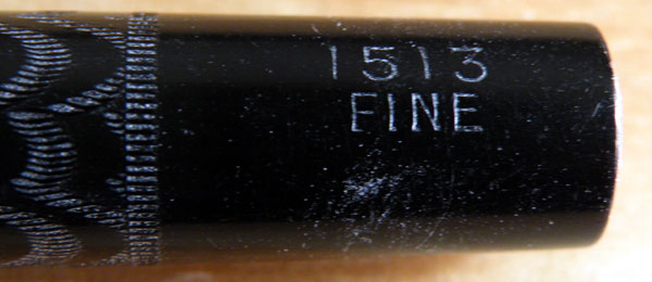
Note that the nib size is imprinted on the barrel. That means they made them in the factory as fines, mediums, stubs etc., rather than having the retailer fit the nib the customer wanted, as happened later.

The Big One – The Swan Leverless 2060

This is the big one. Though it is said that there are No 9 nibs, and therefore one would expect that there should have been pens that would accommodate them, and there certainly are a few No 8 nibs, most of us will never see a bigger Swan than this, the Leverless 2060. It’s true that some earlier Swans were longer, but the girth of this pen together with the lump of gold that is a No 6 Eternal nib give it an unequalled presence. The 2060 had a short and constricted production run and is therefore comparatively uncommon. There’s a story to this one.

By 1939 the Swan range had undergone a redesign. They had become shorter and thicker.

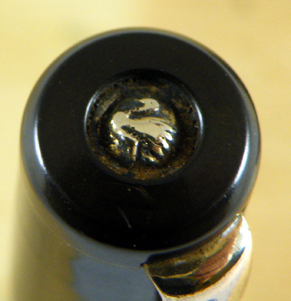
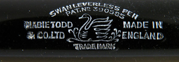
They were streamlined with a flat top and they carried a form of washer clip under a black cap top dressed off with a gilded Swan logo. The barrel imprint had the Swan logo to the left of the four lines of information. This is the “Type A” imprint. The Leverless range contained, as well as the highly-esteemed plain black businessman’s pen, an array of lizard skin designs in blue, green, garnet and pearl grey. They all carried the “L” designation in the form L—/–, L212/87 being the blue lizard, as an example. Mabie Todd had a superb range of pens, and I think it can be said that this was one of the great high points of the company’s history.

In September 1940 the main production facility at Harlesden was bombed. Production stopped for a time until premises were found at Golden Lane, and enough equipment was scraped together to resume manufacturing though at a lesser rate.

These pens bear the “Type B” imprint, where the swan sits centrally, and their identification is truncated to four digits, as with my 2060. Production of these pens, and the cheerfully coloured lizards, continued throughout 1941 and 1942, in what seems like a minor but worthy act of defiance against the horrors of the Blitz and the increasing austerity of wartime. In 1943 the Board of Trade began licensing pen production and these models disappeared.

It’s More Or Less A Clipless, Numberless Leverless

This one’s a clipless Leverless (doesn’t that just trip off the tongue?). Either V. Newby didn’t use his or her pen very much or she/he was very careful with it, because the chasing and imprints are like new, as is the gold plating on the rings.

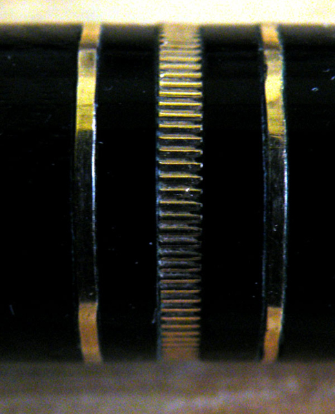
Now there’s a thing! I haven’t seen a ring arrangement like that before, with two plain narrow bands on either side of a milled band just broad enough to be called medium. The effect is very pleasing.

It’s not only a clipless Leverless, it’s a numberless clipless Leverless. I may be reading too much into that but quite a few of the early numberless Leverless pens that I have seen seem to vary from the usual trim. Could it be that these are bespoke pens, and this is a pen assembled to V. Newby’s own specifications?

In any case, it’s a superb pen with its crisp imprint and Swan image on the top of the cap. It’s a big pen at 13.7cm capped. The nib is a No.2 and it gives quite a bit of line variation.