The Conway Stewart Quail Stylo No 3


DSCF0919This little Conway Stewart began life as a stylo, the Quail Stylo No 3 to be exact.  It was subsequently converted into a fountain pen using a short, thick feed and a folded-tip white metal French nib.  I suspect that it didn’t work well as the inside of the section is stepped, meaning that the feed didn’t fit as it should.

DSCF0921

DSCF0924
I searched Stephen Hull’s Fountain Pens For The Million and The English Fountain Pen Industry but found no reference to this stylo.  There is no mention of it in Jonathan Donahaye’s list either.  Of those listed, it most resembles the Pixie 113 Ink Pencil.

Does anyone know anything about this stylo?

There seems little point in posting an enquiry to Fountain Pen Network’s Conway Stewart section as all those with a good knowledge of the brand left some time ago.  Sad business.  I’ve posted to Fountain Pen Board instead.

The Conway Stewart 15

DSCF9410

The No 15, along with the short-lived No 16, appear to have been the economy lines in the range of pens that Conway Stewart issued in the early nineteen-fifties. The patterned ones were made from casein, and beautiful though they are, they are less interesting to me than the single-colour pens, which Jonathan Donahaye believed are made of celluloid acetate. I’m not sure how he came to that conclusion. Perhaps he had a better sense of smell than me, or maybe he accidentally set one on fire. Casein doesn’t burn well but a celluloid pen in flames is memorable.

I had a No 15 in the colour that Jonathan described as “deep brown” arrive the other day. As luck would have it, among my stock was a No 475 which he had described as “uniform chocolate brown”. Comparing the two, they seemed identical to me. I should have photographed the two together, but the 475 found a buyer and is at present winging its way to him, courtesy of Royal Mail. So it goes.

In any case, I would swear that colours, and hence in all probability the materials, were the same. The 15 and 475 also share “uniform forest green”. Is this enough to say that there is a relationship between these pre- and post-war pens? Both are at the economy end, neither have cap rings and both come in innovative colours and patterns that don’t occur elsewhere in the production of their respective periods. Is the CS 15 in some sense the successor to the CS 475?

DSCF9406

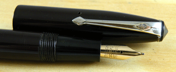
The brown almost comes across as black in photos, so here it is with a black Swan.

The Conway Stewart 15 comes in two sizes, the larger at 12.9 cm being the same size as the commoner CS 75, and the smaller one half a centimeter less. The uniform coloured ones especially are an exercise in minimalism, being about as plain as a pen gets. The nib is smaller than that of the CS 75 and it has a different profile, being more wraparound in the style of the CS388 nib. Minimalist or not, it’s a handsome little pen, except for the clunky plastic stud that retains the clip. That does detract from the pen’s appearance, and it suggests that the pen was made to fit a price.

I like the CS 15s, though, and I’m glad to have finally found a deep brown one. I need a forest green and a deep blue to make the set. To be exact, there’s also a grey, but like all nineteen-fifties greys, whether by Conway Stewart, Parker, Swan or Wyvern, they tend to take on a yellow discoloration and are hence less attractive, so I might forget about that one.
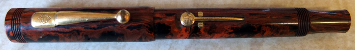
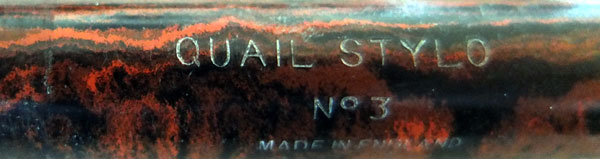
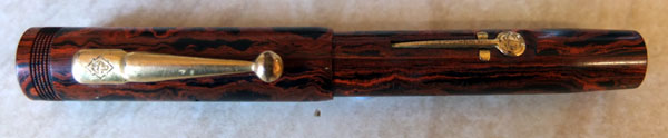
The WHS Self-Filler


Every now and again you come across a beauty that makes you draw your breath in sharply! This WHS pen, more than a century old and in superb condition is one such. These pens were supplied by Conway Stewart to various customers as an own-brand pen, but it is best known and most often seen as the W.H. Smith Self-Filling Pen. Conway Stewart didn’t actually make them, back in 1906, but bought them in from George Shand, a company later bought up by Jewel – such are the complications of the pen industry!

The pen is a simple syringe filler, perhaps not the best filling system ever devised, but welcome as a self-filler at a time when most pens were filled with an eyedropper. They appear with both generic warranted nibs and WHS nibs.

Just quite why or how this example survived in such perfect condition I can’t guess, but it’s as black as black can be and the patterning on the barrel is crisp and clear. Quite a wonderful accident of preservation.

Conway Stewart 479 Red Amber

Conway Stewart 479s turn up with some of the best colours of the pre-war pens. This one is in the pattern that Jonathan Donahaye called “red amber marble”. That’s a pretty good description. I’m not sure that these photos quite manage to fully capture the glowing colour, but they give you an impression, at least.

I’m one of those dull people who think pens are things that you write with, and if a pen writes well I do tend not to notice what colour it is, but even I look at that pen and go, “Wow!” It writes more than adequately well, as it happens, with a consistent fine line, but my goodness, isn’t it pretty!

This is one of the few occasions where I would consider buying a pen purely for its looks.

Well, almost.

The Conway Stewart 75

That looks like one of those puzzle pictures – “Is one of these things bigger than the other or is it an optical illusion?” Actually, they’re the same size and they’re Conway Stewart 75s. Though it’s not depicted here, there is a slightly shorter 75, and even a bandless one. Judging by the frequency with which it appears in eBay, the 75 may well have been Conway Stewart’s most popular post-war model. It was inexpensive, mostly because the trim was chrome plated instead of gold plated. In 1955, when the 60 cost three pounds and six shillings, and the popular 27 cost one pound six shillings and sixpence, the 75 retailed at a mere seventeen shillings including purchase tax. As the build quality was as good as that of the bigger, more expensive pens and the nib is comparatively large, this made the 75 a good deal back in the nineteen-fifties, and it still is.

This was meant to be a clever side-by-side photo of the two 75 nibs but one was out of focus, blast it, so you only get one! That’s an elegantly-shaped CS 3 nib, if you think of the broad, short 84 nib, or the narrow, somewhat wraparound nib of the 55 for comparison. That’s just about the way a fountain pen nib should look!

If you prefer white-metal trim, as many do, this may be the post-war Conway Stewart for you. After all, these pens were made soundly enough that they have survived intact more than fifty years in their thousands. They come in a rainbow of colours and will likely cost around half what you’d pay for a Conway Stewart 60.

Scarcity, Demand And The Conway Stewart International 350

I made a remark in FPN this week about the difference between rarity and desirability. It sank without trace. I suspect that it may not have been what the original poster wanted to hear, but it’s a valid point all the same. Scarcity of a particular model doesn’t always influence value. In fact, the rarity of some models or makes of pen acts in the other way; they’re so uncommon that hardly anyone knows they exist, so no-one’s looking for them and they will barely sell.

There are, of course, serious collectors who will pay whatever they need to pay to acquire a scarce pen to complete a series. However, as the average buyer knows little and cares less about many of these uncommon pens, there’s little competition for the privilege of acquiring them and the price remains low.

Take, for example, the distinctly uncommon Conway Stewart International 350. It’s close to the range of numbers occupied by the common black hard rubber Scribes, the 330 and 333, which it closely resembles in size and appearance. Indeed, some 350s even have the threaded barrel end in common with the Scribes. The main difference between them is that the 350 had a short production run and is seldom seen now, whereas the Scribes are very common, having been the basic clerk’s pen of industry. At times you’ll hardly sell a Scribe 330 or 333 (the colourful 336s are in a different league) but surely the International 350 must be more valuable by virtue of it rarity? Nope. Not in my experience.

It is worth noting, though, should an International 350 ever come your way that it may well be a better pen than the Scribe. Though there are exceptions, most Scribes seem to be nails. The few 350s I’ve owned have all had some degree of flexibility.

This whole area of scarcity and demand illustrates a difference between the British and American markets of yesteryear and collection practices today. It wouldn’t be too hard to name a dozen rare and very expensive Watermans, Parkers and the like, pens that are hotly pursued by many collectors and change hands, when they appear, for more than the price of a nearly-new Honda VFR1200F. I just can’t make a similar list for British pens. Yes, there are some moderately highly-priced Swans and Onotos around, but there are very few – if any – British pens that will have collectors re-mortgaging their houses. It’s not rarity that sells pens here. It’s utility, I believe, and colour. Stick with the Tiger’s Eyes, the Cracked Ices, and the Floral No 22s and leave those grungy old rare pens to me.

The Conway Stewart 475 Forest Green and Other Stories

Sometimes there’s a tantalising serendipity in our lives. It’s almost as if the universe was about to uncover all its secrets for our satisfaction, but actually it’s just the meaningless hand of coincidence at work. Last week I showed you the seldom seen chocolate brown Conway Stewart 475 and that very day I was able to secure an equally uncommon forest green example.


Are these Conway Stewart’s only full-size self-coloured pens from the pre-war period? I don’t mean black or red hard rubber, I mean coloured celluloid. Answers on a postcard to… well, no, answers here if you have them. I’d really like to know.

On a different subject I received this illuminating missive from eBay this morning:

Thank you for writing to eBay Customer Support regarding international visibility of your items.

Deborah, I appreciate your patience and apologise for delay in resolving your issue. As of now you have not listed any item in your account. Meanwhile you can keep listing on your UK site. I am again esclating this concern to an appropriate department and the higher authority. I will rech back to you as soon as I get reply from them.

I trust this information is useful. Please write back to us if you have any concern.
Kind regards,


I can’t begin to tell you how far this drivel is from addressing the problem. It’s enough to make you rech – or is that retch? I don’t know how many times they’ve “esclated” this to a higher authority, which said authority doesn’t give a damn.

Yeah, sure. I might just list a pen or two when I’m assured the problem is solved and I can see the evidence myself, but not before then and maybe not even then.

It’s too little, too late. I’ve had enough. I engaged the services of a company to write me an e-commerce site yesterday, so you can look out for Goodwriters’ pen sales in a few weeks. I note that there are many companies who invite you to put together your own site for rather less money, but I know what my design sense is like. I couldn’t build a dog kennel, never mind a successful online store. To be sure, it’s an investment, but it works out at about three months eBay fees or a bit less. I think it will be worth it in the long run. At least this way I get to run my own show, and I’m not at the mercy of an uncaring international monopoly.

Conway Stewart 475 in Chocolate Brown

When I bought this Conway Stewart 475, it was advertised as being black, which it clearly isn’t. It’s a rich, dark, chocolate brown, and as such it’s a quite uncommon pen, uncommon enough that we might use the ‘r’ word, much as I abhor its over-use on perfectly common everyday pens.

Many of the 475s that turn up today are black, and the 475 tends to be regarded as just an economy-level pen in Conway Stewart’s pre-war range but there’s more to the 475 than that. Conway Stewart experimented with several colours that are seldom – or never – seen in other pens. Apart from the gorgeous moss agate and red-veined jazz*, there are moire-patterned colours and the self-coloured pens – aubergine, forest green and this chocolate brown.

Most 475s are 1930s pens. This example is the last version, made from 1937 to some indeterminate point in the 1940s. They come with the number stamped on the barrel either large or small; this one’s decidedly large.

Beautiful and uncommon as some of these colours are, they’re part of a pattern of Conway Stewart behaviour, in which eye-catching colours were often applied to inexpensive pens. The Scribes and 479s are other examples of this trend. After all, these unusual colours were just another celluloid rod to the supplier, doubtless costing the same as any other. At no extra cost, then, the company was able to make some of their economy ranges more attractive and therefore probably sell better.

* I use Jonathan Donahaye’s colour descriptions here.

The Conway Stewart Conway Pen 340

As you may well have gathered by now, I’m no collector but I do hang on to a few pens that seem to me to be exceptional in some way. This Conway Stewart Conway 340 fits that description in a couple of ways. First, it’s a button-filler – of which more anon – and, second, this pen isn’t listed in any of the usual sources.


I’ve written about Conway Stewart button-fillers and my admiration for them before, back here: http://wp.me/p17T6K-6v . When this pen appeared a few weeks ago I grabbed it. I had to pay quite a bit but I believe it was worth it for the pen’s rarity and the fact that it’s technically different from the 485 and various Duro button-fillers it has been my good fortune to handle.

Conway Stewart’s interest in button-fillers was entirely confined to the 1930s, so far as I can see. After that decade they reverted to lever-fillers and stuck to that except for a brief flirtation with the Speedy Phil filling system in the fifties and descending to cartridges in the period of their final decline. I can’t guess how they determined which pens would be best served by the button-filling system, but the split was between top-of-the-range Duros and some inexpensive workaday Conway pens like the 485 and this 340. I have to modify that statement a little. After all, this pen turned up out of the blue as an unknown, to me at least, and there may, for all I know, be other, differently trimmed button-filler Conway Stewarts out there waiting to be discovered.


This, then, is likely to be a thirties pen too and there’s nothing stylistic that argues against that in the pen. The pattern, which I would characterise as pale green with black veins, isn’t common but it’s not unique, I don’t think. I’m sure I’ve seen it before. Where this pen differs from the 485 and the Duros is that the button is housed in a metal collar. That does seem to be unique, in my experience at least.


There were some severe problems with the cap of this pen. Eric Wilson applied his magic and it looks superb now. He also swapped the warranted nib it had for a beautiful Duro. You may say that’s not right – a Duro nib in a lower-cost pen with no cap bands – but it fits well and writes beautifully so, as this pen hasn’t been previously recorded anywhere, I say it’s right. Prove me wrong.

How Are The Mighty Fallen!

This no-number pen was made by Conway Stewart in its years of decline. I can’t find an image of it in my usual sources, but there’s a fibre-tipped pen in Steve Hull’s Conway Stewart book that bears a close resemblance. The defining feature seems to be the raised, lined ring near the cap lip and the fibre-tipped pen has something similar. That would place its manufacture at 1972. This pen’s design is decidedly seventies, in the sense that form triumphs over function, as it did in so many objects made in that decade. The raised, lined ring might make some sense if the cap was screw-on, in that it would give the user additional grip. However, this is a slip cap. It doesn’t have a clutch, but the section and barrel meet in such a way that one protrudes fractionally at the top, the other at the bottom. This forms a sort of ridge which the cap clicks over. It’s cheap and effective but quite offensively inelegant.


This shoddiness is pervasive. That the pen is made in the particularly unfortunate green that Conway Stewart favoured in those years is neither here nor there, but the very evident seams and flashing left by the injection moulding process indicates that quality control was not high on the company’s priorities. The fixed clip is at an angle, not because it has been bent but because that’s how it was inserted. The process of clip insertion has caused rippling in the thin plastic of the cap. Once known as “the pen with the wonderful nib” Conway Stewart Has now become the pen with the cheap, after-market, folded-tip, white metal Flowline nib, and that’s truly a sad comment on how far the company had fallen.


The filler parts have been lost at some time from this Pressmatic filler and, to crown it all, the pen has begun to warp, giving a slightly banana-shaped front-to-back profile. It would, actually, be possible to restore this pen. I expect I have the metal parts of a Pressmatic filler in the spares box and the pen could probably be straightened without much difficulty, but why bother? Who, in their right mind, would want this pen?