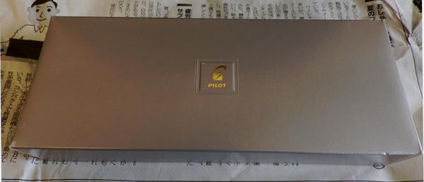
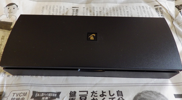
I sent away for a Pilot Capless a couple weeks ago. It was coming from Japan and I’d almost forgotten about it but it arrived today. It came in a cardboard box, wrapped up in a Japanese newspaper. I was quite pleased with that as I’d never seen a Japanese newspaper before. I used it as background for these photos.
Anyway, inside the cardboard box was this:
And once that was removed, there was this:
And finally we got down to this:
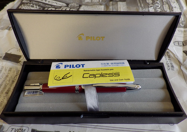
Having bought the cheapest version possible, I didn’t get a converter, just one Pilot cartridge. That’s okay by me because as I understand it, the converter that comes with the pen is called the con-50 and it holds so little ink as to be useless. Separately, I’ve ordered a con-20 converter, which I understand holds a more sensible amount of ink.
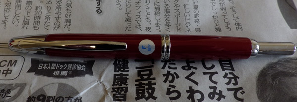
I’m not fond of gimmicky or over-engineered pens, and I expected not to be impressed by the Capless. Actually I am, goshdarnit! I expected it to be very heavy, given all the gubbins inside this pen, but it isn’t. It’s a sensible weight. I didn’t think I would enjoy writing with it but I do.

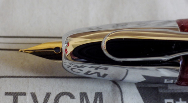
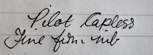
To be sure, this isn’t the pen that you would choose to write wedding invitations with, or even to do your correspondence. There are many better pens for those jobs, most of them older than me. However, for a pen that sits on the desk to take notes as you work it’s perfect. The clicky mechanism that exposes the nib is light and positive and the little cover protects the nib from drying out when the pen is not in use. To my shame, I must admit that I’ve used a rollerball in my everyday working note-taking, but no more! The pen is actually a pleasure to write with. The nib is a fine because that’s what you want for note-taking. As such, it’s not the smoothest nib in the world – there is just the right amount of feedback. It’s comfortable in the hand and the pocket clip doesn’t get in the way at all.

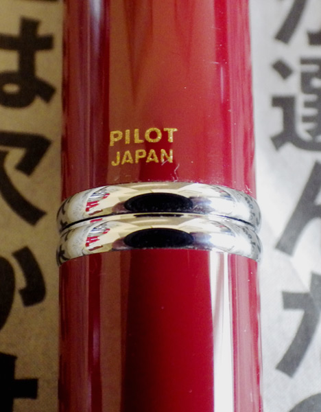
These, then, are the practicalities. What about the aesthetics? To be honest, I think it’s kind of ugly. They say that beauty is the meeting of form and function but I don’t think it is in this case. Given what it is expected to do it is hard to see how it could be any other shape. It’s the Ugly Duckling that will never attain the elegance of a Swan SF230, but I like it anyway. In consolation we can say that the gloss burgundy finish is very nice.

There is more to be said about this pen, I think, and it will all come out in time when I’ve used it a bit more.