Burnham 51

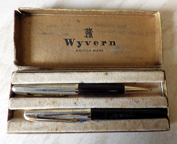
Burnhams haven’t appeared here often.  I avoid them because so many, especially the post-war ones, have not survived well.  Some models tend to lose clips and many of the casein ones suffer from crazing.  They look fine in a photograph, but when you have the pen in your hand the beauty of the pattern is lost in a spider-web of tiny cracks.  I’ve yet to hear why casein Burnhams are worse than other pens using this material.  Perhaps the material was not aged or cured correctly, or maybe they were unfortunate in their supplier.

Still, I pick up a few in lots of other pens and occasionally I break my own rules (it’s OK for me to do it, but don’t try it at home) and buy an especially attractive one.
IMGP2480
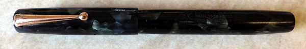
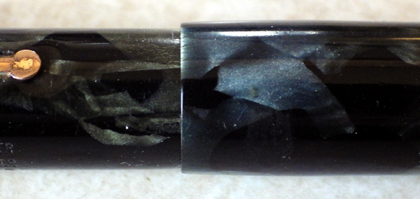
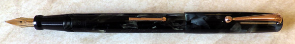
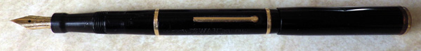
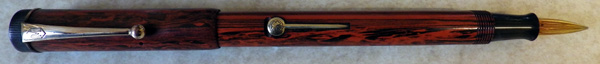
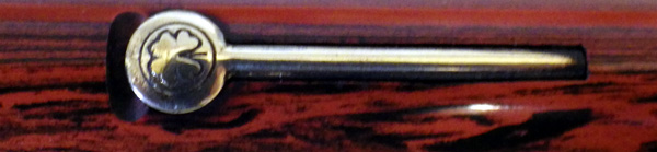
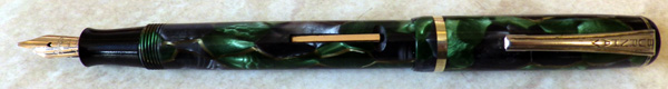
This Burnham No 51 is an example of the latter.  The seller’s photographs were good and it appeared to be free of the pernicious crazing.  The green and grey with amber veins made a wonderful pattern.  To cut a short story even shorter I bought it and I was not disappointed when it arrived.  Though it’s quite a small pen (11.8cm capped) it’s a good quality one.  The cheaper versions have screw-in nibs but this one has a proper 14ct gold nib and ladder feed, held by a robust section. Unlike later Burnhams this example has a low, rounded clip screw which gives the cap a pleasing design.  Burnham’s Achilles’ Heel is poor gold plating and this pen is no exception.  The gold wash clings to the lever and cap ring but is largely gone from the clip.  It doesn’t spoil it, really, because the base metal of the clip cleans up to an impressive shine.
IMGP2483
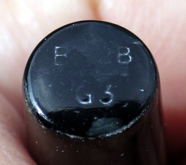
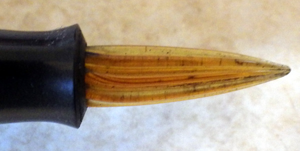
The Burnham nib is small.  This pen was aimed at those with a limited amount of spare cash in their pockets, and savings that didn’t affect the functionality of the pen were essential to keep prices competitive against Wyvern, Mentmore and the like who were producing for the same slender, highly competitive slice of the market.  When all is said and done, though, the only part of the nib you write with is that rounded spot on the end.  Where nibs are concerned size doesn’t matter, at least not from a purely practical viewpoint (the rest is aesthetics) and it’s a great writer.  Burnham made good nibs.
IMGP2486
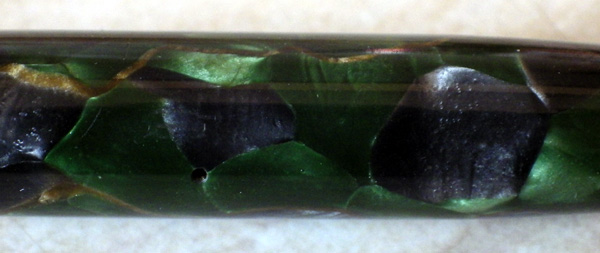
The trouble they have with the casein crazing is a real pity because Burnham turned out some of the most delightfully colourful pens ever made.  Just having one on your desk to enjoy must have cheered even the most dreary Monday.

Onotos

Going back more years than I care to admit, I’ve always had at least one Onoto in my stable of thoroughbreds.  For many years my everyday user was a long black hard rubber Onoto from around 1915 and since then I’ve had a 4601 long enough to have it resealed twice, the last time by the estimable Eric Wilson.  They vie with Swans for being my favourite pens of all.  Purely in terms of quality the pre-war Onoto exceeds any other pen that I’m aware of.  The venerable plunger filler is superior to any other filling system and Onoto and all De La Rue nibs are quite wonderful.  Having said all that, I remain woefully ignorant about their history and the sequence of models.
IMGP2479
This seems to be the De La Rue week for me.  I picked up these fine examples and there’s another one in the post.  The top pen is, obviously, a plunger filler, probably from the late thirties.  As so often with Onotos, this one doesn’t have a number.  Strangely, it seems to have been the practice to imprint the number on the turn-button before it was drilled to pin the shaft.  Thus the number is often obliterated.

Below that is a charming blue pearl De La Rue Junior with a superb Onoto 22 nib.  Late fifties, I’m guessing, though it could go a few years either side. These pens share so many of the characteristics of the Onoto that you couldn’t put a razor blade between them.

The next one down, looking large and solid, is a lever filling Onoto of the same period.  It has a semi-flexible medium Onoto 33 nib.  I confess to being more than a little tempted by this pen.  I don’t really need it but, well…  look at it!

Last, in its olive green box is another De La Rue Junior with a De La Rue 22 nib, still with its “M” for medium sticker.  The last three of these pens are pristine and would be regarded as New Old Stock had they not been re-sacced.   That’s no bad thing, though, as these pens were meant to be used.  As it says on the side of the box, “the pen that’s sure to suit your hand!”

While we’re on the subject of De La Rue Pens, some of you may remember this post: http://wp.me/p17T6K-yP where there was some doubt as to whether the woodgrain section was original.  Having since seen a couple of other examples, I can confirm that it is original.

This And That

IMGP2249

Looking at the number of twists in that sac, I’d say that not much writing was done with this Duofold after the last “repair”.

Non-pen demands on my time have been severe recently, so I’m getting little time at either the workbench or here at the PC.  Hence the lack of entertainment in here and the paucity of uploads to the sales site, matters which I hope to put right soon.  Anyway, here’s a pen joke:

Pat finds a pen in the street one day and he shows it to his pal Mick, and asks him if it’s his pen.

“Give us it here till I see,” says Mick, and pulling a scrap of paper from his pocket, writes on it.

“Sure, and ’tis my pen right enough,” says Mick.

“How do you know?” asks Pat,

“Cause it’s my handwriting,” says the bold Mick…

A Mabie Todd Forum

John Brindle’s Mabie Todd List is coming along by leaps and bounds.  More models are appearing week by week and quite a few are illustrated now.  There’s a new drop-down tab too, entitled Mabie Todd Information Gathering.  This leads to a forum where discussions can take place on any Mabie Todd-related issues you care to raise.  Come along and register and take part!  I know there’s a lot of knowledge out there that we can record for the benefit of all those who love Swan, Blackbird and Jackdaw pens.

How Not To Archive!

A number of years ago, I began consciously creating a photo archive of the pens that passed through my hands.  Sadly, at first I ignored the day-to-day bread and butter pens and only retained photos of the more unusual ones.  Four years ago or so, I came to my senses.  Given the huge disks and vast acreages of backup media we now had there was no reason not to keep everything from the gold-plated Swan to the lowest cartridge-fill Platignum.  And so I did.  I didn’t really know why.  I had no project in mind but I knew they would come in useful one day.  Such appropriate photos as I have are going to illustrate John Brindle’s Mabie Todd pen list.

However, I hadn’t sat down and planned a photo archive.  I just chucked stuff onto a backup disc. My backup is like the neglected attic of my PC.   You know the kind of thing.  That trunk there contains Great-Uncle Murgatroyd’s naval uniform and his wooden leg, and yonder woodworm-eaten wardrobe over there is the actual cupboard that contains the family skeletons.  Of which there are more than a few, believe me.  Really, it’s not quite that bad.  But it’s bad enough.  I backed up everything.  When I remembered.  So one directory will contain the image and data files for March 2009.  Another one contains six months of absolutely everything from November 2008 to February 2009.  It’s a little like if you ran around the library tipping the shelves and throwing the books on the floor.  You know the good stuff’s in there but you’re going to have to dig through a lot of rubbish to get to it.

In 2010 I got some sense at last and began taking a set series of images for each pen, and those were used for sales purposes as well as archiving.  Each set was accompanied by a writing sample which identified the pen.  Those ones can be raced through.  The others – well, it’s hardly efficient but it’s entertaining, just like the neglected attic would be.  Now, where did I put Murgatroyd’s leg?

The Filling System Riff

Some of the terms used in describing fountain pen filling systems are less than helpful in understanding how the pens work.  For instance, Parker’ Vacumatic and Sheaffer’s Vacuum Filler seem to lay claim to the vacuum principle in filling pens, whereas every pen that has a self-filling system depends on that principle.  Whether they be sac fillers, piston fillers, plunger fillers or any other self filling system I’ve forgotten they are provided with a means of creating a vacuum and it is nature’s abhorrence of that vacuum that fills the pen.  None is more dependent or makes greater use of the vacuum principle than another.  All self-filling pens are vacuum fillers.

“Twist Filler” must be the most misused term of all. In a true twist filler, the sac is attached at both ends, one directly to the turn-button on the end of the barrel.  When the button is turned, the sac is wrung out like a dish-cloth.  The defining principle of the twist filler, then, is that the sac itself is twisted to empty it of air in preparation for pulling in ink.  Almost any pen that has a turn-button on the end of the barrel seems to be called a twist filler nowadays, whereas the majority of them work in another way.  Swan’s Leverless is often called  twist filler, but in fact the sac is attached at only one end and rather than being twisted it is pressed against the interior of the barrel, thereby expelling most of the air.  Various late Mabie Todd pens are called twist fillers when in fact they are most closely related to the button filler.  A cam is activated by turning the button, and this presses down on a normal pressure bar which squeezes the sac in the usual way.

Yes, I’m feeling picky and pedantic today.

A Mystery Blackbird

IMGP2019

At first glance this Blackbird appears very similar to those self-coloured nineteen-thirties pens in the 52– range that I wrote about here http://wp.me/p17T6K-7m.  It has the same shape, high-set heat-inserted clip, slight taper and very thin gold on the trim.  The last vestiges of a model number on the base of the barrel indicate that despite the resemblance, this is in a different range of pens.
IMGP2028
The upper line might be BB2B.  The first and last two characters are visible.  The lower line looks like G3, but that fits no system of Mabie Todd numbering that I’m aware of.  Then I tried 63 as that looked possible but that number denotes a russet/jade mix.  Then I thought – against the evidence of my eyes – that it might be a 6 with a five turned slightly to the right,  Neither John’s nor the FPN list show a 65 so it might be that, but I have to say it doesn’t really look like it.
IMGP2024
How does one define this pattern?  There’s a slight colour difference between the cap and the barrel due, no doubt, to a latex sac out-gassing there.  There’s some colour shift in the cap too, especially around the site of the inner cap.  The least affected part seems to be the lower part of the cap near the cap lip.  Here it’s a bluish grey with a paler grey and areas of black.  Perhaps another one will turn up with a better model number.
IMGP2021
These very simple thirties Blackbirds are what we call school pens, though doubtless they were used by many others apart from school pupils.  The price was kept down by keeping the trim basic, but the quality is as high as ever.  The celluloid is decorative and in this case uncommon and the pen is now, as it was when new, an excellent writer.

Wyvern Princess Pen & Pencil Set

IMGP1981

I puzzled a little over the date of this Dinkie-sized Wyvern Princess set until I removed the tray from the box and found all the paperwork inside – instructions, guarantee and the original sales receipt, dated September 1951.  With their engraved caps, nestled in their plush box, this set would have made a very acceptable gift.  They don’t look like the output of a company within five years of dissolution, but thankfully for all concerned, nobody in the fountain pen industry saw quite how bad the future was going to be.

IMGP1983

The pen is the simplest form of bulb-filler, though it nods in the direction of modernity with its semi-hooded nib.  The pencil is – forgive my ignorance of the subject – a pencil.  It has lead in it and works well.  There’s an eraser still in place but by the look of it, it won’t work too well.
wyverns
Between the pen and pencil, the box and the included paperwork, there are a number of images of the Leicester Dragon that Wyvern employed as a trade mark.  I don’t know much about the Leicester Dragon or Wyverns either.  It looks a very cheerful beast and it’s hard to imagine it roaming about the countryside torching villages and chomping on the occasional maiden.

I note that I’m not the only one who will be selling a Wyvern Princess Set.  Antiquesboutiqueuk has one here, and he’s asking a mere £236.00 for it, having generously reduced it from £298.00.  That’s pretty stiff competition but I think I’ll be able to undercut him.  Not by much, of course.  I’ll be selling mine for around £38.00

Mabie Todd Swan 130C/60

IMGP1973

Another of those pleasing three-ring Swans from the late twenties, this 130C/60 achieves its harmonious effect largely by the placing of the plated rings.  The distance from the middle ring to the cap top is approximately 1.5 times that of the two barrel rings.  Somehow that spacing is satisfying; it’s like a Golden Mean for pens.
IMGP1974
The fact that the “SF” has been dropped from the model number indicated that it was made late in the flat-top period, though I would be hard pressed to put year to it.  “130” indicates a number one nib and one band at the crown of the cap and two bands on the barrel.  I think the third digit needs more work.  For the moment all we can say is that the zero is associated with models that have no ring at the cap lip.  The FPN list suggests that 60 indicated black hard rubber.  I think it just indicates black, because this pen isn’t made from BHR; more likely it’s celluloid.  That leaves the “C” to be explained and for the time being I can’t.  No doubt an explanation will suggest itself in time, but so far we believe that “B” means a short model and ½ indicates slender while “C” – more common that either of the others – remains a mystery.
IMGP1976
This is a pleasant pen to write with.  It’s slender, but not so thin as to be uncomfortable.  The fine nib is springy rather than flexible.  The plating shows a little wear, indicating that the pen has been well used, but it was handled carefully.  There’s little in the way of surface scratches from use and the pen doesn’t look anything like its age.  The absence of what at this period would have been an angular fixed clip reminds us that clips were an extra, felt to be unnecessary by many buyers.

A Glass-Nibbed Mentmore?

IMGP1964

What do we have here?  A fine 1920s Mottled Hard Rubber Flat-Top Mentmore?  Or do we…
IMGP1965
Did Mentmore ever make a glass-nibbed pen?  They may have done but I’ve seen no evidence to that effect.  But it doesn’t stop there.  The cap and barrel fit together perfectly but did they begin life together?  There’s a distinct colour and pattern difference between them.
IMGP1968
Adding to that suspicion is this lever.  This lever with its clover or shamrock, I know not which (this is not a gardening blog) was, so far as I know, a mass-produced part bought in by those who didn’t have the labour or machinery to make parts of their own.  It’s not a Mentmore part, in other words.

Frrankenpen, then, but not much the worse for that.
IMGP1967
Glass nibs ( they’re really plastic) were a twenties and thirties thing, I think.  It’s often said that they were chosen for their ability to write through multi-part forms and that’s true, but they were also chosen because they were cheap and durable.  A while back I had a thirties German blow-filler with a glass nib, about as cheap a pen as you could get.  Evidently its British owner became a little concerned about using a German pen during World War II, so he scratched off the barrel imprint and carried on using it.

They’re practical and write well, if in a rather characterless way.  I like them as an interesting byway of the fountain pen journey, but not to write with, I’m afraid.