I had some general things to say about the Targa back here. This one’s the goldplated number 1007 Chequered Classic which was made between 1976 and 1979. Despite its name, the pattern isn’t quite one of chequers; rather it is (when the pen is held upright) a series of three vertical incised lines joined by wider spaced horizontal ones. It makes a very nice finish.

This pen has been well looked after and the gold plating is in very good order. Indeed, like most Targas, it has survived to the present day with very little sign of its 35 year existence.

I have found Targas to be eminently practical pens, well-balanced, robust and always ready to write. They are more than that, though. Walter Sheaffer was a jeweller and until recent times Sheaffer pens have always reflected that. Though it is by no means delicate and easily damaged, the pattern on this pen does make it a form of jewellery – though a useful form. The famous Sheaffer inlaid nib, often firm but never a nail, is also a thing of beauty in its own right.

This one’s a medium with a hint of flex. It has a Sheaffer squeeze converter fitted.
Sheaffer
The Sheaffer Targa
This is the last of my run of Sheaffers – the Targa. I’ve had one of these, completely identical to the one illustrated since around 1980 and it’s had a lot of use. It’s still as good as the day I got it. This one’s the brushed steel version with gold trim and a gold nib – it’s one of a huge number of different Targa finishes which makes it the perfect collector’s pen.

If you go by the description – flat topped, made of two simple tubes – it sounds retro, like a return to the pens of the 1910s and 20s. However, when you see it, any notion that it’s a backward looking design is dispelled. Tapering from top to bottom, it has clean minimalistic lines that are ageless, and the inlaid nib is a long, long way from the early days of the fountain pen.

Despite its metal construction the Targa is a light pen and even posted, it is not unbalanced. When this example arrived on my workshop table it was full of some malodorous gunk that might once have been ink but a sustained period of flushing got rid of that and it writes as well as it ever did. This one has a converter fitted which is handy as I don’t have Sheaffer cartridges lying around. The nib is medium, springy but not flexible and a complete pleasure to write with.

I should make it clear that this is the original Targa, not the later slimline version which I find much less comfortable in use.
A word or two about the name: it’s not the Sheaffer Targa but the Targa by Sheaffer. It’s named after an Italian motor race. Originally the intention had been to call it the Genesis but there were fears that this name would lose it sales in non-Christian countries.
Sheaffer Triumph Imperial Deluxe
Whereas the last Sheaffer I wrote about was too opulent for my personal use, I would have happily gone into a shop and bought this one. The 12 carat gold filled cap isn’t too much and it works with the blue barrel wonderfully.

There are those for whom a flexible nib is the be-all and end-all and this pen wouldn’t do for them because though it has a certain softness it isn’t flexible. For myself, I love a flexible pen but I also love a smooth firm nib that lays down a good line of ink. That’s what these Sheaffers were made to do and they do it so unfailingly well.

This is the cartridge/converter version which succeeded the Touchdown fillers of the sixties. I prefer it because it holds more ink and you don’t want a stingy ink supply to service as generous a nib as this.
The fact that Sheaffer reused both names and styles can make pen identification quite confusing. On the other hand, this makes for boundless scope for the collector.
Sheaffer Imperial Sovereign
I find Sheaffers, especially post-war ones, hard to identify. So many models, so little difference between them! I bought a couple of these cartridge/converter Imperial pens this week and my researches tell me that this one is a Sheaffer Imperial Sovereign. If I’ve got that wrong I expect someone will be along to tell me. Similarly, it was difficult to find a reliable date for this pen’s introduction. It’s variously stated as “late 60s” and 1972. Take your pick; I’m none the wiser!

I don’t think I would have gone into a shop and bought this pen for myself – it’s too blingy for me. It is a very pretty pen, though, and the diamond-cut finish makes it glitter and reflect movement near it in an interesting way. It’s quite a big pen at 13.2 cm but it isn’t heavy. The chiselled finish prevents fingerprints, often an annoyance with metal pens. The slip-on cap grips firmly. The inlaid nib is a beautiful thing and the shiny black section contrasts with the gold.

It’s a nice writer – the nib with its round bead of tipping material is very smooth. In the usual Sheaffer way, it’s firm. Not especially my style, but it’s so comfortable in the hand and the nib glides over the paper so effortlessly that I could write with this pen all day.

It came in a box, a very nice brown leather look one and it was accompanied by a Sheaffer cartridge and a squeeze converter, indications that this pen has been hardly used. The box is quite wide and it may be that the pen was accompanied by another writing instrument: a ballpoint pen, a rollerball or a mechanical pencil.
Several of the more modern Sheaffers have been a disappointment, but this, it seems to me, is a traditionally well-made Sheaffer of the kind that we expected to see until recently. It all fits together with admirable precision. As it is a “white-dot” pen we have learned to expect that it should be a superior model. This one is.
Sheaffer Triumph Imperial / De La Rue Pen
As I said some time ago, I’ve taken a liking to Sheaffer Imperials in their various styles. I have quite a collection at the moment – a couple of Touchdowns and three of the later cartridge/converter pens. Another one arrived today.
At first glance it’s a basic Sheaffer Triumph Imperial, made in the nineties and so very much newer than the pens I usually handle. On closer examination it turned out to be one of the oblique ones. At first I would have said an oblique stub but now I’m inclined to think of it as a cursive italic.
I like oblique nibs and have several but this one seems a little too acutely angled to suit my hand. I’ll have fun with it for a while and probably sell it on.
Another recent arrival was this De La Rue pen. When I bid on it, it was listed as an Onoto, and it wasn’t until it arrived here that I saw that it wasn’t one. While it’s a beautiful pen, I felt I’d paid an Onoto price for a De La Rue pen and I wasn’t very happy, but some cordial negotiation later I’d had the price reduced to what was mutually accepted as a fair price.
I must admit that I’m a bit light on my knowledge of the output of De La Rue, whether their Onotos or their lesser pens. However, even I can see that this De La Rue Pen bears a close resemblance to the Onoto Minor 1202 of 1938, so I’m guessing that it was made around the same date. In the Onoto the semi-transparent lattice served to show the level of ink in the pen, but in this lever-filler it is just decorative, as is the bold MHR section.
As one would expect from this company’s pens, it writes like a dream, a smooth, generous medium with appreciable flexibility. Not an Onoto, to be sure, but a beautiful, unusual pen and an outstanding writer all the same.
The Sheaffer Whateveritscalled
My attempt to learn to write better without the benefit of flex is quite successful. I – my own most acerbic critic – am quite pleased with how things have gone. I enjoy the application of greater precision in writing than was my wont. It’s really most satisfying to develop a not at all objectionable hand without flourishes.
It took longer than I expected, mostly because I had to find a pen I could work with well. I explored the extremes, from a tiny Tuckaway to a Sheaffer Lifetime Oversize, but in the end I settled on this pen:
I don’t even know what to call it, though I suspect it has some mundane title like Sheaffer Cartridge Pen. It’s a mixture of the expensive and the cheap. It has a white dot, which suggests quality – or used to, but the clip that white dot is on has lost most of its gold plating.
The nib, too, is gold, and it’s very good. Smooth, but not in that greasy way many modern pens are, with their great globs of tipping material. This nib doesn’t have feedback, exactly, but it gives a feeling of precision. I knew that I was getting somewhere when this pen began to fall to my hand like one of my old Swans, and I started to look forward to the prospect of writing with it.
Sheaffer Sentinel Tuckaway
When the Tuckaway first appeared in, I think, 1941, it had no clip and the suggestion was fairly strong that this was a pen for a lady’s purse. They did things like that back then, whereas now if you were to suggest that women should confine themselves to little tricky pens you might well get a slap in the kisser. Not from me, of course. I’m against violence in all its forms. Unless I’m annoyed.
Anyway, soon thereafter the Tuckaway became unisex and grew a little clip. I’m informed that this truncated clip is called a clasp. So there. After that it went through the full gamut of Sheaffer options – lever filler, Vac-Fil, Touchdown, open nib and triumph.
This is one of the late ones, a Sentinel Tucky with Touchdown filler. It’s a small pen with big attitude. When you take the cap off the conical nib looks almost out of place on the short pen, but when it’s posted it seems to come back into proportion.
The tip-tilted nib is as hard as a nail. When I got it, it was inexplicably toothy. I could see no reason for it even under magnification, but a little bit of polishing and it’s a pleasure to write with.
The Sentinel may be short but it’s not slender and the section provides a good gripping area, all of which go together to make it surprisingly useful, even for extended periods of writing.
This one’s a keeper!
Sheaffer Lifetime Flat Top
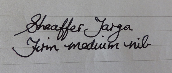
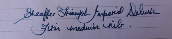
You may remember that I decided to try to improve my writing with firm-nibbed pens instead of covering up my imprecision with the swirls and curlicues of flexible nibs. The project continues and there is some visible improvement, though at the cost of speed. Normally, I write very fast indeed without losing legibility, something I had to learn to do for note-taking in university. Frankly, though readable, the result isn’t pretty, hence the current effort at improvement. Slowing down your natural speed of writing isn’t easy. It’s like grinding along in first gear in an endless traffic queue.
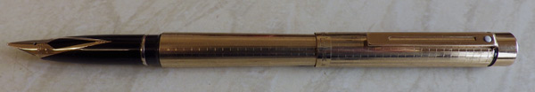
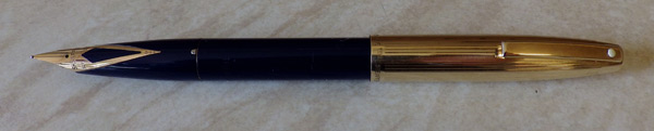
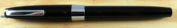
The upside of all this is that I can now have all the stiff-nibbed pens I ignored before. I admired many of those pens but felt that they were not for me. Now they are! The first one I went for was the Sheaffer Lifetime Flat Top, one of those early pens that got it so right first time that it cannot be improved.
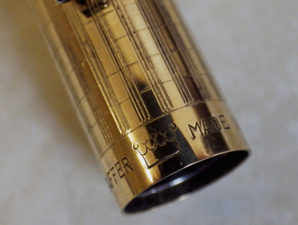
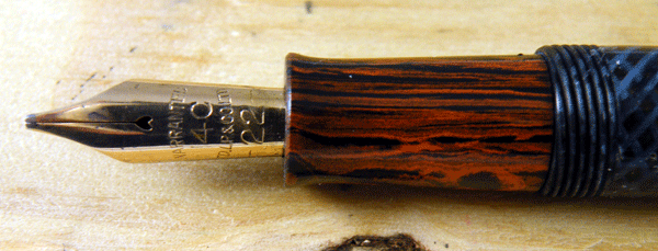
It’s a very simple design. Like all the other flat-top pens that were around at the time, it’s virtually just two tubes, one slightly larger than the other. Actually, the barrel does taper a little as does the cap lip, but otherwise it sticks to that very minimalist design. Unlike most other pens of the time, the Lifetime exudes great rolling waves of sheer quality. The moment you take it in your hand, you know that qualitatively this pen is way out on its own. There are many roads to beauty; one is perfect fitness for purpose. That’s what makes this one of those perfect pens, like the 1920s Swan Eternals or any pre-World War II Onoto.
As luck would have it – I wouldn’t have known – the example I bought is an oversize one, measuring 13.5cm capped. It’s a big, chunky pen, bigger than I have become used to, but not too big. It fits the hand well, it has an easy balance posted and it weighs little. More, by a shade, than the black hard rubber pens I usually use, but nowhere near enough to be tiring over an extended period of writing, like some modern brass-barreled pens.
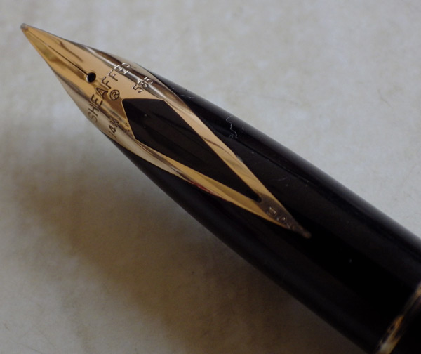
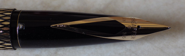
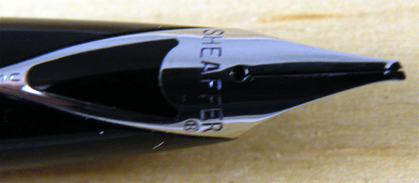
The nib is the stiff nib that all other stiff nibs aspire to be. There is more flex in a granite slab. It’s a smooth writer, though not without enough feedback to prevent it from being one of those horribly slippery nibs they make today. It’s always ready to write without hesitation even after sitting for several days. The feed, a fairly simple ladder type, delivers just the right amount of ink. It holds a gallon of ink, and as this nib is a fairly parsimonious medium, you don’t spend much time filling the pen. This is a great, practical pen.
I see other firm-nibbed pens in my future. Maybe a Tuckaway, perhaps even a Lucky Curve Pastel and certainly a Newhaven Duofold NS.
I’m having fun here.


