Parker Duofold “Big Red”

IMGP2908

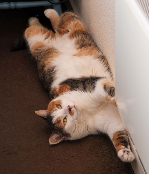
You might think from my recent grumbling and growling that I was fed up with pen purchasing but it isn’t so, not really.  I have some exciting things coming my way.  My assistant is helpfully lurking behind the hedge watching for the post lady, which is a little unfortunate, given how intimidating she can be.  Post-people expect to be bitten by dogs, but the cat?  I leave it for them to sort out among themselves.  I have better things to do.
IMGP2934
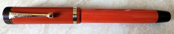
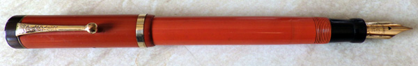
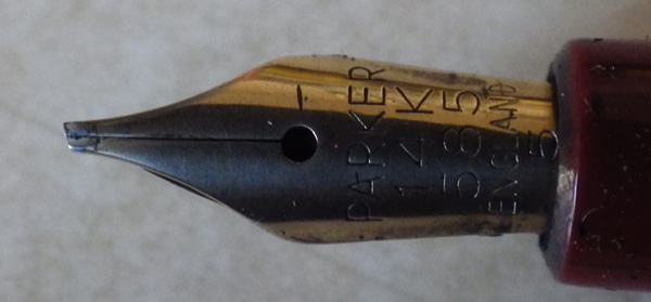
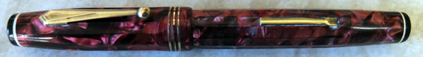
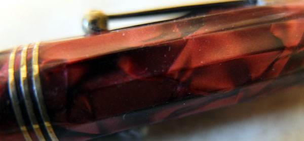
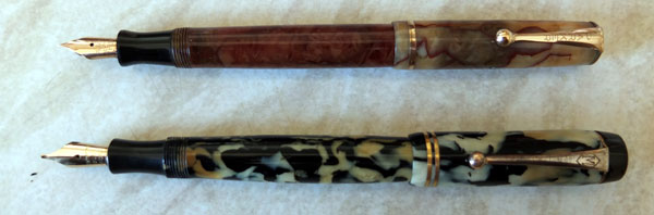
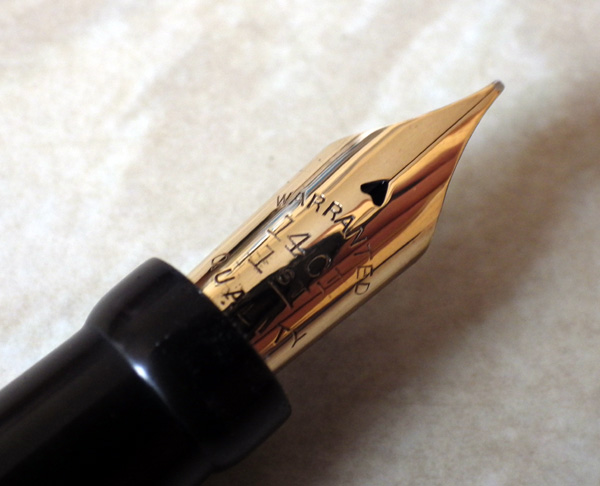
Like playing with this Big Red.  It’s the first one I’ve been able to get my paws on for years and I am reminded what a mighty beast it is and how glorious the colour.  This one was made in 1926, I believe, going on the fact that the cap band has been set level with the material of the cap, rather than a little raised as previously.  It hasn’t passed these eighty-seven years entirely unscathed.  There’s a very slight colour difference between the cap and the barrel.  Is one a replacement?  Also, the nib is certainly a replacement, though a very interesting one  It’s a great big No 6 size warranted nib, something I haven’t seen before.  There’s very little barrel imprint left.  I can see “Duofold” and that’s about it.
IMGP2939
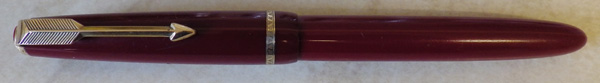
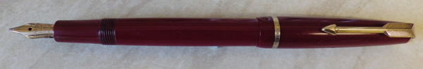
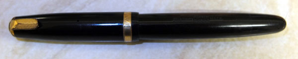
The pen I’m using every day is an early Slimfold, which is smallish but far from tiny.  Holding them in my hand in the writing position one after the other emphasises the great difference between them.  The Duofold is certainly bigger than the pens I generally use but it isn’t unwieldy or uncomfortable.  I think I could get used to it.  It must have been quite a shock when it was introduced back in 1923, when new pens were rather smaller than they are now.

IMGP2935

A Red Parker Slimfold

IMGP1882

I usually avoid the smaller nineteen-fifties/sixties English Parkers.  They’re excellent pens but the market for them is poor.  This one’s a Slimfold, dating back to around 1962 and it looks like this one has done a lot of work since then.  The gold plating’s still good, though.  I suspect there may have been a cap swap at some time, though, because the cap seems a little darker than the barrel.  The imprint is just discernible and no more.  We’re not going to be exclaiming “Minty!” (awful term) or claiming New Old Stock over this one.  No, it’s what it appears to be, someone’s old workhorse that has ended up on my bench.

IMGP1887

The charm of this pen, though, is the nib.  It’s an oblique stub.  Parker didn’t do many of these but when they did, they gave them a sharp edge like an italic.  This one’s a beauty.  I have another with an oblique nib, an equally well-used Junior that is my current every-day user.

These smaller pens have gone out of fashion today.  Everyone wants a pen that will do for a walking stick these days.  Or perhaps provide compensation for physical shortcomings in another respect but I don’t know.  And I’m not going there.  The Slimfold, I must admit, is at the lower end  of the pens I’m comfortable with for extended periods of writing, whereas the Junior is completely fine.  As the arthritis proceeds (I’m not getting any younger, dammit!) I’ll graduate to a Demi and then a full Duofold, followed by a Senior and a Maxima.  After that I’ll scratch messages in the sand with a stick and take photos of them.

IMGP1883

Everybody likes red pens, and rightly so.  I like them myself.  Where they really come into their own is as the pen you use for red ink.  It’s truly pernicious stuff.  I spent over an hour today trying to rid a toffee-coloured Waterman Junior of red ink staining.  Suffice it to say that I was not entirely successful.  Never mind.  Tomorrow’s another day.

An Exceptional Parker 61

As many of you will know, I’m not usually a fan of hooded nib pens with the exception of the glorious Mentmore 46.  I like to see and enjoy a polished gold nib and I find them easier to write with because I’m not constantly checking to see that I’m approaching the paper at the correct angle.  However, I know that others like them, so I keep adding a few Parker 51s and 61s to the sales site.

Of the two pens I prefer the 61.  It has a better shape than the 51 to my mind and the arrow on the hood is both stylish and helpful (remember that thing about approaching the paper with the pen at the correct angle?).  The capillary filling system is, I think, the last major advance in fountain pen technology and like many great inventions,  it’s wonderful in its simplicity.  Inverting the pen over the ink bottle must have seemed very unintuitive to the pen’s first buyers.

Of course flushing a capillary 61 is a bit of a chore, so it isn’t for the writer who is constantly changing inks.  However, if you just use it with one favourite ink and keep it in use there’s no need to flush it.
DSCF2632
This 61 looks like nothing special at first glance, just a black pen with a rolled-gold cap, but look at this nib:
DSCF2654
Isn’t that a beauty?

DSCF2660

English Duofolds

DSCF2386

English Parkers remain among the most underrated pens around.  Not so much the the 51s and 61s, at least partly because our American cousins recognise them, but the whole English Duofold range remains a mystery to overseas buyers.  Maximas and Seniors do somewhat better because they cater to the modern taste for large pens, but the more usual standard Duofolds, Demis, Slimfolds and Juniors sell poorly in comparison with other pens, many of them of considerably less quality.  Though the market has picked up a little recently, I still see Slimfolds, Juniors and the similar Victory Mark V passing through ebay without a bid.

My own favourite is the Duofold AF.  It has a lot going for it.  The splendid Duofold nib – usually firm but not quite as rigid as the American counterpart – remains consistent throughout the Newhaven production.  The aluminium filler looks a lot better than the traditional button.  It’s  finely machined and has a very modern look about it, as though it might be a part for a moon rocket or at the very least a snazzy sports car.  It’s an easy fix when it needs a sac and it holds a decent quantity of ink.  Externally, the Aerometric Duofold is the same pen with the same writing characteristics and many people like it but I think of it as Parker’s first step back from ingenious filling solutions.  Having to take the barrel off to fill the pen is not an advance in convenience.  Having done so, you’re faced with a bulb filler with a protective metal surround – nineteen thirties technology in a nineteen fifties pen.  Thereafter came the descent to Parker pens being mere holders for cartridges, which ensured that the buyer handed the company large profits in perpetuity.

That doesn’t mean that the Aerometric was worse than other pens that were being produced at the time.  The reverse is true.  Despite the dated technology the quality was so high that the pen sold in huge numbers, even at a time when the ballpoint was beginning to dominate the industry.  Though a little subject to cap lip cracks, Aerometrics otherwise just don’t fail.  They’ve kept on going until today with no servicing and indications are that they’ll see all of us off.  Though the plastic they’re made from is soft enough that barrel imprints can wear off, it’s thick and robust.  The sac is so durable that today hardly one in fifty needs replacing.  The sac protector may dull and discolour with age but it remains completely sound, unlike, for instance, many of Conway Stewart’s Pressac protectors.  The nib has a good lump of tipping material, and the pens continue to write as they did when new.

That quality extends throughout the range.  The Junior was cheaper only because it was smaller and had less gold in the nib, not because the quality was less.  That’s shown by the vast numbers of Juniors and Slimfolds that continue to appear in ebay, just in need of a flush and a wipe with the polishing cloth to look as good as new.

Try one, from the first Newhaven Duofolds, through the New Style, Aluminium Filler and Aerometric.  There’s plenty to choose from.

The Parkette Deluxe

DSCF1557

Back to the nineteen-thirties today, to that dodecagonal pen I hinted at, the Parker Parkette DeLuxe.  This is yet another of Parker’s Thrift-Time pens but for a money-saver it’s pretty well appointed. The fluting is a pleasure to look at and it feels good in the hand.  I’m surprised more pens didn’t adopt this design.  The black button with a white line under it on the cap top and the barrel end is an eye-catching feature, and the gold-filled lever, clip and triple cap rings was laid on thick enough to have withstood the passage of the years.  In all, this is quite an outstanding pen.

DSCF1562

I have a theory that up to the nineteen fifties this country was flooded with foreign pens.  Most were poorly made and didn’t last long.  As very few of them were designed to be serviced, once the sac perished, that was it.  In the bin.  Some lasted a bit longer, like this one that was included in a lot I bought.

DSCF1566

Here it is in the ever-popular “Pustule and Vomit” pattern.  My guess is that this, too, is a thirties pen.  If you study it for a moment or two you begin to see that it looks a bit like a child’s drawing of a Duofold.  At a stretch, this pen could be repaired.  The section fitting is best described as “rammed in” and it might need to be glued in place.  The pressure bar has disappeared so one would need to be cut to fit.  The peg that the sac fits on is very slender, so it would need a necked sac.  The plated nib, impressively enough, has tipping material and the blind cap and brass button are fine.

Obviously, the pen wouldn’t be worth the time and expense of repair as no-one in their right mind would want it at any price, but it has its interest, slight and passing though it may be.  Were these the pens that the majority of children carried to school?  Was the presence of a mass of these cheap foreign imports the reason that, unlike America, Britain never really developed a third tier of domestically produced pens?

A Duofold AF

DSCF1547

This is my latest everyday user.  It’s a rather shabby Duofold AF and yes, somebody broke the clip and no, I haven’t got around to replacing it.  The pen writes just as well with a broken clip.  It’s made from that strange plastic that Parker used for the AFs.  It looks black until you put it under a strong light, then it’s green.

DSCF1554

The great thing about this pen is the nib.  It’s a quite acutely-angled oblique.  It took a little practice to come to terms with it but now I’m enjoying it!

I spent all day today editing photos and writing descriptions for my next upload.  My assistant doesn’t do that computer stuff so she took the day off.

DSCF1542

Tomorrow I’ll be back to restoration.  There’s one pen in particular I mean to fix up and photograph so I can write about it here, mainly because it will allow me to use the word “dodecagonal.”  Now what could that be?

The Modernes

DSCF1266

These two little pens could hardly be more dissimilar but they have a surprising amount in common. Both are products of the Hungry Thirties, both are button fillers and both are made of celluloid that has discoloured over time. And though they were made on opposite sides of the Atlantic, both are Modernes. The onyx one is a Parker Moderne and the cream and black pen is the Mentmore Moderne.

Parker, I think, used the name first, in 1932. Mentmore followed on two years later. Did Mentmore just steal the name Parker had used? Or did modernity seem like the way out of the troubles of the times, made a little classier and more effective by sticking an “e” on the end and making it French? I don’t know. I only ask the questions, I don’t have the answers.

DSCF1270

Despite the unemployment and the poverty, there was still a need for pens. School students still had to write, as did those clerical workers still in jobs. These pens were built to a price, but quality wasn’t allowed to slip. The pens are smaller and they have comparatively small nibs but they are stylish and very well made. The Parker has a quality edge over the Mentmore, as you might expect, but the Mentmore’s a good pen too. In a way, the Mentmore’s the more interesting pen as you see very few of these and hardly any in the cream and black livery.

My thanks to Eric Wilson, who made a wonderful job of replacing the Mentmore’s cap rings and found a better nib for it than the one it had.

Parker “17” Super Duofold

DSCF9391

Looking around the web, it seems that the Parker 17 appeared in many guises during its ten years of production.

This is a Parker “17” Super Duofold, to be precise, and it’s quite well appointed with its broad gold plated cap band and double jewels. This one was bought by – or for – its first owner on 12th September 1970, so it’s quite a late model. I’ve never had one of these before, though I’ve seen plenty around – they appear to have sold very well – and I’ve enjoyed giving it a test run.

DSCF9398

Visually, it’s not quite my style of pen, with its hooded (though otherwise normal) nib. I find with these pens that I have to look closely to see if I’m holding it properly because the hood and nib arrangement is so indeterminate. You always know where you are with an open-nibbed pen. Otherwise, I approve of it. It writes well and it’s light and well-balanced when posted. Using it, I was constantly reminded of the Parker 45.

DSCF9397

This example has been well looked after, or perhaps little used. It looks good with the contrast between the gold plating and the very dark blue plastic.

I’m not sure what was the top of the Parker range during this period but despite the use of the Duofold name, I’m fairly sure that it wasn’t this pen. It’s a more than adequate pen, and it’s certainly a better pen than much of what Parker has produced since, but it lacks the feel of quality that, for instance, the Aerometric Duofolds or the Duofold AFs had.

Newhaven Parker Duofold Demi

There’s something strange about the plastic that Parker used for its green Aerometric pens. Do what I will my camera sees them as blue. I’ve adjusted the colour a bit in these photos but it still isn’t right. Think British Racing Green and you won’t be far off the mark.

In the early fifties Parker Newhaven seemed to have one basic design of pen, but they appeared to want as many versions of it as possible, and in 1953, among the other types of Duofold, the Demi appeared. It’s the same girth as the standard Duofold and the same length as the Slimfold. This makes a pleasantly stocky pen, but it’s hard to see what part of the market Parker was aiming for. It had a five-year production run but I suspect that its sales didn’t live up to expectations because you don’t see all that many of them around nowadays.

This one’s unusual in that it has a semi-flexible stub nib, not a thing you see a lot of in Parkers. When I bought it, I didn’t think much about it – just another ho-hum Aerometric Duofold, but I confess it has grown on me. The nib’s really exceptional, not at all what we’ve come to expect from a Duofold, and the stubby design works well. Also, it has most of its plating in place and is in really good order, apart from the worn barrel imprint which is pretty much expected with the soft plastic that Parker used in these pens. On the good side, being a soft plastic it takes a high gloss shine very readily.

Parker 51 Pen & Pencil Set

As those of you who have been around this blog for a while will remember, I’m not especially enamoured of the Parker 51, nor, indeed, of hooded-nib pens in general.  I’m making an exception for this set:

Everything about this set suggests that it has been treasured.  The pen and pencil are in wonderful condition and the box is pristine.  The little I know about Parker 51s includes that the Aerometrics had a long production run, from 1950 to 1969.  At its last possible date of production, then, this set is 43 years old.  In all probability it’s older.  I know a few forty-three-year-olds and none of them look as good as this!