A Colibri Gold-Filled Pen

IMGP7802

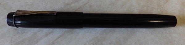
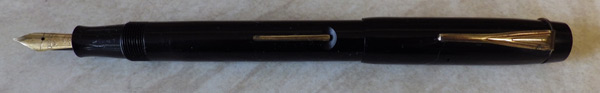
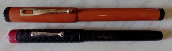
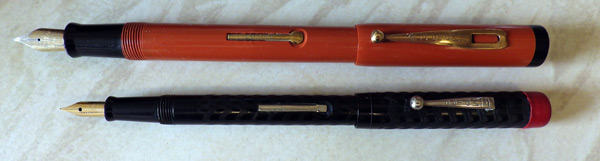
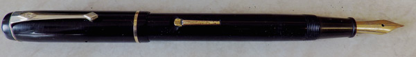
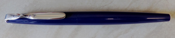
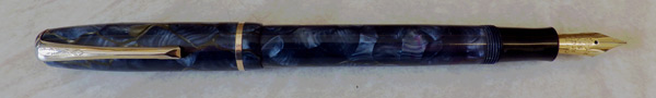
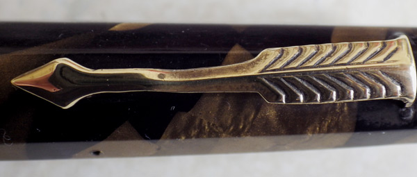
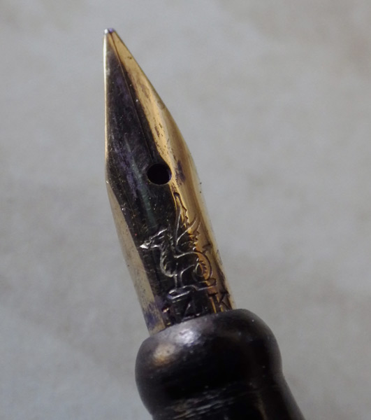
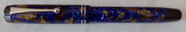
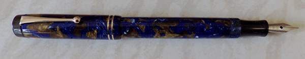
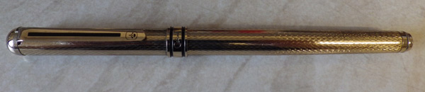
Long, long ago when the world was young and so was I it seemed that almost everybody smoked.  Those cigarettes had to be lit with something, and many of them were lit with Colibri cigarette lighters.  They were middle-range lighters, neither the most expensive but not cheap either, and that seems to be the place in the market occupied by their fountain pens today.  The one I have here turned up in a lot that I bought.  It’s a gold-filled pen, slender and straight sided in a 70s or more likely 80s style.  It closes with a pleasing snap and it has a nice tight clip with a protrusion underneath to grasp the material firmly.  The nib is plated and the pen has a piston-type converter fitted.
IMGP7803
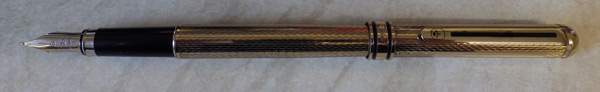
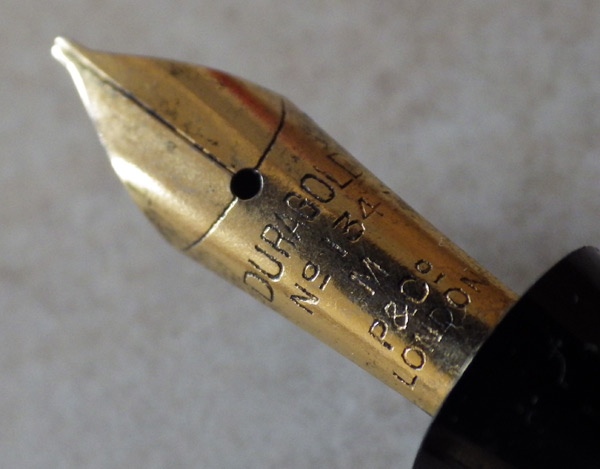
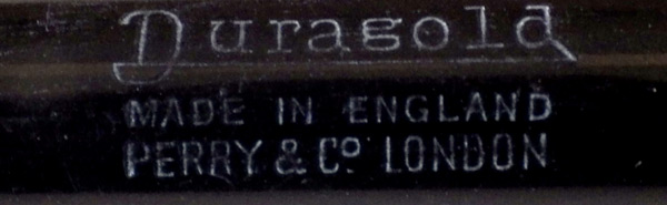
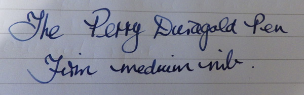
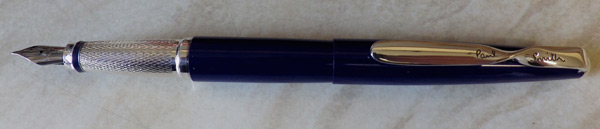
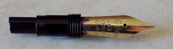
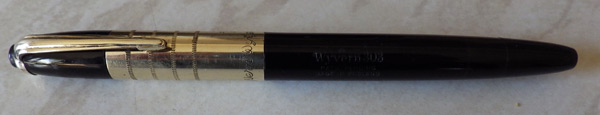
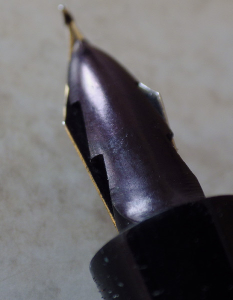
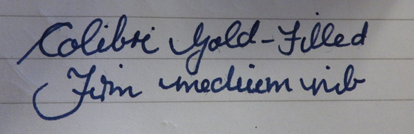
It will post but unless you keep it upright the cap will fall off.  Allowing for that, it’s a very pleasant pen to use.  It isn’t heavy for a metal pen and the black plastic section provides an adequate grip.  The nib which bears the Colibri name is plated and is a very smooth firm medium.
IMGP7808
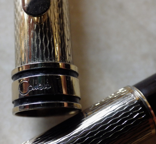
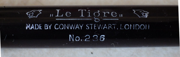
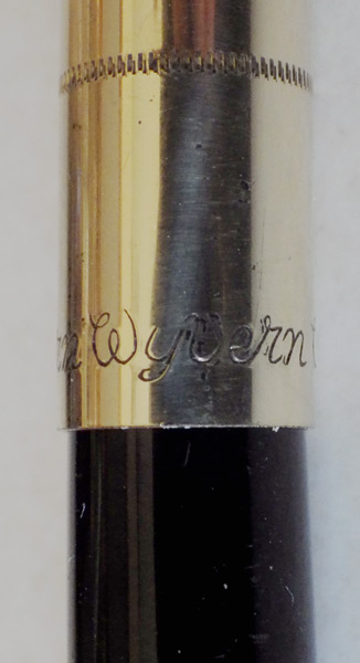
I have handled quite a lot of modern or modernish pens recently and the differences between them seem to be no more than cosmetic.  This pen could have been made by anyone from China to Europe or America and without the name it would be impossible to tell who the manufacturer was.  That’s true of so many of them.  Apart from the name on the cap lip there is nothing about this pen that would say it is a Colibri.

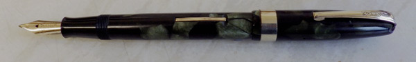
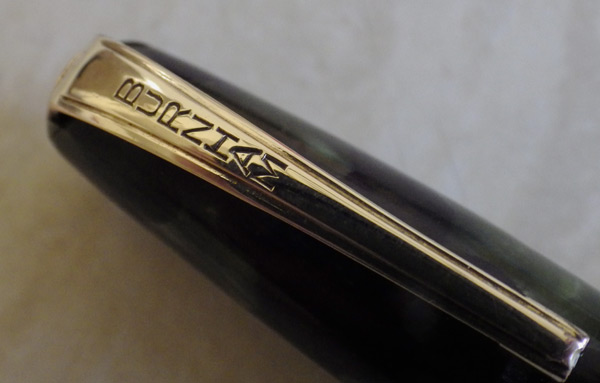
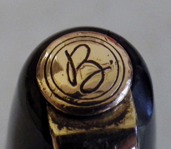
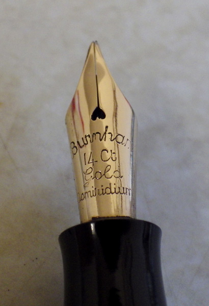
I can tell a 1950s Swan from a Conway Stewart, Mentmore, Onoto or Burnham at 50 paces.  Put it in my hand blindfold and I’ll have a good and probably successful try at telling you which it is by its shape and feel.  That’s no longer the case with many pens today.  They look and feel alike and are pretty much anonymous.  I don’t say that applies to them all – I haven’t tried them all!
IMGP7811
Having said all that, this is, in its way, an excellent pen.  It does everything as it should and lays a perfect line, neither too wet nor too dry with complete reliability.  It’s unlikely to lead you to experiment with your handwriting or try to improve it but it will write whenever you want it to with all the style, character and elan of a Crystal Bic.

The Perry Duragold

IMGP7453

Now that, I dare say, is as plain a pen as you could wish to see.  No inessentials, no furbelows and fol-de-rols there!  It has a simple straight lever and a pressed metal clip because these things are essential and not from any wish to show off!  Perhaps the only concession to appearance is the thin coating of gold but that’s it.  Thus far and no further.  The nib is a plated one.
IMGP7457
Why am I writing about this clearly inexpensive and visually dull pen?  Well, for a start, it’s a pen you probably haven’t seen before as these are far from common.  Beyond that it’s a Perry’s Duragold, and thereby hangs a tale.
IMGP7455
Without the work of James Perry we wouldn’t have any of the dip pens or even fountain pens that are so familiar.  A teacher, Perry was frustrated by the amount of time wasted in re-pointing students’ quills.  This was around 1819 and though steel nibs did exist they were not popular because they were so rigid.  Perry developed a way of slitting the nib to encourage ink flow and allow flexibility.  He later developed a nib with the central hole  at the top of the slit. That was really the basis of everything that followed in the pen industry.  By the 1830s, Perry’s nibs were being mass produced and supplied to schools and industry.  By the mid-1870s Perry’s was the largest manufacturer of steel nibs in the world.
IMGP7459
In 1918, Edmund, the second son of James Perry, set up his own factory in London, producing a variety of office supplies and other items including even a motor car.  It was this company, ES Perry, that eventually produced the famous Osmiroid fountain pen.  I suspect, though I can’t say with certainty, that they also produced the Duragold.
IMGP7461
If you think that the similarity of sounds between Duragold and Duofold can hardly be an accident, you’re probably right!  I have no doubt that the name was intended to cash in on the popularity of the more expensive American pen.  I believe that the Duragold was produced at several different prices; I used to have a Duragold with a gold nib and a single cap ring.  The present example is a sturdy, well-made pen and despite the plated nib being of the cheap, folded tip kind, it writes very well.  I confess to a fondness for it in its unpretentious utility.  I might hang onto it for a while.

Empire Pens

I don’t usually go in for lesser-known American pens but this pair caught my eye.
IMGP7428
The fountain pen industry has had a long affair with the name “Empire”.  Parker, Sheaffer, Conway Stewart and DuPont have all used it at one time or another and there are modern examples too, like the Piper and the Conklin.  Perhaps the concept of empire reflects their corporate ambitions.  Be that as it may, this particular Empire is a sub brand of Eclipse.  I don’t think it was around very long but some handsome flat tops were made.

The orange, oversized pen has a Sengbusch nib, probably a replacement for the original.  These nibs were made by the Sengbusch Self-Closing Inkstand Company of Milwaukee, Wisconsin.  Now there’s a name to conjure with!

The black pen with the red top may be black hard rubber but I think it’s more likely that it’s celluloid.  It has a beautifully crisp engined chased pattern.
IMGP7430
Both of these pens are in superb condition and appear to have been used little if at all.  It’s unusual to see pens that some would call “third tier” in such pristine condition.  Though they may not be the equal of the Parkers and Sheaffers of the day, they are not all that far behind and they are extremely attractive and useful pens.

Edit To Add:  Doubt has been cast on the idea that Empire is an Eclipse product.  No indication has been offered as to what else they might be.

The Le Tigre 286

IMGP7056

After the First World War Conway Stewart pens were selling well in Belgium and France.  This encouraged Rene Kintz to start his own company selling Conway Stewart pens essentially rebadged as Le Tigre.  For over 40 years this company sold pens only marginally different from the Conway Stewart equivalents.
IMGP7058
Take this Le Tigre 286; from a distance it would be assumed to be a Conway Stewart 286.  There are one or two differences on this pen that are probably not original – I think the lever has been replaced, as has the nib, the original being a 14 carat gold nib stamped either Conway Stewart or Le Tigre.  Originally the only real difference would have been the barrel imprint.
IMGP7059
So close are they that the parts are interchangeable.  This pen had lost its pressure bar and I was able to salvage a perfectly fitting replacement from a Conway Stewart 286 in the spares box.
IMGP7061
As company logos go, this is the coolest!  It kicks sand in the faces of Swan’s swan, National Security’s lion, Pelikans pelican and all the other animals of the pen world.

I think my assistant took it all wrong for she had a look at the Le Tigre logo and ran away crying, “Les Tigres? Non! Non! Je me cache sous la serviette!”
IMGP7054
I didn’t even know that she spoke schoolgirl French!

The Burnham No 65

IMGP6719

Here’s another Burnham today, but a rather more expensive example than the one I showed last. This is the Burnham No 65, a post-war pen probably dating to around 1950. I’ve heard it said that this pen was made to compete with the Conway Stewart No 60. The much better plating on the clip, broad cap band and straight lever suggest that that may be so as does the use of a gold nib rather than a plated one.
IMGP6726
I haven’t seen all the colours used for this model but going by the present example, Burnham used a more muted (dare I say more tasteful) colour scheme than in the cheaper pens. I believe this is a casein pen. There is a commendable attention to detail, exemplified by the “b” on the rivet that holds the clip and the deep cut “Burnham” on the clip.
IMGP6728
It’s a standard sized pen, comfortable in the hand and pleasant to write with. Burnham gold nibs are invariably good.
IMGP6722
Was the No 65 a success? I believe it was, because these pens appear quite frequently. Did Conway Stewart sell less No 60s because of this pen? Probably not. The 56 is a good pen, a quality pen, but I don’t think it stands up to close comparison with the Conway Stewart No 60. Doubtless Burnham had their adherents just as Conway Stewart did and it was probably from their ranks that the buyers of this pen came, particularly among those trading up from Burnham school pens.

The Paul Smith Cross Pen

IMGP6685

What! I hear you say, yet another modern pen! What is this vintage pens blog coming to?
IMGP6688
I’m sorry. I couldn’t help myself. I mean, look at it!

This is, I think, the first of the pens that Cross made for Paul Smith, the British designer. This one’s in Midnight Blue and the alternative is Cherry Red. Paul Smith’s designs are described as “classics with a twist” hence the twist in the clip I suppose. That’s in danger of being a cheap visual pun but despite that, taken in isolation, it’s impressive and original. I haven’t seen a clip like that before. I haven’t seen the Cherry Red pen in the flesh (as it were) but the silver trim certainly works with this dark blue.
IMGP6692
So how does it perform? Pretty well, actually. The beautifully engraved section provides quite a decent grip. I’m not fond of metal sections but the depth of the engraving reduces the cold and slippery feel of the metal. It’s well-balanced and would be quite comfortable in the hand were it not for the weight. It’s a full 34 g which is a bit heavy for my taste. Unless you had bionic assistance, you would find this tiring after a page or so. It’s resin over brass, the usual method for giving a spurious sense of quality through excessive weight. That aside, it’s a pretty good pen to use in short bursts. The stainless steel nib is medium, firm and very smooth indeed.
IMGP6690
I believe there was originally a converter though it’s not there now. There are some cartridges in the box. Unscrewing and refitting the barrel to replace a cartridge is a pleasure. It’s a fine piece of engineering as you would expect from Cross. The cap snaps onto the barrel with a pleasing click.
IMGP6689
It comes in a large and well-made box that clearly was not intended to be throwaway packaging. It seems that originally there was another pen in there and I believe that both ballpoint and rollerball were available. I suppose it’s a slight detraction that the other pen is not there now but really I am only interested in the fountain pen.
IMGP6693
So it’s a modern pen and one that I would be happy to have and use were it not for the foolish addition of unnecessary weight to an instrument that works best when it weighs least. But, boy is it pretty!

Burnham B 48

I usually don’t buy Burnhams because of the problem with surface cracking or worse affecting the casein. However, if you get a good Burnham you get a good pen. This blue marbled Burnham arrived as part of a lot I had bought. I struck lucky – it was a good one!
IMGP6623
Though they had more expensive pens, by the mid-50s Burnham was beginning to develop its economy and school range, of which the B 48 is an example. It has a screw in nib which can be changed for any one of a range of nib styles. At 13.1 cm it is a full-sized pen which feels quite solid. Its major fault is the quality of the gold plating which is little more than a gold wash. Though it has survived on the lever and the cap ring, it has almost completely disappeared from the clip.
IMGP6625
The best point about Burnhams of this period is the plastic from which they are made. The colour patterns are glorious, rivalled only by the best of Conway Stewart. This one is completely free of the deterioration which so often affects casein. Having survived so long in good condition this pen is unlikely to deteriorate unless it’s soaked.
IMGP6626
The nib is a plated steel one with a folded tip. One of the cheaper ways of making a nib, it is generally assumed that such a nib is deficient in some way. While it has a shorter life than a tipped nib, it will last for a considerable time particularly at today’s rate of usage. It would take a great deal of writing to wear this nib out and in the meantime it will write as well as any tipped nib. There is also the advantage that other styles of Burnham nib may be fitted. In addition Osmiroid and Esterbrook nibs will fit this pen

This raises an interesting issue about nibs: traditionally there were gold nibs, plated nibs, steel nibs and, off to one side screw in nib and feed units like this one. Gold obviously was the most costly, followed by plated and steel. Nowadays even very expensive pens often have steel nibs plated or not and the price does not seem to be determined by the value of the materials any more.

In parenthesis, perhaps the best aid for the arthritic is Dragon NaturallySpeaking with which this was done. It only took me about four times as long to write this as it would have done on the keyboard, but doubtless Dragon and I will get faster in time.

The Fratelli Pecco Eridano Extra No 33

IMGP6672

When this pen was offered in eBay a few weeks ago it caught my eye.  I knew nothing about it but decided I must have it.  Its colours, quite unlike anything else around, appealed to me as did its 10-sided shape.  As it turned out, there was little interest in it and I got it easily.
IMGP6673
The pen was made by the Pecco Brothers in Turin, who began pen-making in 1917.  They used the names Eridano, Eridania and the slightly better known brand-name Stilus.  Eridano, for what it’s worth, is the ancient Greek name for the River Po which flows through Turin.
IMGP6674
One might be forgiven for thinking that the Pecco Brothers had a good look at the Wahl-Eversharp Doric before they sat down to design the Eridano Extra 33.  It’s ten-sided rather than 12-sided but at first glance it’s very Doric-like.  The arrow-shaped clip has come to grief at some point.  I straightened it a bit and may do some more but it doesn’t detract too much from the beauty of the pen in my opinion.
IMGP6678
The nib it came with was beyond repair.  I had a hunt through my warranted nibs but nothing there fit.  However there was a rather splendid Swan No 1 flex stub that slotted right in and could have been made for the Eridano.
IMGP6679
It’s a superb pen, though it suffers from being one of those brands whose name is not well or widely known.  I think I might hang on to it.  It’s time I had a new daily writer.

Wyvern 303


IMGP6603As is usually the case with Wyverns, there isn’t much information available for the 303.  It was introduced in 1948 along with several other hooded or semi-hooded new models.  In truth, the 303 can’t really be regarded as even semi-hooded.  It’s a perfectly traditional button-filler.  It just doesn’t look it.  The very small nib is fully visible.  Small though it is, there’s still room for the little Wyvern image.  The extremely long cap band (if you can even call it that) has no equal anywhere, though perhaps the Waterman Taperite Citation comes close.
IMGP6606
It is sometimes said that the fountain pen failed in Britain because manufacturers were not innovative enough in the post-war period.  I think this pen and several other Wyverns and Mentmores gives this opinion the lie.  These pens were very different from what had gone before.  In any case, British buyers did not demand innovation in the way that the American buying public did.  Besides, the American fountain pen industry suffered almost as much as the British, in the face of the irresistible success of the ballpen.
IMGP6609
The 303 is a pleasant pen to use.  The little nib isn’t flexible but it’s a smooth fine to medium.  Grab one if you get the chance but beware – this is one of those Wyverns that have a left-hand thread at the section.  There’s a nice example on a Buy It Now here.  I expect to be selling this one in due course and I’ll try to undercut that one.  By more than a hundred quid.

IMGP6607

The St. George Button-Filler

IMGP6582

Here’s another mystery pen.  All suggestions and comments welcome.

It’s a well-travelled pen.  Though it was made in England, I discovered it on one of my periodic trawls of eBay Australia.  I bought it and here it is back in Britain.
IMGP6584
The “St. George” name doesn’t give much away.  Patriotic, perhaps in the adoption of the name of the English patron saint.  It doesn’t help me in determining where it was made or by whom.  When, I think, would be the early thirties.  This is a consciously Duofold-like button-filler and as it’s a little tapered, it is doubtless based on the Duofold Streamline.  It goes so far in its emulation of the Duofold as to have a copy of the spearhead feed.  It’s not a Lucky Curve, though.  That’s where they drew the line.
IMGP6588
The patterned celluloid is the same as one of the patterns used by Waterman for their Patrician.  Waterman called this pattern “Turquoise” and it’s dark blue with large areas of golden brown and little splashes of white.  It’s an outstandingly beautiful pattern but I’ve always wondered about the name they gave it.  Turquoise is an opaque, blue/green mineral with brown inclusions.  The main blue/green colour is about as far away from this dark blue as it could be, and it is this pale blue/green colour that people mean when they say turquoise.  If you don’t believe me, put the word into the search engine of your choice, then select “images”.  Your screen will be awash with pale blue/green pictures and there won’t be anything that looks like this pen or the Waterman Patrician.  Strange!
IMGP6589
This pen now has a W.R. Bruton Bros plated steel nib.  Bruton Bros made dip pen nibs and folded-tip nibs for fountain pens like this one.  I’ve heard it said that they made low-cost fountain pens but I’ve never seen one.  Did Bruton Bros make this pen?  It seems highly unlikely though it can’t be totally discounted when there is no other evidence.  I would say that this is anything but a low-cost pen, though, and the plated nib looks quite out of place.  I think I will have to find a suitable 14ct nib for it.

IMGP6585