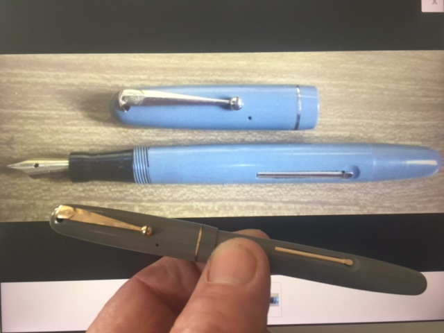
Rob P kindly provided me with these photographs of the same pen. The bottom one is accurate. These extreme variations often cause problems for buyers who discover that the rare colour they thought they were buying turns out to be something duller and more common.
It’s hard to imagine that such a difference from the real colour can be entirely innocent. Differences in uncalibrated monitors can account for a certain amount of colour change but not this much. It looks like very bright light with a blue cast is responsible.
It happens mostly with the paler pens. It’s easier to decide what colour patterns should be. I would think that such an unreal picture would be the basis for returning a pen – after all, you’re not getting what you have every reason to think you should.
Of course PhotoShop and similar programs can be used to make a pen appear any colour but they can also easily restore accurate colour to an image with a colour cast or overexposure. The one exception I have found is in some of Parker’s English Duofold range of the mid-20th century. Greens in those materials that Parker used can be impossible to photograph accurately, usually appearing blue.
If a photograph leaps off the screen at you and is clearly a previously undiscovered colour in a Swan, think twice. It most likely isn’t.

Deb.
Realising that I would probably never own a bright red Ferrari, and settling for a similarly lovely and equally red Parker 45 , I have been fooled three times now , buying what for all the world looked like the ‘happy colour’ red as Parker called them, only to receive the much more common darker or burgundy (?) one.
Upon complaining to the seller on a couple of occasions I was given the ‘difference in monitors’ excuse ..which personally I just don’t buy at all.
Short of actually messaging the seller and asking exactly which sort of ‘red’ they have ..
there’s pretty much no way of ascertaining from the pictures that some of them put up.
I know I know …’fool me three time and shame on me !! ‘
I’m a bit more circumspect now.
Anyone want a couple of BURGUNDY 45s. 🤣😩
It is very annoying, Rob. Universally accepted colour comparisons have been an aim since the 19th century. It seems we’re not there yet!
I know from experience that it is quite difficult to get the colour of Swan pens accurate in photographs on the printed page, but really?! That must have been done to deceive. Calibration of monitors is a real issue, especially as the effect is cumulative (original photographer’s monitor, plus viewer’s monitor), but I’m also sure people tweak exposure and colours to make a pen look more attractive.
Not knowing much about Swans before I started photographing them for TSP, I found it interesting that they chose to issue four colours (Blue, Green, Burgundy and Black) that look virtually identical under normal room lighting conditions! Another photographer’s nightmare….
That’s a good point about the 50s Swans. Often impossible to tell apart without strong light. But yes, though eBay has done a lot to reduce the amount of chicanery possible, two of the remaining problems are colour and flex.