(Excuse B&W photographs. They had to be taken under lamplight and the horrible colour cast was persistent)

This is a beautiful grey striated Waterman 513 pen and pencil set. This range of pens and pencils went into production in 1948 and it was the first style of pen that Waterman made in its new British plant. The plastic is delightful; it gives the impression of transparency in some lights. It’s a standard-sized pen at 13cm capped.
The pens that have been made for Waterman by Altura in the 30s and 40s were good writing instruments but they lacked flair. Watermans new, distinctive clip in the Art Deco style makes for a very attractive pen. The only thing that lets it down is Waterman’s notoriously poor gold plating. On the other hand, this range of pens is better than its successor of the 50s, the “W” range of pens, which was similar at first glance but did not have a lever box, and seems to have been more cheaply made. That’s the Waterman story, I suppose. If you were to draw a graph of Waterman’s quality, it would describe a pretty steep decline after the late 50s, and this resulted in a fall in sales.
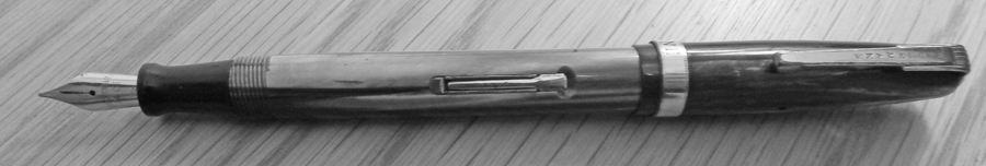
This pen and pencil set, though, was made before the rot set in. It has a quite large no.3 nib. It isn’t flexible but it has a comfortable springiness. The broad cap band is personalised: MP Mulchrone was the proud owner. I hunted him down. The unusual name made my job a little easier. It appears he was a Royal Marine, and may have used this pen to write home from overseas postings.

The matching pencil shows less wear on the plating than the pen. That’s often the way. Pencils don’t seem to have had the use that pens did. The pen and pencil are housed in an unusual case. It’s obviously not original but I have kept it because it probably was chosen by the original owner, it being more robust than the Waterman box.

would agree this colour range is attractive, and quite subtle – they have an almost pearlescent appearance – a look that reminds me of the almost opalescent shimmer on the C.S. Lumina pens. I have a 513 in a sort of toffee-humbug colour – very attractive – and must boast that mine has it’s gilding in good nick still – but like yours a firm nib which doesn’t appeal to me. I’ve another 513 in the same general pattern with a silver sheen – not quite such good condition – both of these have the lever box.
I also have a couple of later W5 models you mention – from the 1950s – both of which also have lever boxes, so must assume this part of the pens design continued for longer than is believed.
Nibs on these W5s are stamped W5, which is good to see – both are like nails, which is not to be surprised, as one of them actually says Manifold – which I’d forgotten!!
I can never quite feel the same passion for these Watermans as we do with M.T. – perhaps it’s as much to do with the non flex nibs as the poor gilding – I also dislike the W’s because I mostly have trouble removing the clips. hose little nuts or whatever, up inside the caps, seems to rust.
The 513s can be confusing too. The Canadian ones I have seen don’t have a lever box. It seems that they “updated” the ‘W’ range part way through the run.
Quality does not reside in a flexible nib. It’s just a different nib. Some of the highest quality pens I have handled had rigid nibs. That’s because that’s what people wanted, until the modern fad got started. People used to know how to handle flex nibs because that’s how quills and many dip pen nibs were. The firm nib was regarded as an improvement, and in terms of durability it undoubtedly is. Many who ask for truly flexible nibs are not as happy with them as they thought they would be. When you see their efforts at writing with them you understand why.
Yes, the clips are even worse than the Conway Stewart variety. In any case, post-30s Watermans can’t be compared with Mabie Todd.
Utterly stunning pens, in a classy, restrained way. I had a green striated W5 (with lever box) that I basically stole for £30: it was absolutely mint, I don’t think it had ever been used. The nib was too fine for me, and I didn’t have the stomach for having a nib like that retooled, so I gave it to a friend. I do miss ogling it, though…had I kept it, I would have mounted it in a shadow box. Probably the most beautiful pen I’ve ever seen.
It is beautiful material. I’ve had some low-end French pens that used it as well. Had they not used that plastic, I wouldn’t have given them a second glance. I think Waterman’s use of it together with their trim makes a very stylish pen.
I have the grey 513 too with a stubbish nib and beautiful line variation that flatters my handwriting. It’s one of my favourites- the sort of pen that looks good to those who appreciate subtlety.
Waterman’s last hurrah before they stepped on the slippery slope, I always think.