
This Rembrandt is towards the lower end, in terms of cost, of Visconti’s output. It’s probably the only one I will ever own.

It avoids the two most egregious faults of modern pens: it isn’t too large and it doesn’t weigh too much. That’s a good start. It’s 14 cm long capped and I didn’t bother to weigh it. It isn’t going to roll off the desk with that protuberant clip which appears to be spring-loaded and quite effective at keeping the pen in your pocket. The cap appears to contain a magnet which draws the pen in before you apply a little pressure to achieve that final “click” as it closes firmly. I’m really not sure why that’s there; we’ve usually managed to close pens without a magnet over the last 100-odd years, but it does no harm and it’s a new idea. It’s a cartridge/converter and mine came with only a cartridge. I’ve ordered a converter which will fit. In use, the pen feels a little overbalanced when posted and that might get tiring after a time. The ink-flow is good, making it quite a wet medium. The nib is firm. I find it pleasant to write with and it has a certain sense of precision which you get with some pens.
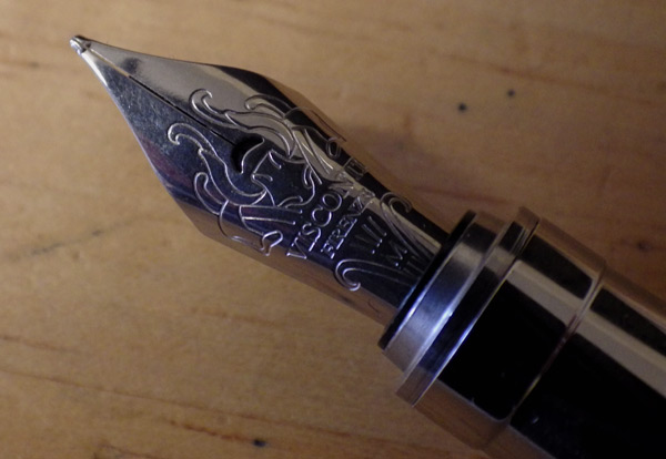
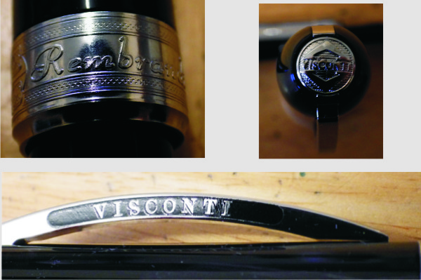
Then we come to the aesthetics, which are of major importance in Visconti pens. First of all, it’s called the “Rembrandt”, but there is nothing about the pen that connects it with the painter. The idea seems to be to associate the pen with the famous name without anything to back it up. I don’t like that. This one is in a dark blue pattern which shows up more the stronger the light. I saw somewhere a hint that this related to Rembrandt’s use of chiaroscuro. Frankly, that’s a piece of far-fetched nonsense. You can’t present chiaroscuro in an abstract pattern. The cap band is the high point of the pen. I suspect that it’s cast work and the name “Rembrandt” is there prominently beneath the clip, the rest of the band being filled with a vegetal pattern. It’s beautiful work and very impressive, as is the disc at the top of the cap which has the Visconti logo. The steel nib, too, is highly decorated with a floral pattern and “Visconti Firenze” and “M” for medium.
Included in the box is a glossy booklet on very high quality paper with numerous photographs. It must have cost quite a bit to produce. It’s a pity that it was not better edited. At one point it says, “The director of this Florentine company founded in 1988 is Dante Del Vecchio, deus ex machina of strong creative dynamism, the same features that we can find in all Visconti creations.” That’s kind of sad. A “deus ex machina” is a plot device in a novel, not a term of approbation for someone we are intended to admire. Doubtless Mr Vecchio is admirable; whoever put the document together is not.

How does this pen compare with the vintage pens I normally write about? It is undoubtedly beautiful. It lays down a good line of ink but as a writer it is rigid and characterless, like many modern pens. As someone who enjoys a variety of filling systems, the cartridge filler must always be a disappointment. The resin of the barrel and the metal of the section have a high polish and I find it a little slippery to grip. When all that is said and done, I like the pen and despite its deficiencies, I have enjoyed writing with it, so far at least.

P.S. It has been commented to me that the design on the nib resembles a rather aggressive octopus wearing a suit of armor, or at least the helmet. I can see that!
It was enjoyable to read your review and get your take on a modern pen. I certainly agree with you that many pens are overweight and almost comically oversized.
You have a good blog going there – really incisive and helpful reviews.
Great to hear your valuable opinion on this pen. Indeed it is not often that I see you giving an opinion on a modern pen.
A year ago or so I bought the Visconti calligraphy set which has a lovely Italic stub 1.5mm and a EF or F nib together with two convertors. I am not sure if they will sell the stub nib separately but it is one of the better ones I have tried although I am quite useless at Italic script.
Kind regards,
Rui
Visconti seem to make some of the better modern pens but most of them cost far more money than I would consider spending on a fountain pen. Like most things Italian they are well designed.
I have derived a good deal of pleasure over the years from reading Visconti’s publicity material. When it comes to connoiseur grade flimflam, they’re in a class of their own … chiarascuro my foot. As for their designs, I have to say that many of them are very pretty indeed, and if I had a taste for big heavy pens with stiff nibs the temptation would be strong.
It seems strange that they would put such effort into producing high-quality pens, and then employing a decidedly low quality publicist to write their blurb. Talk about shooting themselves in the foot…