Thaddeus’s Silver Onoto

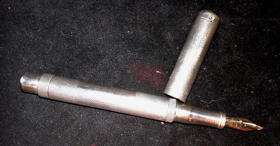
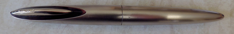
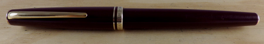
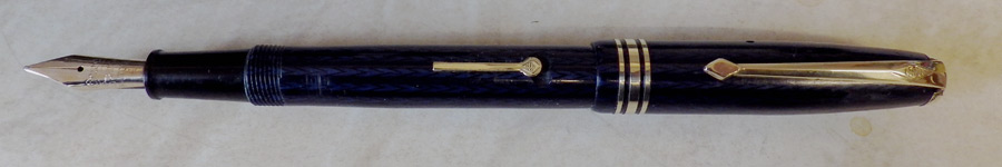
Some time ago my good friend Thaddeus Butts asked me what I thought was the “Best of British” fountain pen.  After some consideration I concluded (and this is my opinion, I know yours will differ) that a solid silver 1920s Onoto would be about the best you could get.

Thaddeus went looking and eventually one turned up as part of a “miscellaneous silver lot in an auction.”  It was in quite sad shape at that stage.  The silver section was gone, the inside of the cap had to be rebuilt and threaded. The turning button cover needed to be built up to fill the hole made from removing the silver pin holding it for restoration of the filling system (1mm x 1.5mm elliptical).

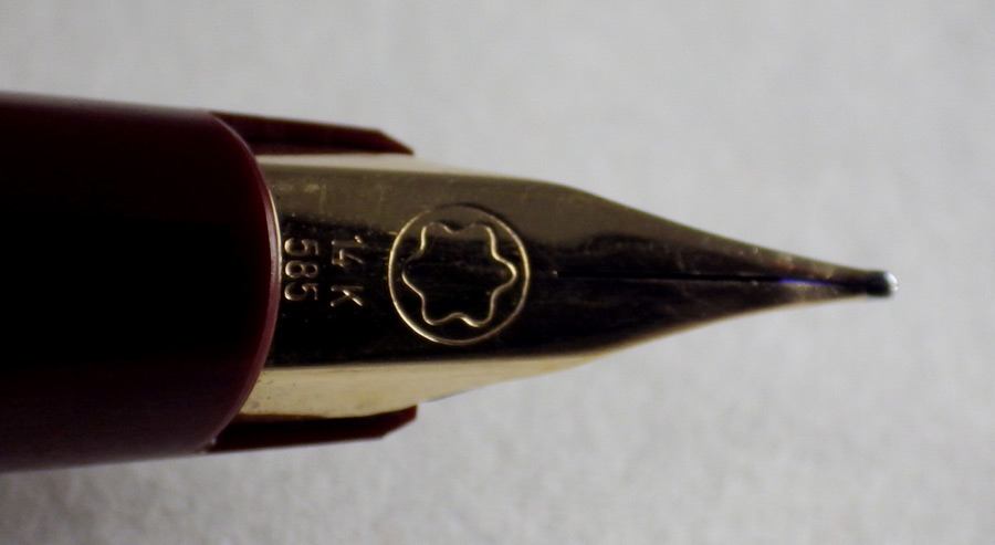
It was passed to Eric Wilson.  He had some difficulty obtaining a silver blank to fabricate the section and eventually a section from a donor pen was adjusted to fit.  To say the least of it, this was an exceptional repair, restoring this superb pen from scrap metal to its original condition.  It has a splendid Onoto nib and it writes beautifully.  Thaddeus is very pleased with it.  Full credit and a round of applause to Eric Wilson.  There aren’t many pen restorers around these days who can do work of this high quality.

Here it is:Barnie-Assay-Marks Barnie-uncapped

Calligraphy Sets

Though there is the occasional collector’s item most of the pens that I sell will be used by their buyers.  That, I think, is as it should be.  Unlike more complex elderly mechanisms, fountain pens are easily restored to working condition and it’s right that they should be used and loved again.  Doubtless they will be employed for business and private correspondence, journalling and the like.

There’s another area of fountain pen use that I try to supply, and that’s calligraphy.  I source the occasional Osmiroid or Sheaffer calligraphy pen and they are usually snapped up pretty quickly.  I’ve been trying to develop a better calligraphy section and today I’ll be uploading a variety of  sets with cartridges.  I think they will be excellent for the beginner or for the more practiced writer.

See what you think, all ye of the elegant letter-forms and swooping lines!

Parker Frontier and Parker Urban

IMGP1020

I bought these two low-cost modern Parkers to see what I thought of them.  The Parker Frontier comes in a metal and plastic box with a large Parker cartridge and a converter.  The Urban is presented in a white sleeve containing a grey and gold cardboard box which holds the pen and converter – no cartridge, but there is a registration and instruction leaflet.  They are both black cartridge/converter pens with simplified versions of the Parker arrow but there the resemblance ends.
IMGP1021 IMGP1024
I would describe the Frontier as a very traditional-looking pen.  The barrel is tapered and the top is flat.  The pen is light-weight and the nib is steel and the shape that nibs have been for a few generations.  On closer inspection, the word “Parker” and the Parker logo are poorly stamped, making the nib look cheap.  The pen closes firmly with a satisfying click.  That’s pretty much it.  This is not a pen that calls for much in the way of description.
IMGP1026
The Urban is radically different.  It’s like the Parker designers went out of their way to be anything other than traditional.  The barrel has a stretched hourglass shape.  The cap looks a little bulbous.  Lines are etched into the barrel and cap.  There is a metal cap at both ends, reminding me a little of the Cross.  It’s a heavier pen than the Frontier but not especially heavy by today’s standards.  This one (and it may only be this particular example) snaps closed well, but is quite hard to open.  The nib has no slit or breather hole, like the Vector or IM.  Taken overall, this pen looks a little eccentric, like the Parker design department had a few drinks at lunchtime and came back and put this pen together.  That said, it’s a pleasant writer.
IMGP1029
In fact both of these pens performed well and I confess I liked them both.  They both feel good in the hand though the Urban is perhaps a little over-balanced when posted.  The nibs are smooth and the flow is good.  Either might have been a Chinese made pen but they don’t have the flow and skipping problems that those pens so often have.  They are remarkable value for money and I would be happy to use either, though I am slightly biased in favour of the Frontier.  Any time you have a tenner or so lying around and you want a good basic pen, you could do worse than either of these.

IMGP1025

Lazin’

What’s new in the pen world?  I don’t know, really, because I’ve been taking a holiday, enjoying the good weather that came at last.  So rather than pen work I’ve been in the garden day after day.  My assistant says two paws up to that.
IMGP1015
Not that she’s been helping me – she’s out all night and sleeping all day.  I’m not good at employing assistants.

I’ve not been entirely idle.  I’ve been looking at low cost modern Parkers and I’ll have something to say about them shortly.  For the moment however, my lazy days of summer continue.  I’m off out to lunch with friends (hi Penny!) and I expect I’ll be back in the garden later.

Black Forest Carved Owl Inkwell

DSCF6313

Inkwells provide endless fascination.  If I could, I would buy them all.  However, the pocket doesn’t stretch to that and I wouldn’t have space for them anyway so I have to make judicious decisions about which inkwells to buy.  If they are exceptionally pretty, like this one, I might hang on to them for a while.  Sooner or later, of course, another one comes along that I have to have and I will need to clear the space for it.
DSCF6321
I am assured that this beautiful owl was made in the Black Forest of Germany and I have no reason to doubt it.  It’s carved from a very light wood, probably lime.  His glass eyes make him look very fierce and maybe a little bit cross-eyed.  I think this is how an owl would look to a mouse.  I believe he’s a Short-Eared Owl with the tufts in the raised position.  He’s about six inches high.
DSCF6315
These Black Forest carved inkwells are very popular and they go from the realistic, like this one, to the sentimental, usually doggies and pussycats.  I’ve noticed that the sentimental ones fetch the biggest prices.  I love them all.

The inkwell lacks a liner but I have a cream porcelain one on order that should fit it.  As well as being beautiful it’s very practical and there’s a nice pen rest in front of the owl.  These things make delightful ornaments but they’re even better when they’re used for the purpose for which they were intended.
DSCF6323
The detail of the carving is beautiful and precise and the longer one studies it the closer one feels to the craftsman of perhaps 100 years ago who patiently carved this item and doubtless hundreds of others in a lifetime of this work.  It’s a privilege to own something like this.

Cross Verve Platinum

IMGP0877

Cross pens are not especially popular in the UK.  I’ve never understood quite why this is so.  Perhaps it’s because they have tended to be traditional – nay, old-fashioned.  That changed, I think, when they introduced the Verve some years ago.  This is anything but traditional pen.
IMGP0878
It’s quite a large pen at 14.9 cm and nearly 16 cm posted.  It is said that the nibs are made by Namiki and I would be quite prepared to believe that as it’s a splendid writer.  Some people have complained about this pen being too short but that makes no sense to me.  It’s a decidedly long pen posted.  Of course there are many longer pens but I fail to see why the length of this one, which is greater than many others, should be regarded as short.

The design seems to be three elongated ovals, the pen itself being one, the clip assembly being another and the nib being the third.  Aesthetically, that works well for me and practically it seems good too.  The clip fits snugly against its surround and it is activated by pressing the very top.  The tubular nib is a very pleasing design.  This one appears to be platinum over gold – it’s silver coloured but marked 18K.  It is a medium and as I said above it’s a delightful writer.
IMGP0879
Discontinued now, I believe that the Verve was designed to counter Cross’s reputation for conservative pens.  It certainly did that.  Now they have the Peerless, Apogy and Affinity ranges which, while not as unusual as the Verve, are not quite as conservative as their Townsend range.

IMGP0870

Montblanc Generation

IMGP0768

As you will know if you’ve been reading this blog I don’t like today’s Montblancs (mainly because of the awful hype and the ridiculous overpricing) but I do like the older ones.  Mostly, the ones that I like are from the 50s or earlier and they are piston fillers.  The Generation is not a piston filler; it’s a cartridge/converter pen but a very likeable one.  It’s quite a big pen at 14 cm and it has a smooth and pleasing outline without much in the way of bling.  It has gold plating (in very good condition) on the clip, at the base of the barrel and on the thin and medium cap rings.
IMGP0769
I’ve been unable to find the dates of this pen.  I would guess at the 90s but I might be wrong by a fair bit – it might be older.  It has a push fit cap which closes the pen with a very satisfying snap.  The nib is not what you would think of for Montblanc.  I’m much too lazy to attempt to describe it but you can see it in the photograph.  It’s actually an absolutely superb nib, such a pleasure to write with.  Montblanc may over praise and overprice themselves but they do make splendid nibs.  That, and the prestige that many people imagine it confers upon them to have one, is what makes them such big sellers.  Now me, I’m not looking for anything to confer prestige upon me and I don’t believe it really would anyway, so I just assess the pen as I would any other and it comes out as a terrific pen.  Not as good as the best Swans, of course, but a really excellent example of the best post-war pens.
IMGP0774
So there we are – yet another Montblanc that I approve of.  Unfortunately, of course, they are very expensive – even the older ones.  Otherwise I would buy many more of them.  There is obviously quite a lot of “the Emperor’s new clothes” about  Montblancs and, indeed, some other modern pens like Visconti.  However, it is worth saying that any Montblanc you buy, even the cheapest ones (back when they made cheaper ones), will have a thoroughly splendid nib.  By comparison the one Visconti that I had was nothing special in that regard and in fact I might have been writing with a cheap Chinese pen because it was so heavy and the nib so lacking in character.
IMGP0782
I never dreamt the day would come when I would be boosting Montblancs in my blog but here it is!  I do recommend that you stick to the cheapest ones you can find and please avoid paying thousands for the perishing things!

Conway Stewart 93 Blue Herringbone

IMGP0751

I’ve had a red herringbone, now here’s a blue one.  I’ve only got green to go and I’m sure that will turn up one of these days.  The difficulty, generally, in acquiring the herringbone colours is price.  These are probably the second most popular Conway Stewart patterns, giving way only to Cracked Ice, so they are much sought after.
IMGP0753
The ironic thing about it is that Conway Stewart placed no especial value in these patterns that are so esteemed now.  The herringbone didn’t cost any more than any of the other patterns or even the black example.  They didn’t care enough to give the pattern a name.  It was probably Jonathan Donahaye that christened the pattern.  The only other example of a herringbone pattern that I can think of is the little-known Rubinette pen that I wrote about some time ago.
IMGP0754
The 93 isn’t especially common.  It appears only as black and the three herringbone colours, together with bandless examples in green and blue herringbone.  The production run of this pen was particularly short, running from about 1961 to 1963, which goes some way towards explaining their present scarcity.
IMGP0757
It’s one of Conway Stewart’s “quality” pens, as evidenced by the narrow/medium/narrow cap rings.