Mabie Todd Swan SM100/63

DSCF1582

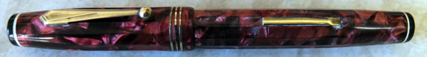
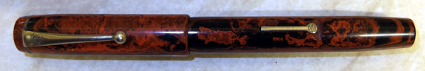
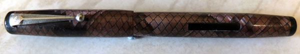
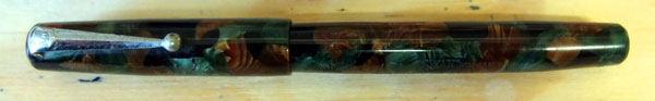
Swan had the best colours.  They don’t come any more beautiful than this.

DSCF1585

I expect that when this pen came on sale back in the thirties, it cost the same as the plain black one.  Things are a little different now.  These pens, like the colourful Visofils and Jackdaws are hard to come by now, and expensive when they do appear.  I count myself fortunate that this is the third russet/jade marble pen I’ve had in all the years I’ve been buying pens.

DSCF1589

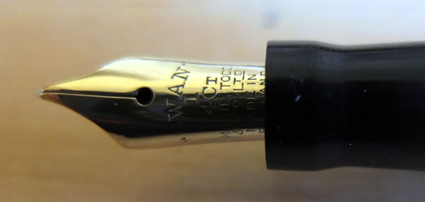
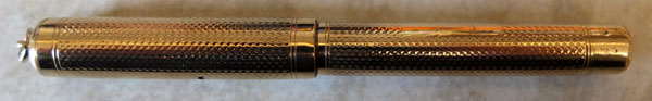
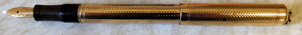
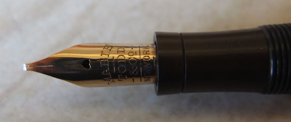
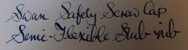
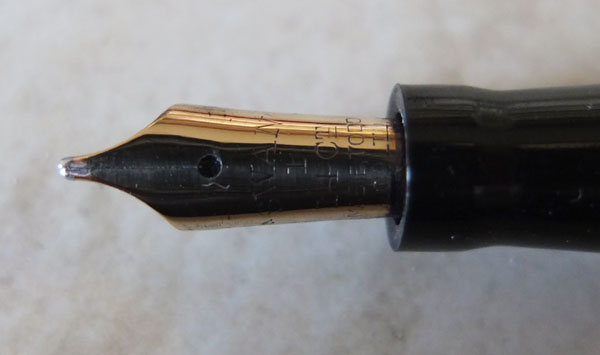
This pen isn’t just a pretty face, either.  It has a high-shouldered oblique nib with a little flex to it, which makes for a nice writer.

I think it needs to be said at this point that I can’t make this pen available for private sale.  It will have to go up on the sales site.  I got into all sorts of hot water over privately selling a pen that everyone wanted recently. The burnt child minds the fire, as they say here in Scotland.

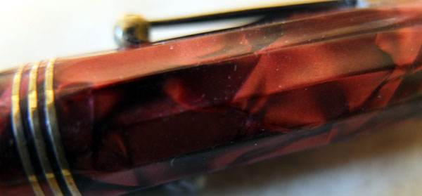
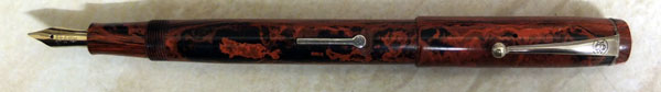
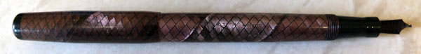
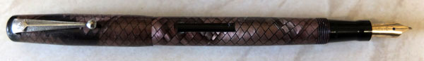
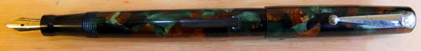
Want another look at those colours?  Go on, then!

DSCF1593


A Gold-Filled Swan Safety Screw Cap Ring-Top

Someone sent me photos of a beautiful old Swan for valuation this morning.  It was a half overlay eyedropper filler from around 1908, long and slender with an over-and-under feed.  A wonderful thing, but a pen of an earlier era, a time of gas lamps and foolscap paper, of top hats and horse traffic.

DSCF1573

Later, as I was restoring pens I came on this gold-filled Swan Safety Screw Cap.  It was made within a very few years of that earlier pen.  The Screw Caps went into production in 1911 and went on until around 1920, so only a short time separates the pens but in that brief period, the fountain pen has been transformed!  Gone is the over-and-under feed, the most evidently archaic feature of the earlier pen, to be replaced with Swans’s excellent and enduring ladder feed.  The proportions of the pen have changed.  Despite being a ring-top, this pen is entirely modern on shape.

DSCF1575

There’s some wear, particularly on the end of the barrel where the cap has been posted.  This pen evidently was not reserved as a thing of beauty (though it is!) but was well used over a lengthy period.

DSCF1576

And rightly so, too!  The stub nib is a complete delight to use, and the pen is large enough, and contains enough ink to be completely practical.  It’s both a wonderful writing instrument and a stepping-stone in the development of the modern fountain pen.
DSCF1580


The Parkette Deluxe

DSCF1557

Back to the nineteen-thirties today, to that dodecagonal pen I hinted at, the Parker Parkette DeLuxe.  This is yet another of Parker’s Thrift-Time pens but for a money-saver it’s pretty well appointed. The fluting is a pleasure to look at and it feels good in the hand.  I’m surprised more pens didn’t adopt this design.  The black button with a white line under it on the cap top and the barrel end is an eye-catching feature, and the gold-filled lever, clip and triple cap rings was laid on thick enough to have withstood the passage of the years.  In all, this is quite an outstanding pen.

DSCF1562

I have a theory that up to the nineteen fifties this country was flooded with foreign pens.  Most were poorly made and didn’t last long.  As very few of them were designed to be serviced, once the sac perished, that was it.  In the bin.  Some lasted a bit longer, like this one that was included in a lot I bought.

DSCF1566

Here it is in the ever-popular “Pustule and Vomit” pattern.  My guess is that this, too, is a thirties pen.  If you study it for a moment or two you begin to see that it looks a bit like a child’s drawing of a Duofold.  At a stretch, this pen could be repaired.  The section fitting is best described as “rammed in” and it might need to be glued in place.  The pressure bar has disappeared so one would need to be cut to fit.  The peg that the sac fits on is very slender, so it would need a necked sac.  The plated nib, impressively enough, has tipping material and the blind cap and brass button are fine.

Obviously, the pen wouldn’t be worth the time and expense of repair as no-one in their right mind would want it at any price, but it has its interest, slight and passing though it may be.  Were these the pens that the majority of children carried to school?  Was the presence of a mass of these cheap foreign imports the reason that, unlike America, Britain never really developed a third tier of domestically produced pens?

A Duofold AF

DSCF1547

This is my latest everyday user.  It’s a rather shabby Duofold AF and yes, somebody broke the clip and no, I haven’t got around to replacing it.  The pen writes just as well with a broken clip.  It’s made from that strange plastic that Parker used for the AFs.  It looks black until you put it under a strong light, then it’s green.

DSCF1554

The great thing about this pen is the nib.  It’s a quite acutely-angled oblique.  It took a little practice to come to terms with it but now I’m enjoying it!

I spent all day today editing photos and writing descriptions for my next upload.  My assistant doesn’t do that computer stuff so she took the day off.

DSCF1542

Tomorrow I’ll be back to restoration.  There’s one pen in particular I mean to fix up and photograph so I can write about it here, mainly because it will allow me to use the word “dodecagonal.”  Now what could that be?

The Combridge Pen

DSCF1275

You may remember that I said recently that I’d swapped the little Quail Stylo for a pen I’d long wanted.  This is it, the Combridge, another of those Conway Stewart Associated pens, to use Jonathan Donahaye’s term.  What it is, is a pen made by Conway Stewart for another company, on which Conway Stewart’s own name does not appear.  It’s one of several forms of re-badging.

Combridge was a large stationery business in Birmingham.  Their origins lie in the Victorian period, and they started out with the confidence and ambition of that period.  They expanded into postcard and book publishing, at least a proportion of the latter being devotional material.  As well as having their own branded pens made by Conway Stewart they sold Watermans and Swans. The company was wound up in 1994.

DSCF1279
My Combridge Pen is a later one, I think.  Certainly the chrome clip and lever point to that conclusion.  There are earlier ones that have the Conway Stewart flange lever, and I’ve seen a very up-market version with two gold barrel bands and a cap band.

The nib in mine is a replacement.  Some, at least, have a “Combridge” nib, I believe.  Others may have a warranted nib.  Mine has a warranted nib but it’s graced with rearing unicorn, which I vaguely believe comes from Unique’s nib works.  I have no evidence and if you know better, tell me.

Some sellers describe Combridge pens as rare.  Not so.  Certainly they’re not as common as Conway Stewart 286s, but don’t be talked into paying a high price for their supposed rarity.  They sold well and are moderately common.

I have a particular affection for all of Conway Stewart’s woodgrain pens.

The Modernes

DSCF1266

These two little pens could hardly be more dissimilar but they have a surprising amount in common. Both are products of the Hungry Thirties, both are button fillers and both are made of celluloid that has discoloured over time. And though they were made on opposite sides of the Atlantic, both are Modernes. The onyx one is a Parker Moderne and the cream and black pen is the Mentmore Moderne.

Parker, I think, used the name first, in 1932. Mentmore followed on two years later. Did Mentmore just steal the name Parker had used? Or did modernity seem like the way out of the troubles of the times, made a little classier and more effective by sticking an “e” on the end and making it French? I don’t know. I only ask the questions, I don’t have the answers.

DSCF1270

Despite the unemployment and the poverty, there was still a need for pens. School students still had to write, as did those clerical workers still in jobs. These pens were built to a price, but quality wasn’t allowed to slip. The pens are smaller and they have comparatively small nibs but they are stylish and very well made. The Parker has a quality edge over the Mentmore, as you might expect, but the Mentmore’s a good pen too. In a way, the Mentmore’s the more interesting pen as you see very few of these and hardly any in the cream and black livery.

My thanks to Eric Wilson, who made a wonderful job of replacing the Mentmore’s cap rings and found a better nib for it than the one it had.

The Conway Stewart Quail Stylo No 3 Again

The Quail Stylo attracted much interest.  A consensus of opinion has it that it’s a rebadged Conway Stewart Pixie 113 though the company for whom it was provided is now unknown.  Late twenties, early thirties, then, one of Conway Stewart’s peaks of high quality production.  For me, their pens never got better than they were in that era.

The Quail is on its way to become part of a very large collection of Conway Stewart pens.  In return I’ll be receiving a very interesting Conway Stewart associated pen which will doubtless appear here shortly.

Swan Snakeskin SM100/85

I wonder if somewhere someone has a full list of Swan colour codes.  Such a thing would be very good indeed!  I work off the the number interpreting list that was developed in FPN some time ago.  It’s very good but it consists essentially of the pens people had at the time, so it’s incomplete.  It’s also my assumption that these colour names are not those that Swan assigned.

DSCF0943

This one is a Swan SM100/85.  It’s the “85” part that I don’t have a good explanation for.  The seller of the pen described it as “ruby snakeskin” but that’s far from right.  So far as I’m aware there is no ruby snakeskin.  Garnet is the nearest to that colour and that’s very much brighter than this pen.

DSCF0942

These photos were taken in natural light and what I’m seeing on my monitor is close to identical to the colour of the actual pen.  Very close.  In fact, I can see no difference.  Monitors vary, of course, so you may be looking at something slightly different.  The colours I see vary from dark brown to light brown to dusky pink.  So what do you call that?  Brown snakeskin?  85 is “mauve snakeskin” in the list.  Well, maybe, I suppose, in certain lights.  But not really.  For it to be mauve it would need a lot more purple than it has.  There’s no evidence of fading, either.  Faded pens always have the original colour on that part of the barrel shielded by the cap.  There’s no brighter part under the cap here.

DSCF0941

These snakeskin and lizardskin pens have a tendency to plastic shrinkage, making them a challenge to disassemble.  Luckily, this one was an exception.  The section popped out with just a little heat.  It was a matter of moments to install a new sac and reset the nib which gone a little awry.  The chrome plating on the clip had seen better days – probably around seventy years ago – and I brightened that up, so far as possible.

DSCF0944

The nib, as is so often the way with these pens, is an oblique stub with a little flex.  They don’t come any sweeter.