A Very Flexible Waterman 52

IMGP7854

I’ve outlined the history of the Waterman 52 before so there is no point in going over that again.
IMGP7853
This very fine example of a US-made Waterman 52 in black chased hard rubber didn’t look quite so good when it arrived.  It had accrued many years of dirt, mostly, I think, from being in a drawer somewhere.  I say that because it doesn’t show the signs of long, continuous use.  The chasing is crisp and the black hard rubber shows very little fading.  A little cleaning and polishing returned it to something very close to what it looked like on that long ago day that it was bought and became someone’s pride and joy.
IMGP7857
The pen bears a patented clip of a type that I see now and again.  Though it has a patent number, there is no maker’s name on the clip, but it’s a clever little device that takes a firm grip of the cloth and can be released by pressing the tiny trigger.
IMGP7859
As is so often the case with Waterman 52s, the high point of the pen is the nib.  It’s the most flexible nib I have had in quite a while and it snaps back to medium the instant the pressure is released – not that it takes very much pressure to produce a double-broad line.
IMGP7860
Pens like this are truly precious.  There is no pen made today – or in the last few decades – that can compare with a really great Waterman 52 like this one, or for that matter, a flexible Swan or Onoto.  We are very fortunate that these pens were made so well and have lasted to our day in such splendid condition.

A Waterman Ideal 513 Set

IMGP6614

Here’s a very handsome Waterman 513 set.  It’s in a striated version of the Tiger’s Eye colours, an exceptionally beautiful combination of honey and brown.  The 513 is a standard-sized pen, 13cm capped.  It’s paired with an equally attractive and (to me) unusual pencil.  It’s part of Waterman’s less expensive range – you’ll not that it doesn’t have a lever box.
IMGP6622
There’s quite a bit of confusion over these pens with the Art Deco stepped clip.  They end up being called Stalwarts, 513s or W3s.  They’re made to slightly different specs in the USA, Canada and Britain.  To be absolutely precise this particular Canadian pen is just a Waterman Ideal with no number or name assigned to it, but as it meets the specification of a 513 we might get away with calling it that.  The 513 is the 1948 version with two cap rings and a 2A or W-2A nib.  Nibs give rise to alot of confusion and this pen isn’t an exception in that.  It has an Ideal No 2 nib which is certainly a replacement.  It’s actually an older nib, commonly found in the Waterman 52.  I’ve also seen 513s bearing W3 nibs and that’s wrong too.  The W3 nib is fitted to the W3 pen, a much later though not dissimilar pen turned out in 1955, so that nib’s a replacement too.  Why so many replacements?  I don’t know.  The 2A nib has always seemed a perfectly good nib to me, as robust as any other Waterman nib, and coming in the full range of nib types from flex to nail, with the occasional stub or oblique.
IMGP6616
If all that hasn’t made your head spin you now have the story on these post-war Watermans.  The 512 is a slightly cheaper version with a single cap ring.  The 515 is a bigger beast with an impressive, often flexible nib.  The W2, 3 and 5 are later pens.  Some people try to find an equivalence between these pens and the Stalwart.  If it doesn’t say Stalwart on it, it isn’t a Stalwart.  Simple as that.  I don’t know why people want to insist that these are Stalwarts – perhaps they prefer names to numbers.  There is enough similarity to allow for confusion but it’s important not to run them all together.
IMGP6621
Anyway, I’ve had this pen and pencil set for quite a while and I’ve written with the pen quite a bit.  The nib isn’t flexible but it’s smooth, making it a nice pen to write with.  The pen and pencil came in the leather case and I assume it’s original.  It’s the right age.

IMGP6619

The Waterman CF

Despite a slight prejudice against cartridge-fill pens, I have always admired the Waterman CF, the daddy of all cartridge/converter pens.  It’s just such a bold innovation – not so much the use of the cartridge to fill the pen but the futuristic styling which was designed by Harley Earl.  Waterman borrowed him from the automotive industry and I don’t think you have to look far to see that influence in this pen.  It’s very much of that optimistic era, the fifties.  Back then we believed in progress and knew that the solution to all our problems was just around the corner.  A science fiction future was almost upon us, and designs like this one anticipate that.
watermanCF
Here’s one or two before shots.  This pen was more than a little rough and being one of the more expensive ones it had more décor to get discoloured.  Thankfully this one hasn’t suffered the damaging corrosion that has ruined many of these pens.
Waterman2b
Restoration required very little.  Flushing old ink out of the section took a little time due to complexity of the feed, full of nooks and crannies for ink to cling to.  The rolled gold cap and the teal and white plastic cleaned up well.  The gold-plated brass areas showed more indications of wear but at least there’s none of the pitting that has afflicted some CFs.

This pen came with a cartridge, a precious thing these days now that they’re no longer made.  It can be refilled, but I set my heart on a converter.  They’re hard to find now.  Amazon used to stock them but no more.  I could have bought one from America but by time I paid for the shipping, customs dues and Royal Mail’s handling charge it would have cost several multiples of the buying price of the pen.  I finally tracked one down in Penbox and that’s eagerly awaited.

The smooth nib is springy rather than flexible.  It’s pleasant to write with but perhaps too slender for me to use it for my magnum opus.  The cartridge is big so it won’t need filled very often.  The pen closes firmly but the cap wobbles a little.  I can’t see an obvious way to fix that.  It’s not the worst fault.

This is one of the English-made pens.  I see no difference from the American ones.  The French pens came in a whole variety of colours.  This one is the standard teal and white.  I’m pleased that the white cleaned up so well.  I’ve seen examples where the white has taken an ivory tinge or even become downright yellow.  I’ll ink up this pen now and again so that I can plug in to that future that once was, with personal fliers, transporters and instant meals from machines.  We don’t seem to be so optimistic any more.

Watermans, Ideal and Otherwise

Here’s a comment made by Stuart today.  As comments go, it’s rather longer and raises more issues than most of my blog entries.  Rather than italicise which makes it a pain to read, I’m enclosing Stuart’s comment within dotted lines.
……………………………………………………………………………………………………………………………………………………………………………….
I had gotten so emotionally involved in my earlier comments that I neglected to ask a specific question re: the Waterman ‘Ideal’ pen and how it so easily seems to play into the ‘greasy’ hands of such sellers.  This is a very popular pen on eBay and for very good reason.  Yet I cannot help but notice some things which have been ‘troubling’ me for quite a while.  The question seems to boil down to whether there is anything at all ‘ideal’ about an ‘IDEAL’?  In other words, what, specifically, makes an ‘IDEAL’ pen by Waterman so doggoned ideal?

I ask this question not to be obtuse but to make a sincere observation.  For the life of me, I simply do not see anything unique or ‘ideal’ about a Waterman ‘IDEAL’!  It seems to be designed the same as a non-Waterman IDEAL.  The barrel seems the same, the filling system is the same.  The cap seems the same.  What, exactly, is so doggoned ‘ideal’ about it?  Is it made from a better grade of celluloid or hard rubber? Does the gold-filled or plated lever have a higher percentage of gold in its formulation?  Or are we simply dealing with a marketing concept on the part of the Waterman executives?

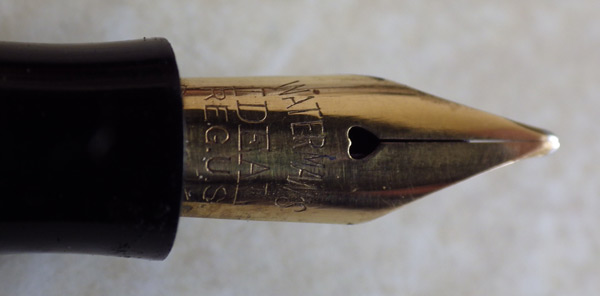
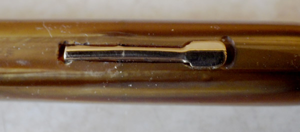
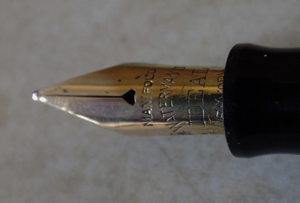
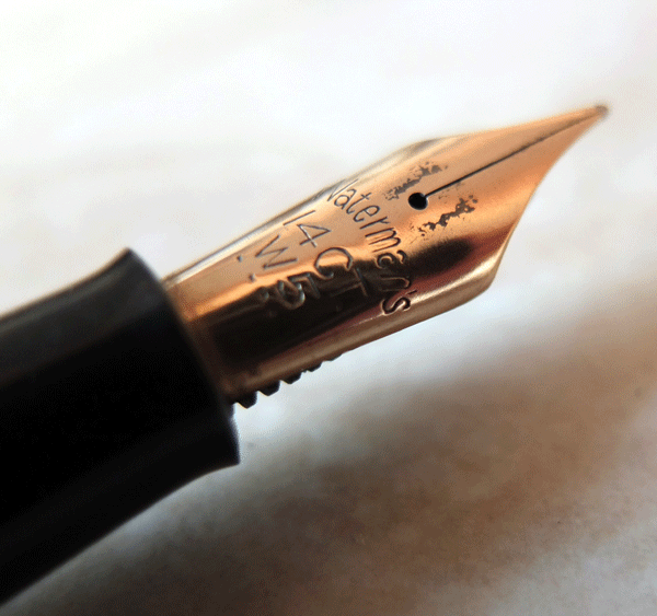
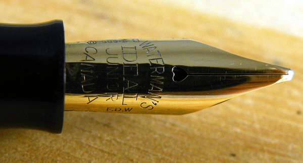
I have seen many IDEALS offered on eBay where the barrel has the IDEAL globe on the pen barrel BUT – lo and behold – the nib on this pen does not say IDEAL on it!  Is a fraud being perpretrated upon the unwary buyer in such an instance?   Is a Waterman nib engraved with IDEAL in any way made better or likely to last longer or flex better than a Waterman nib which is not marked IDEAL?  If it is, then every seller marketing his pen as a Waterman IDEAL is committing a fraud (or so it may seem) unless the nib on that pen also has the IDEAL imprint on it.  If there is no real difference in inherent quality or performance between an IDEAL and a Waterman 2A nib, for example, then what is the benefit or real value in having an IDEAL nib?.  Again, are we dealing here with nought but advertising hype?  Or is an IDEAL really and truly ‘ideal’ after all??  Inquiring minds want to know!!
……………………………………………………………………………………………………………………………………………………………………….
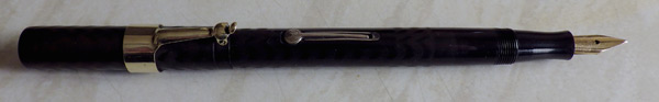
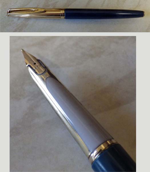
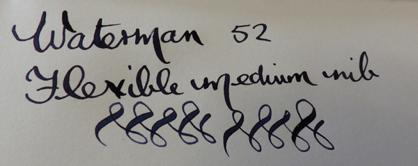
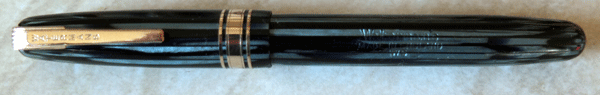
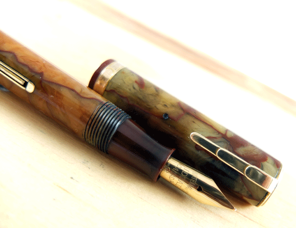
What is so ideal about a Waterman Ideal (by which I take you to mean the Waterman 52 as you refer later to some of them having replacement 2A nibs)?

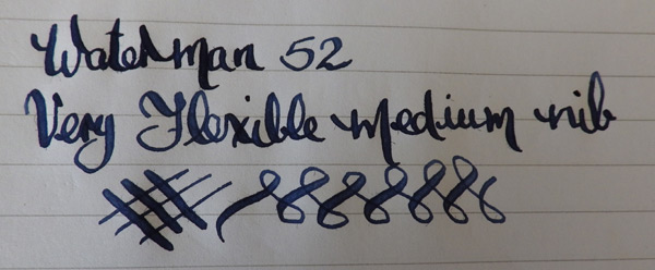
I’m no expert on Watermans, I hasten to say, but the Waterman 52 is a very practical and useful pen as was recognised by the huge numbers that sold.  Size, weight, balance, price, quality and performance all came together in the 52.  The Ideal No 2 nib is an exceptionally good one, whether it be firm or flexible and across the range of point sizes.  Are we dealing with a marketing concept of the Waterman executives?  Far from it, we’re dealing with a product that the common writing man found to be the best of its kind for many years.  I confess, Stuart, that I’m at a loss to understand what you mean by a non-Waterman Ideal.

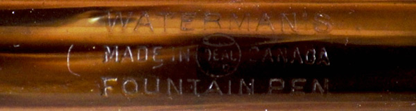
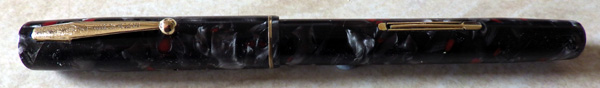
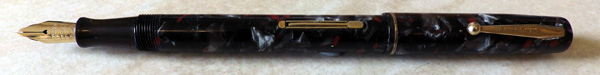
Yes, many Waterman 52s appear in eBay and elsewhere with nibs that don’t say “Ideal” on them.  These are old pens and nibs are their most fragile component.  Particularly for those Canadian 52s imported into Britain, the most commonly available nib of the right size is the English Waterman 2A.  Most 2As are not as good as most Ideal No 2s, admittedly, but they were a serviceable nib fitted to save the pen’s owner having invest in a new pen.  These repairers didn’t know that a few decades later these pens would be collectables and that there would be a premium on originality.

Are sellers committing a fraud by selling a Waterman 52 Ideal with a non-ideal nib in it?  Yes and no.  If it’s on a pen-retailer’s site, I would expect the seller to be knowledgeable enough to realise that he’s selling a slightly inferior product and I would expect him to point out that the nib is a replacement.  In eBay, you can’t expect sellers to be knowledgeable.  Some are, of course, but most know little about pens.  It’s best to ask whether the nib is an Ideal or something else.

It seems to me (if you don’t mind me saying so) that you have a very distrustful attitude to pen sellers and manufacturers.  A certain amount of due caution will serve you well; deep-seated suspicion of those you deal with will, among other things, poison your own enjoyment of pens.

A Celluloid Waterman 52

IMGP0959

Waterman updated its long-running 52 in 1934.  It was shortened slightly and the ends of the cap and barrel became a little tapered.  Most importantly, it was now made from celluloid and the trim was redesigned.

These pens were not lathed from rod stock but made from wrapped celluloid sheet and some show signs of delaminating.  Most are stocky, sturdy pens like their hard rubber predecessor and of course they retain the wonderful Ideal nib.

Care should be taken in disassembling these pens as some of them have a two-part feed which can be damaged by injudicious use of the knock-out block.  Not all celluloid 52s have these redesigned feeds.  Perhaps they were tried and withdrawn.
IMGP0965
This example was made in Canada.  Back in the bad old protectionist days (considering how well globalisation has worked out they might not have been as bad as all that!) the larger US companies found ways to overcome the tariffs imposed on imports of their pens in Britain.  Parker and Waterman established factories in Canada and Sheaffer did the same in Australia, as these Commonwealth countries had free trade with Britain.  Interestingly for us, some of these factories developed a degree of independence and made models unique to them.

This red and grey marbled celluloid was popular and was used in several other Waterman models of the time.  Despite its face-lift and new material, the 52 began to look dated when compared with pens designed in the thirties.  As demand for it dropped, the pen disappeared from the Waterman catalogues.  Celluloid 52s are far less common than the hard rubber ones.  The 52 appeared in so many different forms that it makes an ideal subject for collecting and it is, of course, the writer’s pen par excellence.

IMGP0966

Waterman W5

DSCF0330

Probably because of its similarity to pens like the 502 and 515, the Waterman W5 is almost always referred to as a nineteen forties pen but it’s actually a product of a second revamp of the post-war range in 1955, along with the W2 and W3.

DSCF0340

It’s an understandable mistake because the differences are slight. As a replacement for the 515, it has exactly the same clip and lever. The size is pretty much the same and the main differences are that the 515’s single broad band has been replaced with a narrow/medium/narrow arrangement and the No 5 nib has now become the W5, with a slightly different profile. Though it may be subjective as I don’t have both models here to compare, I believe the W5 is a little lighter in the hand.

DSCF0333

These pens appear to be the flagships of the English range, and this example is in a most attractive iridescent striated blue pattern. The still photo doesn’t show the oil-on-water effect of these changing colours as the pen is moved in sunlight. It’s a stunning pen visually and like all Watermans it has a delightful nib, smooth and with a hint of line variation.

Waterman Lady Patricia

DSCF0065


This is the Lady Patricia, issued around 1930 as the distaff addition to the Patrician, which it resembles in the materials used but in no other way, really, except for the lever box. It’s a simple and elegant design in its own right, shown off by some of the best celluloid Waterman ever employed.

DSCF0069

This one is in the onyx pattern. As usual with this pattern, there’s some discolouring, though in this case it isn’t too bad and the original pattern remains clearly discernible. The worst colour shift is in the cap, exactly over the inner cap. Whether this is a result of the decay of the inner cap, the inner cap trapping decomposition gases from the sac or even some pernicious old ink trapped below the inner cap is anyone’s guess.

Though short, these pens are not slender and they make practical everyday writers. Most Lady Patricias I’ve had were stiff-nibbed, but this one has notable flex.

Waterman Junior

DSCF8317

I’m always pleased when there’s a Waterman Junior coming my way. They’re superb pens, often in glowing colours like this iridescent green marble, and they have very, very nice nibs. I can’t find it in Max Davis’s Waterman book but looking at the very neat chrome-plated lever box, I’d guess that it was made in the late 1930s.

DSCF8319

Invariably, in my experience, these pens have superflex nibs. A glance at the nib would give you no clue to the decorative line that resides in there. It just looks like another ho-hum Ideal nib. But it’s not…

DSCF8323

Forgive the hasty and somewhat blotted writing. I closed the page before the ink was dry, but you get the idea.

Flexibility And A Waterman 52

Though I enjoy flexibility and I know many of my customers do, I don’t try to buy flexible pens. Buying from photographs, as I do, it’s impossible to judge what will be flexible and what won’t. I’ve had nibs with long, slender tines that you’d swear had to be superflex and they were hard as nails. Conversely, I’ve had short, stubby nibs that had wonderful line variation. You just can’t tell by looking at ’em.

Of course I buy a lot of pens, and on average somewhere between a third and a half of those I buy will have an appreciable degree of flexibility, so I get to play with lots of interesting nibs. I often see people raising questions about how to buy a flexible-nibbed vintage pen on FPN and I feel sorry for them, because there really isn’t a good answer. They only want to buy one Swan or one Waterman, not four in the hope that one will turn out to be what they want, and the odds are against them. Hope is at hand, though because online sellers are increasingly including writing samples and good descriptions of the attributes of nibs these days.

All of which is a long and wandering preamble to today’s pen, a rather ordinary Waterman 52. It’s clipless and probably one of the earlier ones. It has nice gold trim, hallmarked in the case of the cap band, but it’s quite faded and worn.

None of that matters a bit when you see what the nib is capable of. It’s towards the fine end of medium unflexed and it flexes readily to double broad or more, with instant return. It’s a gem, and it goes to show that there are many superb writers out there awaiting restoration and to be returned to use.

Waterman No 14 Eyedropper Filler.


The Waterman Ideal 14 differs only in size from the No 12. It’s close to as simple as a fountain pen can get and yet there is still, rightly, huge demand for these excellent writers. I believe it came out in 1899, breaking new ground with its cone cap and the overflow reservoirs in the feed, which Waterman now christened the “spoon feed”.

I think it’s worth saying with regard to this particular example that I’m not totally convinced that the cap is original. The person I bought it from, to be fair, wasn’t sure either. It fits perfectly in length and diameter but it’s a little darker than the rest of the pen and I view it with mild suspicion.

Waterman made a virtue of the minimalist simplicity of these pens; there’s a barrel, a cap, a feed, a section and a nib. That’s it. It’s all you need to make a perfect pen! Later models came with a fixed clip as an option, and so popular was this range of pens that it continued on sale until around 1925.

The main reason for their continuing popularity today is the nib. The No 14 nib is noticeably bigger than 12, but otherwise it conforms to the same “Ideal” design. These are wonderful nibs. This particular one is very fine, perhaps an EF, with superb flexibility and snappy return.

I should have photographed the barrel thread. Waterman’s have quite short barrel threads, but they’re deeply cut and unless they’re completely worn out, which is rare, they hold ink absolutely securely. No need to go slapping silicone grease on these pens!

Because the cap may be a replacement, I can’t date this pen with certainty but it’s unlikely to be much, if any, less than a hundred years old. What a privilege it is to share the pleasure of writing with such an exceptional pen with its original buyer all those years ago!