Swan 3230

IMGP1767

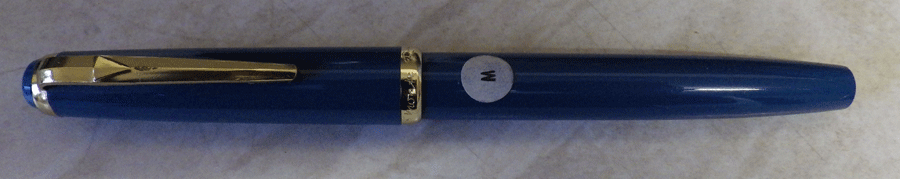
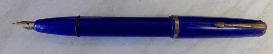
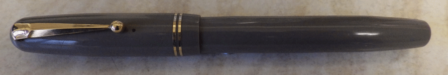
Here’s a rather nice Swan 3230. Most of these grey pens aren’t very nice, as many of them are discoloured to yellow. I’m not sure what it is that causes this particular discolouration, but it happened often enough that Mabie Todd stopped producing this colour and used the number 30 to indicate a pale blue instead. Grey must have been popular in the immediately post-war years, because several of the manufacturers, like Parker, Wyvern and Mentmore, had grey pens on offer. All suffered discolouration and were, sooner or later, withdrawn. Much later, in the nineteen sixties, Conway Stewart introduced grey pens to their less expensive range. Whatever else was wrong with those pens – and there was quite a list – they didn’t suffer from the yellow discolouration. I suppose this must have been because a new plastic must have been developed in the interim which did not discolour.
IMGP1768
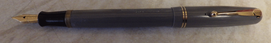
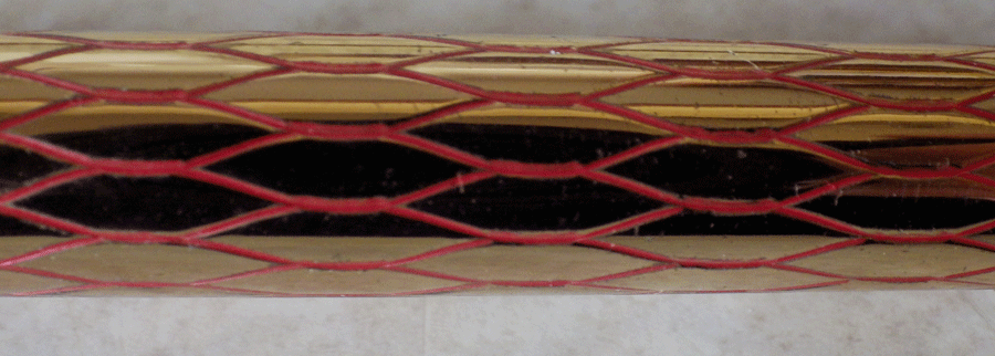
One other noticeable thing about this pen is the brass threads on the barrel. They look really stylish and indicate that this pen was one of the first run of the new design in 1948 or 1949. They, too, were withdrawn and replaced with plastic threads. There is no written evidence of why this was done but I assume it was because the brass threads can cause undue wear to the plastic threads inside the cap. The other possibility is that it was too expensive.

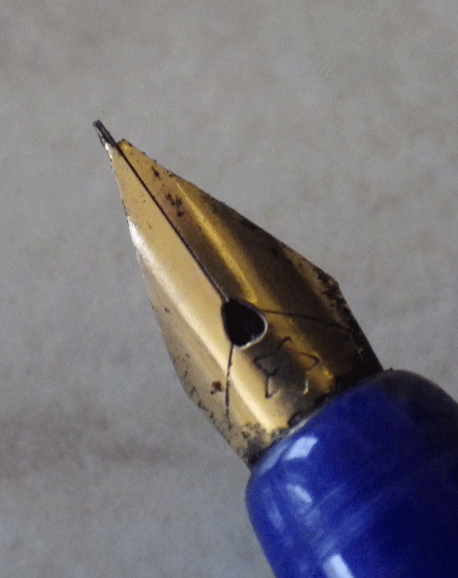
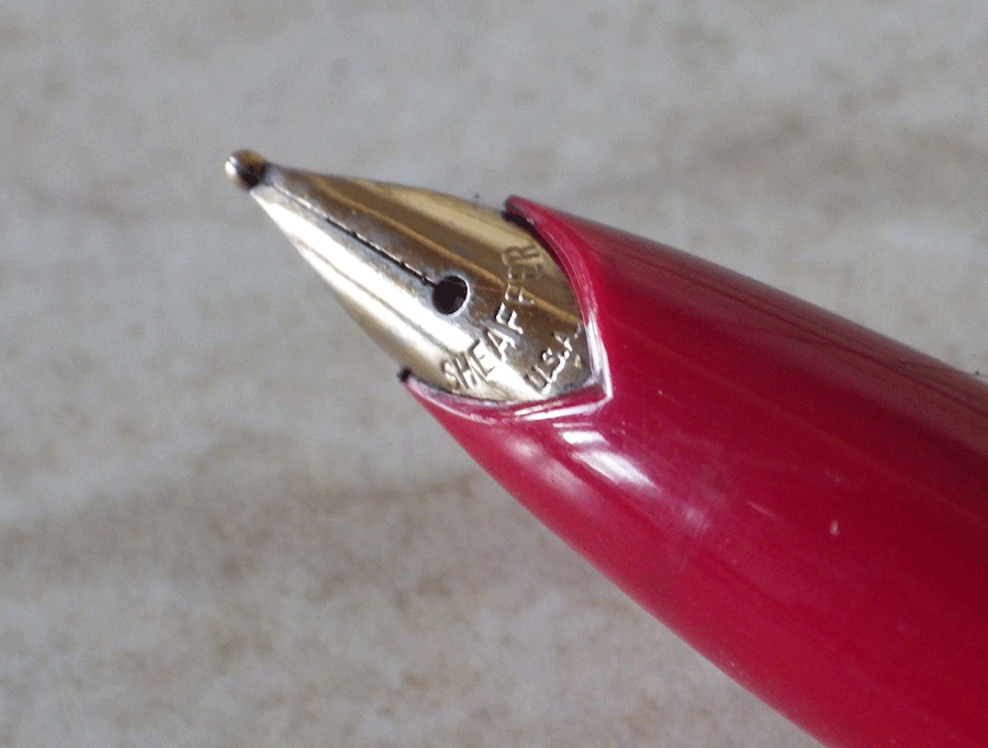
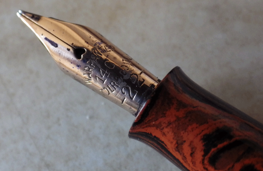
Finally, this pen has an exceptionally nice nib. It’s a stubbish left-foot oblique, and for me it’s a real pleasure to write with.

Monte Rosa

IMGP1631

I’m writing about this pen to show the depth of my ignorance. I’ve had a few Monte Rosas before but they were of the open-nibbed type with a wavy edged cap ring. I haven’t been able to find anything about this specific pen but it resembles the hooded nibbed ones with a metal cap which were made in the sixties. I guess that would be when these ones were made, too.
IMGP1632
Though they were cheaper, Monte Rosa pens retained the high quality of the Mont Blancs. This one measures 13 cm capped and the cap ring is engraved “Monte Rosa” and “Germany”. It has a blue ink-view area and it is my guess that the hooded nib is gold plated. This is a medium and it appears not to have been used. I bought it along with another, a fine, in black.
IMGP1633
There it is, then, that’s all I can tell you about it. Perhaps you can educate me?
IMGP1636
On another subject if you have one of these Swan pockets and you want to use it, be sure that it is rust-free inside. If it’s not, it can scratch a pen horribly. I’ve heard about this from correspondents and I’ve seen one or two myself where sellers have sent pens inside one of these pockets. Some wire wool attached to a bit of dowel should do the trick.

Tallon

School is and has always been a cruel, class-divided place. Nowadays you are judged by your clothes and trainers but back in the day your pen told all about you.

If your parents were well-to-do, you probably had a Conway Stewart. If they were merely comfortably off you would have a Blackbird or possibly a flashy Burnham. If your parents were just getting by, with nothing much to spare, your pen would be a Platignum. If, however, they were in direst poverty and you lived on water and bread and dripping, you would have a Tallon but you would hide it as best you could.
IMGP1628
Platignums tended to fail quite often but Tallons were misery in plastic. It was quite unusual for a Tallon to lay anything other than a blot on paper. A very, very good one might write somewhat acceptably for a day or two; none lasted as long as a week.

I might be exaggerating a little there but they were pretty foul pens. I have one here that I bought in one of my moments of extreme madness. It’s a button filler with imitation gold trim and a plated steel nib. As well as all the other faults Tallons were not durable. This one has a broken tine, rendering it useless.
IMGP1630
Here it is in all its splendour. I didn’t bother cleaning it up but I will hang onto it as a suitable nib may come my way one day and then I can have the only working Tallon in this universe or any other.

IMGP1629

Mentmore Supreme

IMGP1623

The Mentmore Supreme was introduced in 1940 and was one of the pens that Mentmore continued to make throughout the Second World War. It must have remained on sale into the sixties because my husband had one when he was in high school. It was their first full-size cigar shaped pen, the fashionable shape of the time. This one is in a pleasing red (forgive the dark photos) and it’s a rather a smart pen with its concave clip and milled cap ring. It’s a lever filler and, unnecessarily for this filling mechanism, the section is threaded. Perhaps they saw it as an additional bit of quality thrown in. The nib is small but not tiny as some of the Wyverns were. It’s a medium point with some flex and it’s very pleasant to write with.
IMGP1624
I have a feeling that this might be the last gold-nibbed Mentmore. If not, it’s pretty close. After this, it was Platignums with steel nibs. The company made much of the fact that it took much research and trial and error before a steel nib with hard tipping material could be produced.
IMGP1626
Considering that their pens were aimed at the school market it makes sense to make the considerable price reduction that was gained by going from gold to steel. The company didn’t lose by it: hundreds of thousands of steel-nibbed Platignum school pens were sold in the sixties and seventies

The Process

Prep1

I’m finally getting back to preparing pens for sale. It’s quite a process. First, the pens are repaired and restored, then they are tested and adjusted to write well. That’s probably the most time-consuming part of the job. Then they are photographed and the photographs are edited – mostly cropping and re-sizing for the web. Next each pen is described and then they get uploaded to my sales website.
Prep2
This is the write-testing process. Tines are realigned and nib tips are re-ground where necessary. Then a page of writing is done with each pen to ensure that there is reliable ink-flow. As well as being the most time-consuming part of the process, it’s also the most enjoyable. It’s a delight to see each pen working well again, and to write with them and enjoy their characteristics.

Prep3

Keep an eye on the website. There will be some new old pens appearing in the next day or two.

Sheaffer Skripsert Lady

IMGP1462

When Sheaffer first introduced the “Lady” range of pens in 1971 they had a small Triumph nib. In 1973 they changed to the Stylepoint nib, as on this example. Though they are a very decorative purse pen, this is a good nib and it writes well. It’s a completely practical pen though the absence of a clip will bother some. Back in 1971 it was regarded as quite okay to bring out pens that were purely for women, as if we could not grasp a full sized pen with our delicate little fingers. Most women, of course, are not as delicate as all that – in fact I have mighty paws after years of operating motor cycle brake and clutch levers. For the most part, fountain pen manufacturers have now realised that us frail little things can manage a full-size pen.
IMGP1465
This pen is something of a collector’s dream. There are at least 65 patterns, probably more. Many of them are quite scarce, making collection of a full set quite challenging. This one is the Lady Sheaffer Scripsert IX Balicon Red on Gold. And no, I don’t know what Balicon means either. It’s an attractive pattern but it’s advisable not to post the pen because it will wear the pattern.
IMGP1467
I’ve had this pen for quite a while and I’ve used it quite a bit – it’s a splendid writer and I really like the Stylepoint nib. It’s not Sheaffer’s prettiest nib but it is a little gem in terms of writing, and that’s what you buy a pen for. If you are a collector, you’re probably not going to use this pen because you don’t want wear on the pattern. That’s a loss in a way but I suppose it’s understandable. My main problem with using it was that it tended to roll off the desk. Otherwise it was a very good pen. I used to solve that problem with a little bit of Blue Tack stuck on the barrel. Not to everyone’s taste, I suppose…

IMGP1463The other good thing about this pen is that, collectors aside, most buyers don’t rate this pen very highly. The result is that you can pick one up very cheaply in eBay.

Edit To Add: I got the dates wrong on this one. The pen was first issued in 1958.

Conway Stewart 759 Set In Blue Marble

IMGP1457

This is a Conway Stewart 759 set in blue marble. I’ve written about the 759 set before; you’ll see it here: http://wp.me/p17T6K-VV. I won’t repeat all that. Suffice it to say that this set seems to have been used remarkably little. The pencil still contains all the spare leads it was issued with.
IMGP1456
Conway Stewart boxes are in a class of their own. A few are in Art Deco style but most are just in pleasant patterns that don’t adhere to any particular artistic period or style. This one is a particularly nice example. Perhaps it has faded a little over the years but it is still immensely appealing.

What’s In A Name?

IMGP1447

For the last couple of years I’ve been writing with firm-nibbed pens and I have to say I’ve enjoyed them but I thought I would get back to my first love, the flexible nib. I didn’t have anything around that particularly appealed to me, so I went browsing on eBay and found this De La Rue pen. It’s not quite right. The cap and barrel are from different pens but they are roughly the same colour (though a different pattern) and they fit well enough. The mottled hard rubber section is correct – that’s how they were made and it’s part of their charm.   Most importantly, the nib is flexible.

IMGP1448

I got a good deal on this pen, partly because the parts didn’t quite match but also because De La Rue pens don’t reach the prices of Onotos, despite the fact that they were made by the same craftsmen, using, for the most part, exactly the same materials. It’s a good way to get an exceptionally high quality pen for a moderate price.
IMGP1449
Restoring this pen was not quite as straightforward as it should have been. The last person to work on the pen shellacked the section in. The good thing about shellac is that you can easily loosen it but the downside is that it takes a lot of heat. Taking the section out of the barrel is one of the more dangerous manoeuvers in restoration, and anything that makes it unnecessarily more difficult is bad practice. When I put it back together the section fitted the barrel very tightly so there was absolutely no need for the shellac.
IMGP1446
It writes beautifully with no pressure at all producing appreciable line variation. If I push it a little harder the tines separate widely giving a very broad line but there is a tendency to tram-track. That’s okay, I don’t go pressing my pens against the page. I’m more than happy with it. It’s a keeper – unless somebody is absolutely desperate to have it.

So there you are. I’m giving you the hint of how to get hold of some of the world’s best writers at a very decent price. I had considered keeping quiet about it and buying them all myself, but I couldn’t do that. What a fine human being I am!
IMGP1996
My assistant says that she would be delighted to help me, but it’s mad to be indoors on sunny, warm days like this when they happen in November.