The Austin Pen

'THE-AUSTIN'---1A

This one’s a little off-topic, I suppose, in that the one thing it isn’t is a fountain pen. It was referred to me by a correspondent; I don’t have the pen. However, his photographs are so good that all aspects of the pen are covered. I can find no mention of the Austin pen online or in my fountain pen and ballpoint reference works.
THE-AUSTIN---2A
It’s a strange mixture of things. It has a glass cartridge which is open at the rear end like a ballpoint refill. It has an open tip like a stylographic pen, but I don’t think that’s what it is. The crimping at the tip may once have held a ball which is now lost.
THE-AUSTIN-PEN---POINT
It certainly looks like the earliest ballpoint pens, for instance the Miles Martin which was one of the first really practical ballpoints.
the-austin---3A
It’s most interesting and I post about it in the hope that one of you might have seen this before or at least something similar.

Asa Daily

IMGP2586

I’ve been looking at Indian pens recently and many of them seem to be good buys. It pays to do some research before plunging into the market as not all of the pens are well regarded. I settled on this Asa Daily. It’s in light brown and green mottled hard rubber. It’s a very large pen at a whopping 15.8 cm capped. The filling system is described as three-in-one: in other words it’s a cartridge/converter which can be used as an eyedropper filler, and indeed, it comes with a little eyedropper.
IMGP2578 IMGP2577
The clip is large and firm. There is a barrel imprint which states “Asa Daily, India 2015” and appears to have been applied with a centre-punch. Both the cap and the section have long screws. It’s understandable for the section as the pen can be used as an eyedropper filler, but it takes 4 1/2 turns to fasten the cap. The converter is a standard type and works well. I had asked for a fine but unfortunately I was supplied with a medium Schmidt nib. That’s not as bad as it might be because in use the nib is somewhere between fine and medium.
IMGP2582 IMGP2583
I love the feel of the hard rubber, smooth and warm to the touch. As it is so large, I can only write with the pen unposted which is not the way I normally use a pen, but at 17 cm posted it’s much too big for me. The Schmidt nib is lovely, smooth but with a faint feedback.
IMGP2588 IMGP2591
Though this pen has its problems: the long cap-thread is annoying and the pen is very big, that’s outweighed by its good points: the beautiful hard rubber and the excellent nib. If I could find a pen like this that was 2 cm shorter I would be happy. The search goes on.

Twofold No 1

IMGP2447

This Twofold was made by Wyvern in, I believe, the nineteen twenties. It’s a combination pencil and pen. The pen part is a perfectly normal lever filler. In this case it’s fitted with a steel nib. I’ve seen others with gold nibs. The pencil is housed in the cap and you simply unscrew the end to make use of it. The pen has a fixed clip.
IMGP2450
This is clearly the economy model and there are rather better ones around. They are uncommon but not rare. Considering their age and the fact that none of the models was very expensive, they have survived rather well. Dual purpose pens are not very common in Britain – they are much more of an American thing. This one seems to be the exception.
IMGP2455
I don’t think that this sort of pen would have been seen lying around on desks very much. It was more likely to be found in a tradesman’s pocket so that he could sign cheques and contracts with the pen and use the pencil for marking out and drafting.
IMGP2449
It looks a little peculiar to the modern eye but it’s eminently practical. It’s not entirely without decoration – there is a nice milled pattern here and there. I often see these described as hard rubber but I think it’s some form of plastic. There may be hard rubber ones but I’ve yet to see one.

The De La Rue Koala Pen

IMGP2435

This one is a bit unusual. It’s a Koala Pen made by De La Rue for, I assume, the Australian market. There is a possibility that it was made by the Australian distributors, Norman Baker and Longhurst, as they made Onotos after 1957. I would have thought that this might have been a bit earlier than that, but it’s hard to tell. It would be interesting to know how it made its way back to Britain.
IMGP2437
The pen measures 12.2 cm capped and it’s in a beautiful gold/brown/black marble. The end of the barrel and the finial are black. It has a small red decal which looks as though it is made from a different plastic and affixed with heat. This contains the letter “M” which I assume indicates that the nib is medium. This is the usual DLR&Co Warranted 14 carat nib.
IMGP2441
The more I look at the imprint “The Koala Pen” the more it seems to me that it is an impression made with a hot iron. It’s quite a rarity. They do pop up from time to time but I haven’t actually seen one for several years.
IMGP2443
I’m not sure whether that clip is original or not. I don’t have much in the way of reference on De La Rue pens, and they’re quite hard to search for online as they are generally masked by the more popular Onoto. On balance, I would say it’s more likely than not that it isn’t original, but memory fails me.

It’s a nice oddity and it clearly fits into somewhere in the declining years of pen production by the De La Rue company.

Does Size Matter?/Kaweco Sport

IMGP2427

The fountain pen world is full of myths and legends. On examination some of them hold true, others do not. One that interests me is the oft-repeated statement, “I have big hands so I need a big pen.” Back in yesteryear the only really big pens around were very expensive ones. Somehow, most people seemed to manage with their Swan SM/100s and Conway Stewart 286s. More recently, I remember my fellow workers, some of whom were great hulking brutes, doing just fine with their Crystal Bics.

How does one explain the popularity of the Kaweco Sport? This is a tiny pen; even posted it’s 13.3 cm. There are thousands of them out there. Can that only be explained by the existence of an army of Munchkins all busily using their Kaweco Sports? Somehow, I don’t think so. I think you can use any size of pen you want to and anything bigger than a pencil stub is comfortable for anyone.
IMGP2430
It’s a curious little thing, the Kaweco Sport. It’s like a descendant of all those pocket pens of long ago mixed with the long-shorts that the Japanese used to be so fond of. Personally, I rather like them but I’d like them better if the nibs were more to my liking. I’m told these are Bock nibs. This one is a fine and it’s okay but it’s not a patch on some of the other fines I have, like my Pilot or Platinum. I’ve also had a medium and I didn’t like it at all. I’m not sure why that is. It’s just an impression. I could sit here and analyse it all but I might still never get to the bottom of it. I’m just not fond of Bock nibs.
IMGP2431
That said, the Sport seems to be an almost ideal carry-about pen. Small, well-capped and light. They’re quite good on the desk too. With their faceted shape they stay where they are set down and don’t go falling on the floor. They are cheap too, coming in at under £20 for the Classic – quite a bit under, if you shop around. I am told that they are quite easy to turn into an eyedropper, though why you would want to do such a thing I don’t know.

Nemosine Singularity

IMGP2418

Well, here it is – the Nemosine Singularity. That’s probably the very worst thing about this pen – the name. Nemo sine is “nobody without” in Latin.  Nobody without what?  Singularity is defined as “the condition of being singular” or “a point at which a function takes an infinite value – such as at the centre of a black hole”. Pretentious, much?

As you can see, this one’s a demonstrator. I bought it because it was the cheapest one I could get at the time. I actually hate demonstrators. They’re a silly modern thing that bears no resemblance to the demonstrators that a salesman would have carried at one time. Those were constructed to show the clever filling system that they contained. You don’t need a demonstrator to show how a converter works. You just unscrew the barrel and there’s the converter. Stupidest of all is the eyedropper-filler demonstrator. Yes, you put ink in the barrel, and there it is: ink. In the barrel. Quod erat demonstrandum, seeing we are on a Latin kick.
IMGP2422
Now that I have finished showing how clever I am let’s get onto the pen. It’s a hair short of 14 cm and it’s pretty sturdily made. The plastic is crystal clear, which is a good thing, in the sense that if you have to have a demonstrator you might as well do it properly. The trim is bright, shiny chrome-plating. The cap ring has “Nemosine” etched around its circumference. Without even unscrewing the cap (it’s a demonstrator, remember) one can see that the section is black and nicely sculpted. The nib is bright steel and has a butterfly-like decoration. It’s probably a Bulow. Not much one can say about a converter except that this one is well made and takes in a good draught of ink.
IMGP2420
The pen posts deeply and well which is important to me as I’m an inveterate poster of pens. Can’t use them any other way. The nib is a bit strange. It looks like a .8 mm stub but what I’m getting is a medium line with a very slight line variation. A little bit of re-shaping would make it more stub-like or I could even make it an italic, but I think I’ll leave it as it is. It’s very smooth and has great ink-flow. The only real fault I can identify with this pen is the spray of ink droplets inside the cap. I haven’t been walking around with this pen. It’s only been sitting on the desk. Of course, I’m only aware because it’s a demonstrator. Another reason for my loathing.
IMGP2423
The pen cost me £17.74. It’s another example of those very cheap pens that make one wonder why one should pay large loads of loot for a pen that has a better name but performs not a whit better. It’s a very good pen indeed and I might even be able to overcome my aversion for demonstrators in this case, and in this case only.

IMGP2425Excuse the writing sample! I kept getting it into my head that this was a .6 mm stub. It really is a .8 mm.

Wahl Eversharp Skyline

IMGP2411

The Wahl-Eversharp Skyline is a very popular and highly-regarded pen but personally I’m not that fond of it. The early polystyrene can become very brittle with age and it also tends to shrink, making it difficult to work on. Some of them post reasonably well, others have the cap wobbling about insecurely.

Then there’s the aesthetics. There is the oft-told tale that Henry Dreyfus had his locomotives made for the New York Central Railroad in mind when he designed the pen. That’s as may be but this is a pen which travels slowly across the page and doesn’t charge across the prairies at 100 miles an hour. The extremely tapered barrel form causes the frequent posting problems and the design of the cap is unnecessarily complicated. It’s just not a good pen design.
IMGP2414
On the plus side, the filling system, with its breather tube, is very efficient. It always gives a good fill. The Skyline nib is one of the best in the business. Many are flexible to one degree or another and even when they are not they are still splendid writers.
IMGP2413
This particular example was sold as a Presentation but I think it’s a Standard. Either way, it’s in chocolate brown with a gold-filled cap. It writes well with wet ink-flow and some flexibility.

This, That And The Other

I’ve been busy arguing in Fountain Pen Geeks. I do like a good, nasty, spiteful argument and you’re never far away from one in the fountain pen hobby.

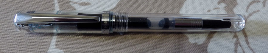
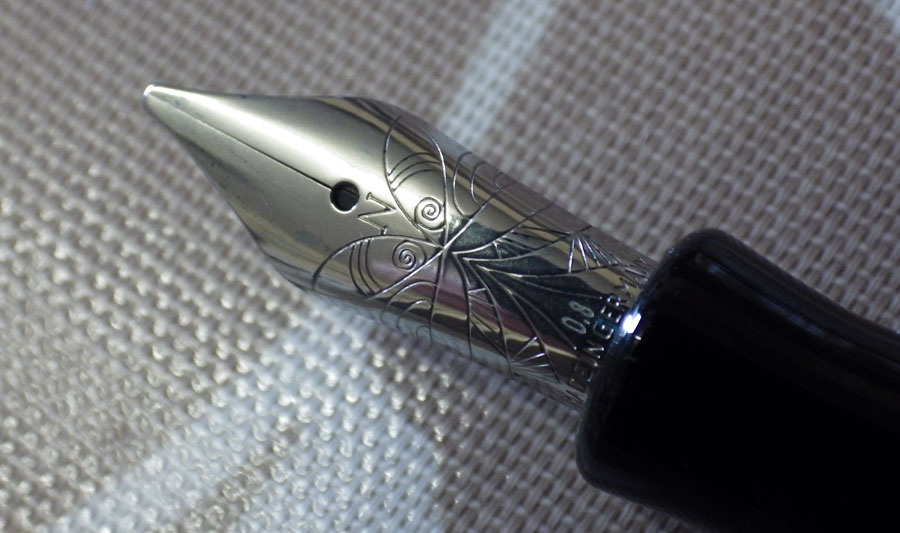
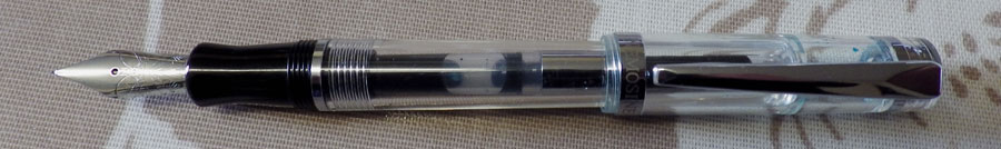
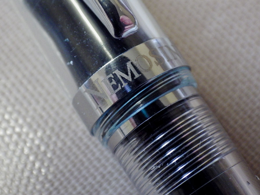
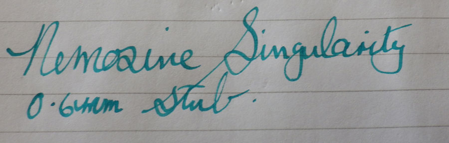
I had long been interested in the Nemosine Singularity, which seemed like a lot of pen for not a huge amount of money so I ordered two of them – a .8 mm calligraphy nib and an extra fine. Unfortunately, they’re demonstrators, something that I find aesthetically unpleasant, but they were cheap. They arrived today, or at least one of them did. Unbelievably, someone had opened the packet and helped themselves to the one with the extra fine nib. I hope it burns their fingers, the thieving gits. I’ll be writing about the Singularity in a day or two, I expect.

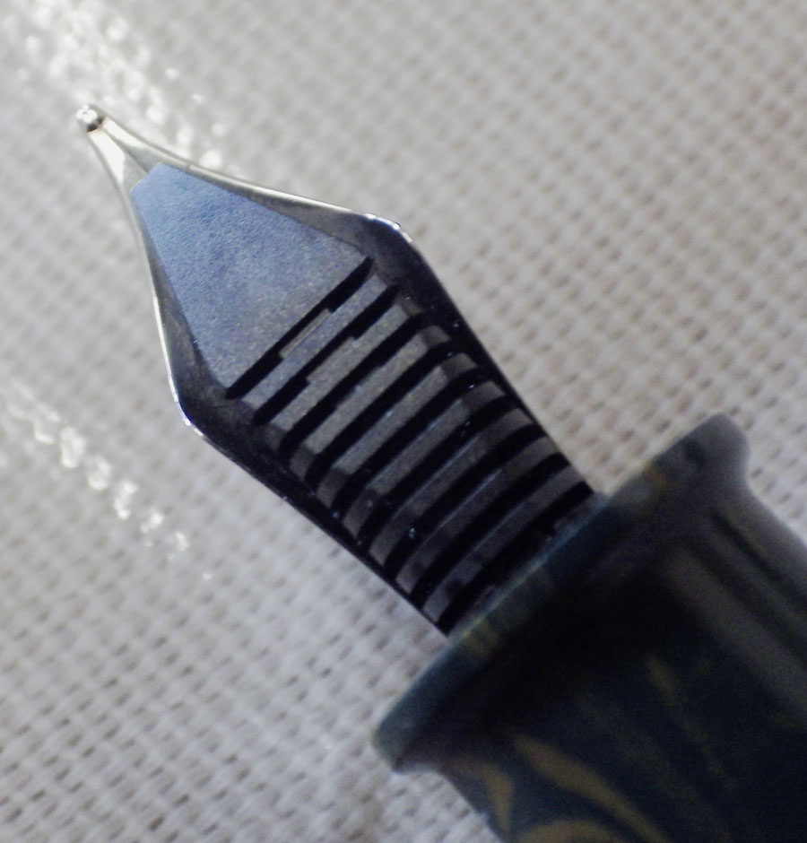
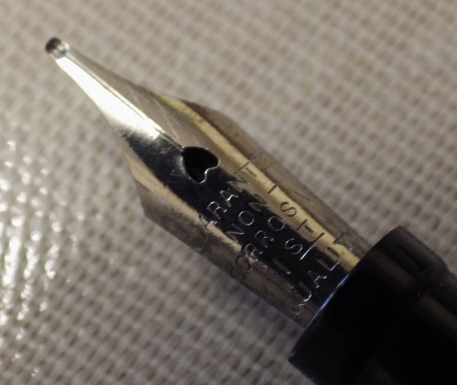
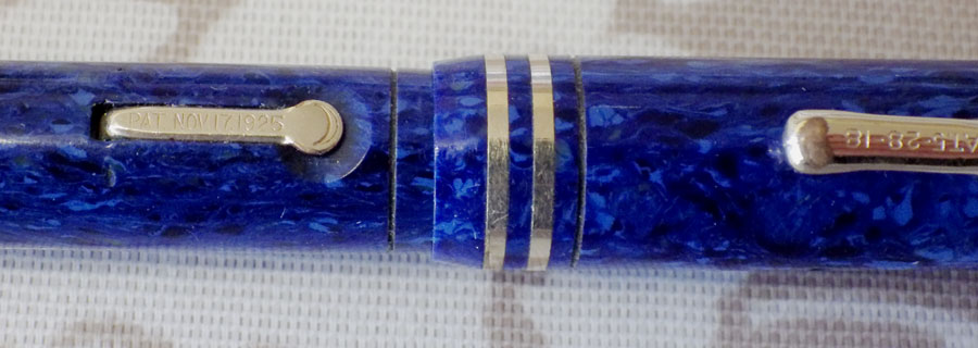
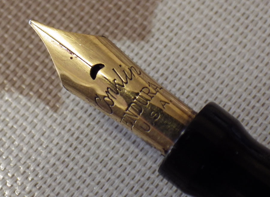
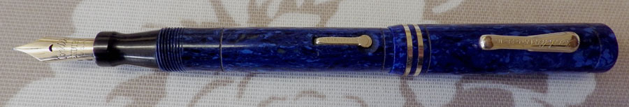
I have many, many requests for pens with flexible nibs. Quite a lot of those are looking for what they describe as “wet noodles”. I almost never have them and at any time I will only have a limited amount of pens with a decent degree of flexibility. I used to use flexible pens. In fact at one time I used nothing else, then I decided to start trying firm nibs and I have to say I enjoy them just as much if not more. A large part of the reason why I used flex in the past was that it tends to cover up the faults of your handwriting. I had a wonderful Onoto (I later foolishly sold it) that made my writing always look beautiful. I came to feel that I was cheating. I should make the effort to produce good handwriting using any pen; not just that one special pen that made everything look good. So I made the switchover to firm nibs and I have stuck with them ever since. In my ignorance I assumed that all firm medium or fine nibs would be the same. Of course they are not. Some just don’t work well for you at all whereas others are like an extension of your hand.

Leaving aside stubs and obliques which are a different matter altogether, what do you think about firm and flexible nibs?

Conklin Endura Junior Lapis Lazuli


IMGP2402

This Conklin Endura Junior Lapis Lazuli was made in the mid-twenties, I believe. It’s in marvellous condition, the only real flaw being some wear on the plating of the clip. I understand that these pens are prone to colour change; this one is as perfect in colour as it was originally. Also, I am told that there are often barrel cracks where the pin for the lever comes through, and there are often major problems with the clip. None of those apply here. It’s just a totally gorgeous little pen.
IMGP2408
The interpretation of Lapis Lazuli that Conklin uses is very similar to a Parker one. It’s made up of lighter blue areas on a darker matrix with some small areas that are so dark blue as to be almost black. It needs good light to appreciate its beauty in full. The plastic of these Enduras is quite thick, making for a sturdy pen.

Strangely enough, Conklin, at this time, did not put a 14K stamp on their nibs. It just says, “Conklin Endura USA”. The nib is a little beauty. It’s not really flexible but it has some spring, making it very pleasurable to write with. The crescent-shaped breather hole is like an upside-down grin.
IMGP2405
This is a small pen. It’s about 10.8 cm capped. I compared it for size with a Kaweco Sport and it’s a little longer both capped and posted. I would think it would be quite adequate for most people.
IMGP2404
Much as I enjoy modern pens, a pen like this is why my heart always remains with vintage. It’s a sad thing, but modern pen-makers can’t replicate this. I know there’s a new Conklin company and their pens are quite well regarded but their nibs bear no comparison to the originals. Thank goodness there are still a few of the old ones around and, luckily for us, their prices have not quite gone into the stratosphere yet.