In the glory days of the fountain pen Waterman was up there with the best of them. Waterman brought out the spoon feed which I think still does an adequate job. Then there was the 12, the 52, the Patrician, the 94 and a lot more. The CF of 1953 began the modern use of cartridges. Even the post-war pens like the W3 and 513 were good writers and were well-made apart from the poor plating. All that was while they were truly Waterman. Bought out by Bic in nineteen fifty-eight, a series of takeovers followed and today the company is a subsidiary of Sanford/Newell Rubbermaid.
The result, I believe, was a loss of direction. Over the years Waterman has turned out many uninspired pens, probably efficient enough but without the company personality of the years before they were absorbed into the large, diverse organisation of today.

The great exception, to my mind, is the Carene. This is a pen of character. The body is lacquer over brass, making it quite heavy at 33.9 g. Though that doesn’t particularly suit me, heavier pens are popular today. It is quite large at 14.4 cm capped. The slant-cut barrel is unusual enough to identify the pen at a glance, but what makes this pen stand out is the beautiful inlaid nib. It has taken an entirely different approach to inlaying from Sheaffer.
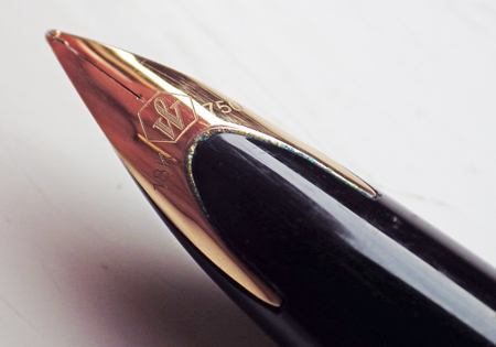
The pen gives the impression of luxury and solidity. The two o-rings at the barrel closure is an indication of the quality of the work that has gone into this pen. I’ve seen it said that the Carene was designed with a luxury yacht in mind. I’m not sure I see that but the design appeals and works well.
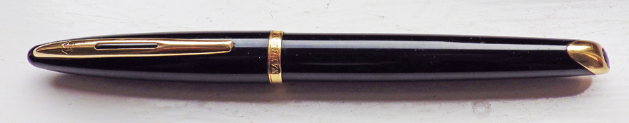
Initially quite an expensive pen, Carenes are priced a little lower now, and good examples appear on the second-hand market at affordable prices.

Waterman is part of Newell Brands, not Newell Rubbermaid.
Fine.
Deb, hi.
I agree completely with your assessment. The Carene is a beautiful and superbly built pen ,albeit unnecessarily weighty in my opinion as well.
The nib is innovative and quite interesting, with a slight tendency to ‘gunking up’at the section interface.
The attention to detail is as you say, excellent, and I also remarked on the ‘O’ ring in mine .
It balances well in the hand and is a pleasure to write with.
However, it still has to be said that it plays completely into the firm , smooth, round tipped nib paradigm that the ballpoint ushered in.
Although there were obviously firm and rounded nibs prior to ‘BP’ days , they and the various softer , flexible and stub type nibs actually demanded to be used in a certain manner, and imparted an unmistakable style to one’s handwriting. Especially when coupled with the more common regime of attention to handwriting as a discipline.
Possibly with the slight exception of the rounded stub nib ( which mine doesn’t have), the Carene’s nib , albeit stylish and innovative, allows whatever quality ( or lack thereof !) of handwriting the user has , to be what flows from the pen. There’s no intervention from the nib at all.
It is my considered observation that handwriting generally has been and is given less and less emphasis in the last few decades (!) and IMHO …..the Carene could be said to be a part of that decline . Notwithstanding its sugar coating.
What you say is undoubtedly true, especially in Western designed and/or produced pens. I find modern Pelikans completely unuseable for this reason.
There’s more to it than that, though and I might make this a subject of a future blog article. The ballpoint didn’t usher in the rounded point – some Parkers and especially Mentmores had them before the ballpoint was dreamt of. Also, the fountain pen is not , and has never been, primarily about flexibility. There have been flexible nibs, to be sure – I’ve sold hundreds of them – but flex is and was mostly the province of the dip pen.
For yourself, you’re probably better sticking to vintage. That’s the advice I would share with everyone. If you really want modern, and I do sometimes, the Japanese are much less enamoured of the rounded, blobby point. As I use fine and extra-fine, this problem rarely arises for me.
I bought a Carene some 15 years ago for its looks . At that time, I was interested in (writing with) fountain pens but entirely ignorant of the factors that define writing experience. And I was unaware of the existence of vintage pens. Since discovering vintage pens (partly thanks to you, Deb) I don’t even think of picking up the Carene any more. It’s a heavy bar if brass with a nib that makes a Pelikan 800 seem flexible and (in my case) rather poor ink flow no matter how thoroughly you flush and clean the darn thing. It does look the part, sure, but an elegant pen that doesn’t write well only brings me frustration.
Not a happy Waterman customer, then, Hans! Nothing can be done about the weight or the stiffness of the nib, but something might be done about the ink flow.