The name Waterman was a guarantee of quality for five decades and more. It is unnecessary to list the brand’s achievements but from eyedropper fillers to the glories of the ripple pens, then some of the finest celluloid patterns in the thirties, Waterman pens had an immense appeal. The heart of any Waterman pen was the nib. Whether firm fines for accountants or wonderful flexible nibs for those who had the skills to use them, Waterman’s “Ideal” nibs were internationally recognised as among the best.

After World War II Waterman’s business declined but there were still some good pens to come. The “W” series of pens introduced in 1955 employed splendidly patterned celluloid, perhaps the company’s swansong before they, like so many others, began using the cheaper injection-moulded plastics and plated nibs that were but a faint echo of the high-quality gold “Ideal”.
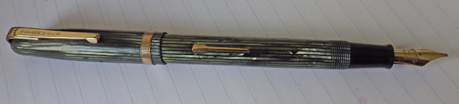
This series retains the Art Deco clip of its predecessors but the box lever has been retired to be replaced by a simpler spatulate lever. I’m not quite sure how to describe this green and black pattern: not so much striated as striped perhaps. The cap band is vertically incised.

This British pen no longer has the Ideal nib. It is an NW3. W3 reflects a number of the pen – I don’t know what the “N” denotes. Nonetheless it’s a good quality 14 carat Waterman nib – in this case a stub. It isn’t flexible but still gives pleasing line variation.
These pens have their failings. The gold plating tends to suffer, especially on the clip – though this example is quite good. Otherwise they are quite robust and this pen, at 63 years old, looks ready to serve another generation or two.
My assistant is very busy today as you can see.

I’m probably flying a kite but offer the suggestion that the N could just possibly stand for Neasden, London, as in the similar N on Newhaven nibs for Parker’s U.K. factory.
According to Andreas Lambrou (Fountain Pens Vintage And Modern – page 190), Waterman, England, had taken over the Falcon Pen Works, in Neasden, London, after the end of W.W. II. Falcon had been making the Pitman Shorthand pen, Unique pen and Boots own-label pen, and the manufacturing of Waterman pens started in 1946.
It’s true that Waterman moved to Finsbury in London subsequently, and I’ve no accurate dates to back up all of this re-location etc., but in view of the Parker nib imprint/location similarity, this suggestion does seem a possibility.
As with other pen manufacturers, It might even be that old Neasden stock was being used at a later date.
I’ve a W3 in a sort of mid blue, though the nib imprint only includes W3, and it too is a stub looking point, though not being a scribbler I’m never entirely sure of accurate point classification.
Judging by my examples from the 5XX and W series, which I think were contemporaries but not certain of dates – the most common nib size appears to be the 2A – with larger numbers corresponding to larger nibs – though not sure of the A bit. ………… could relate to the point, as in fine, medium etc., as I’ve a 2B which would seem to suggest ‘broad’.
The 2A also occurs on some V models (Vest pocket – i.e. shorter pens), and I’ve a W5 nib imprinted with MANIFOLD (when multiple copies were wanted – through carbon paper perhaps).
Calligraphy pens appear not to carry this nib coding.
It looks like this nib numbering code goes back some way before the mid century era we’re discussing, and widespread too, as I’ve some French 18 ct. nib glass cartridge pens with similar numbers.
Sorry, this is longer than I’d intended.
Just a tad more if you can take it 🙂
Similar numbering occurs on their Account and Shorthand f.ps. Caps have white jewels for Accounts – the nib is also supposed to carry the imprint ‘Account’, also with the word ‘BOOK-KEEPER’ around the barrel under the cap threads.
Shorthand caps are red jewelled and carry the appropriate similar wording, though I have only Model 503 for both uses – no idea if other W models were used.
I think Andreas’ interpretation has since been updated.
The Falcon Works was built by Waterman and opened in 1948, rather than taken over. The reference to Pitman’s is correct but relates to their manufacture by Altura who also made pens for Waterman’s before, and after the war, were taken over by them.
I don’t know of anything to suggest that they made pens for Unique or Boots. Can’t rule it out but Unique’s links were more towards Lang’s and possibly Parker while Boots was with De La Rue and Burnham.
The move to Finsbury was the result of being purchase by Stephens and relocation to their headquarters.
thanks Peter – as usual, you’re light years ahead of me in knowledge of the British fountain pen industry.
Just to clarify, and for those who might have misunderstood my comments re Deb’s nib imprint query – I wasn’t suggesting that Mr. Lambrou had implied that the N stood for Neasden – that was purely my speculation, and if I say so myself I thought it quite a rational explanation:-) It seemed to have some logic in view of the Parker N for Newhaven imprint.
What do you think of the suggestion of N for Neasden:-)
Incidentally, a Waterman’s pen has recently been sold with ‘RED’ imprinted on the nib
– I know this is unrelated to the O.P. – U.S.A. Waterman had in the later 1920 to the 30s – Red, Blue, Yellow, Purple, Brown, White I think… the infamous “Pink” – and the mythical Black — The colors represented the writing characteristics of the nibs – they were used in hard rubber pens & in to the early celluloid Waterman pens.
Yes, I remember reading about that though I haven’t come across them here in the UK. Waterman was king of the nibs!
Well, you certainly come across a good number of beautiful pens ! – I am very impressed, – Ive been to Scotland several times & only found a few pens, Though I did not look as hard as I should have 🙂 your blog came up in google research – and now I find it to be a pleasant distraction – So thank you for that ! But I must be getting back to my pen projects – See you soon I am sure 🙂
Thank you. I’m always trying to find something different to write about.