Sheaffer Skripsert Lady

IMGP1462

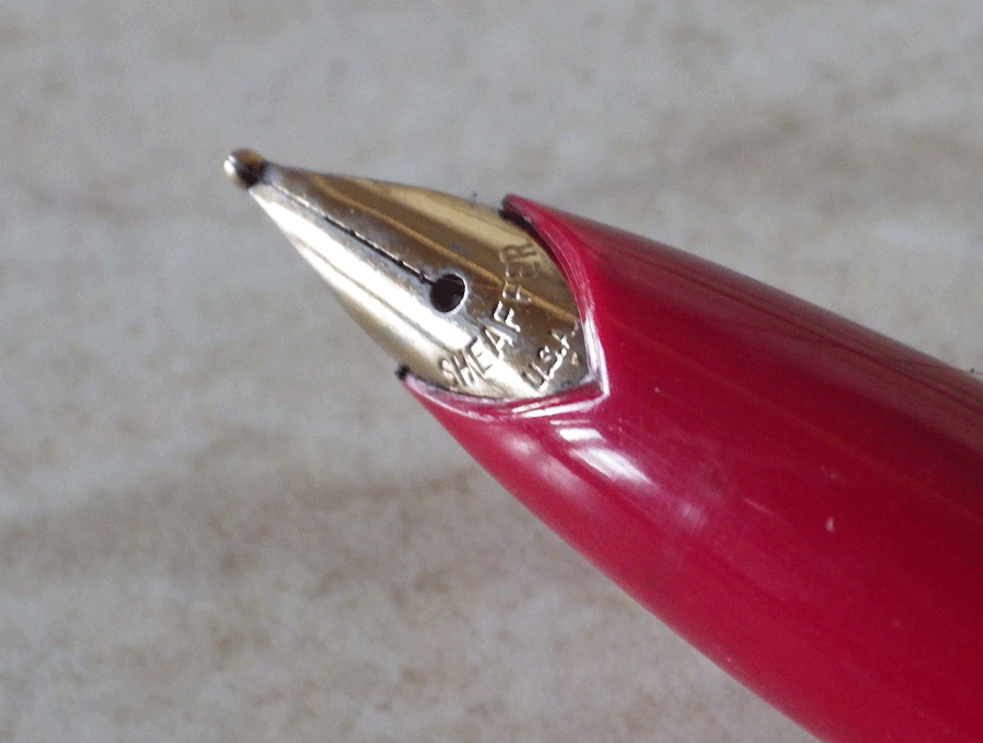
When Sheaffer first introduced the “Lady” range of pens in 1971 they had a small Triumph nib. In 1973 they changed to the Stylepoint nib, as on this example. Though they are a very decorative purse pen, this is a good nib and it writes well. It’s a completely practical pen though the absence of a clip will bother some. Back in 1971 it was regarded as quite okay to bring out pens that were purely for women, as if we could not grasp a full sized pen with our delicate little fingers. Most women, of course, are not as delicate as all that – in fact I have mighty paws after years of operating motor cycle brake and clutch levers. For the most part, fountain pen manufacturers have now realised that us frail little things can manage a full-size pen.
IMGP1465
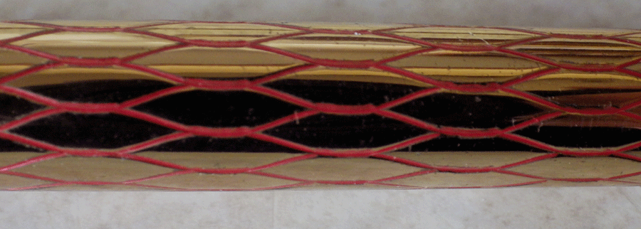
This pen is something of a collector’s dream. There are at least 65 patterns, probably more. Many of them are quite scarce, making collection of a full set quite challenging. This one is the Lady Sheaffer Scripsert IX Balicon Red on Gold. And no, I don’t know what Balicon means either. It’s an attractive pattern but it’s advisable not to post the pen because it will wear the pattern.
IMGP1467
I’ve had this pen for quite a while and I’ve used it quite a bit – it’s a splendid writer and I really like the Stylepoint nib. It’s not Sheaffer’s prettiest nib but it is a little gem in terms of writing, and that’s what you buy a pen for. If you are a collector, you’re probably not going to use this pen because you don’t want wear on the pattern. That’s a loss in a way but I suppose it’s understandable. My main problem with using it was that it tended to roll off the desk. Otherwise it was a very good pen. I used to solve that problem with a little bit of Blue Tack stuck on the barrel. Not to everyone’s taste, I suppose…

IMGP1463The other good thing about this pen is that, collectors aside, most buyers don’t rate this pen very highly. The result is that you can pick one up very cheaply in eBay.

Edit To Add: I got the dates wrong on this one. The pen was first issued in 1958.

Conway Stewart 759 Set In Blue Marble

IMGP1457

This is a Conway Stewart 759 set in blue marble. I’ve written about the 759 set before; you’ll see it here: http://wp.me/p17T6K-VV. I won’t repeat all that. Suffice it to say that this set seems to have been used remarkably little. The pencil still contains all the spare leads it was issued with.
IMGP1456
Conway Stewart boxes are in a class of their own. A few are in Art Deco style but most are just in pleasant patterns that don’t adhere to any particular artistic period or style. This one is a particularly nice example. Perhaps it has faded a little over the years but it is still immensely appealing.

What’s In A Name?

IMGP1447

For the last couple of years I’ve been writing with firm-nibbed pens and I have to say I’ve enjoyed them but I thought I would get back to my first love, the flexible nib. I didn’t have anything around that particularly appealed to me, so I went browsing on eBay and found this De La Rue pen. It’s not quite right. The cap and barrel are from different pens but they are roughly the same colour (though a different pattern) and they fit well enough. The mottled hard rubber section is correct – that’s how they were made and it’s part of their charm.   Most importantly, the nib is flexible.

IMGP1448

I got a good deal on this pen, partly because the parts didn’t quite match but also because De La Rue pens don’t reach the prices of Onotos, despite the fact that they were made by the same craftsmen, using, for the most part, exactly the same materials. It’s a good way to get an exceptionally high quality pen for a moderate price.
IMGP1449
Restoring this pen was not quite as straightforward as it should have been. The last person to work on the pen shellacked the section in. The good thing about shellac is that you can easily loosen it but the downside is that it takes a lot of heat. Taking the section out of the barrel is one of the more dangerous manoeuvers in restoration, and anything that makes it unnecessarily more difficult is bad practice. When I put it back together the section fitted the barrel very tightly so there was absolutely no need for the shellac.
IMGP1446
It writes beautifully with no pressure at all producing appreciable line variation. If I push it a little harder the tines separate widely giving a very broad line but there is a tendency to tram-track. That’s okay, I don’t go pressing my pens against the page. I’m more than happy with it. It’s a keeper – unless somebody is absolutely desperate to have it.

So there you are. I’m giving you the hint of how to get hold of some of the world’s best writers at a very decent price. I had considered keeping quiet about it and buying them all myself, but I couldn’t do that. What a fine human being I am!
IMGP1996
My assistant says that she would be delighted to help me, but it’s mad to be indoors on sunny, warm days like this when they happen in November.

Conway Stewart 55

IMGP1443

Astonishing though it may seem, it appears I have never written about the Conway Stewart 55. It’s one of Conway Stewart’s best and most popular pens in the post-war period. It closely resembles the even more popular 388 but it is larger in all its dimensions and, of course, it has the Duro nib. It’s not a huge pen by modern standards at 13.3 cm but posted it’s a very considerable 16.2 cm.
IMGP1445
It’s the successor to the 45 which, as a short-lived wartime pen had but a single cap-ring instead of the 55’s narrow – medium – narrow set. In other respects it’s quite similar. Unlike most post-war Conway Stewarts it isn’t cigar shaped but, like the 388, has a barrel that is straight-sided with an abrupt taper at the end.
IMGP1444
These pens, like all the Duro models, are quite sought after, particularly the colourful patterned ones. They are not just collector’s pieces though, as they make excellent writers, well-balanced and comfortable in the hand. In many respects, the 55 is one of the best Conway Stewarts. Most Duro nibs are firm.