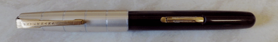
Here’s a nice English Waterman 575 Crusader. These pens were brought out in 1948 and they are often described as Taperites, but they aren’t. Those Crusaders with open nibs are technically not Taperites, though there are Crusaders with enclosed nibs that are Taperites. I’m sure this wasn’t done with any intent to confuse. They come in a couple of styles, the most obvious difference being in the section. Later ones have more traditional sections than this pen.

At 13 cm it’s an average size, average weight pen for its time. The aluminium cap is divided into five sections by incised lines, and the sections are gold anodised. The clip is the standard art deco design that Waterman used on its pens at that time. The cap closes against a gold plated clutch ring. The barrel is made from a hard burgundy plastic. The section is black and the pen has a 14 carat gold nib. In all, the design goes together well and the effect is pleasing.
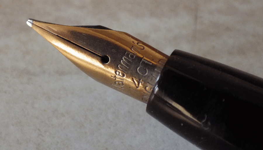
Despite an effort to appear modern, this is an entirely traditional pen, with a normal lever filling system and feed. In use, it’s well-balanced and a very pleasant pen to write with, with some flexibility. Both the anodising and the plating have survived better than most of this manufacturer’s pens of this time.
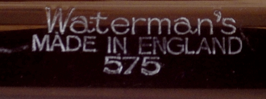
So that’s the Crusader. I have the impression that it was at the lower end of Waterman’s range at the time, but like the Taperites these pens have survived well and are not uncommon. Their worst fault is a tendency for the clutch to loosen but that can be easily put right.
